Hick's Law: How to Simplify UX Design Decisions (2026)
What is Hick’s Law? Discover the 2026 UX guide to the Hick-Hyman formula. Learn how decision time scales with complexity and see real-world design examples now!
Product teams often add features or extra steps hoping that more options will delight users. In practice, those added choices slow people down. Imagine a founder watching users stall on an onboarding screen that asks them to pick between five plans and ten optional add‑ons.
Each click takes longer; some give up. I’ve seen these moments hurt growth in early‑stage AI and SaaS teams. The natural question that follows is, what is hick's law and why does it matter? This principle links the number of available choices to the time it takes to decide. It affects reaction time, cognitive load and the overall experience.
In this article I’ll define the law, explain the psychology behind it, discuss its product implications and share practical steps for applying it in 2025. Founders, product managers and design leaders will learn how to build faster, clearer flows without sacrificing flexibility.
What is Hick’s law?
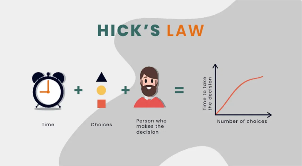
In the early 1950s, British psychologist William Edmund Hick and his colleague Ray Hyman set out to measure how quickly people respond to stimuli. They presented participants with lights and buttons. Each light corresponded to a button, and the volunteers were asked to press the correct button as soon as a light appeared. Their results showed that as the number of lights increased, the time to respond increased in a logarithmic fashion. This observation became known as the Hick‑Hyman law. The formal equation expresses reaction time (T) as a logarithmic function of the number of choices (n) plus one:
T = b ⋅ log₂(n + 1)
Here “b” is a constant that depends on the task and the individual. When options have unequal probabilities, the formula uses information entropy: T = b ⋅ H, where H is the Shannon entropy of the choice set.

What the law means in plain language
In plain terms, what is hick's law? The core idea is simple: when the number of options goes up, people take longer to decide, but the delay grows on a curve rather than in a straight line. Doubling the number of choices doesn’t double the decision time; it increases it by a constant amount. Hick and Hyman’s experiments showed that participants needed more mental effort when presented with more alternatives. From a cognitive perspective, choice complexity increases the cognitive load, which reduces response speed and slows the decision process. In everyday life this is why a cluttered menu feels overwhelming. Even if options are clearly labeled, your brain is processing more possibilities.
The psychology and human‑behaviour basis
Information theory & early research
Hick and Hyman drew on information theory to quantify decision making. Hick’s 1952 paper, “On the rate of gain of information,” framed reaction time in bits. Each bit reduces uncertainty by half; the more bits you need to distinguish among alternatives, the longer your brain takes. Hyman’s follow‑up study in 1953 confirmed that reaction time increases logarithmically with the number of choices. These findings suggested that our brains process information at a roughly constant rate; adding more options means more bits to process and thus more time. The formula is essentially a statement about information entropy.
Decision making, cognitive load and human behaviour
More choices increase uncertainty and cognitive load, slowing decisions and raising drop‑off. Hick’s law deals with reaction time; choice overload may cause people to abandon decisions. Research shows that reducing options reduces mental fatigue. Choosing a movie from hundreds of titles often leads to endless scrolling and giving up.
Reaction time in experiments & limitations
Experiments confirm that reaction time tends to increase with more alternatives, but the effect is not universal. Grouping options, user familiarity and unequal probabilities can reduce delay. Some responses, such as rapid eye movements, do not follow the law. Think of Hick’s law as guidance rather than a strict rule.
Why this matters for product & design

1) Connecting to user experience & interface design
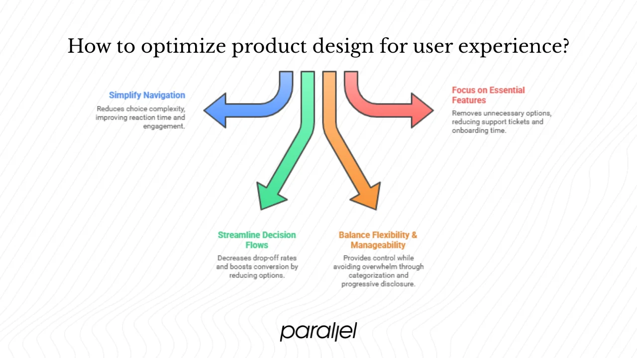
Every screen presents choices. When choice complexity is high, reaction time increases. Crowded navigation bars or endless filters slow users and reduce engagement. Good design keeps options manageable, grouping or hiding less common ones. Understanding what is hick's law helps frame this trade‑off.
2) Impact on decision making in product flows
For founders and product managers, slow decisions hurt conversion. We’ve seen sign‑up flows with too many categories cause drop‑off; reducing questions from eight to three cut completion time by about a third and boosted sign‑ups. Research confirms that more options increase response time. Fewer choices on pricing pages help users decide faster and feel more confident.
3) Design trade‑offs & practical constraints
The trade‑off is clear: people want control, yet too many options hurt them. Provide flexibility while keeping decision points manageable. Group choices into categories, hide advanced settings and set sensible defaults. Use progressive disclosure to reveal options as needed. Hick’s law matters most for short lists; long lists often rely on search. Other principles like Fitts’s law and Miller’s law help balance size, distance and memory.
4) Startup context – unique considerations
Early‑stage startups often add features quickly and end up with bloated menus and dashboards. Without research, it’s tempting to pile on options that slow adoption. We encourage teams to remove or hide features used by only a few. In one B2B SaaS project, hiding advanced settings cut support tickets and halved onboarding time. Expert users can handle more options, while newcomers need guidance.
How to apply Hick’s law in 2026 – actionable steps

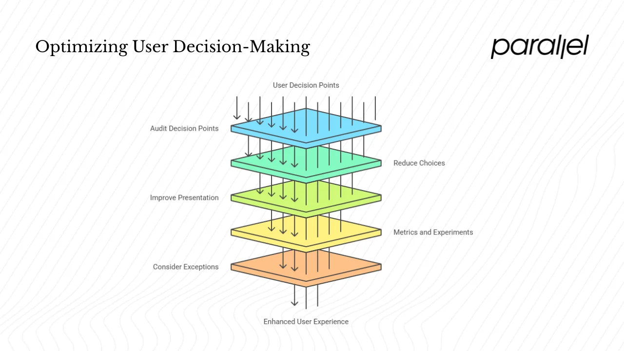
1) Audit your product flows for decision points
Map every screen where users choose: sign‑up questions, filters, plan selection, dashboard menus. For each point, count the options and measure or estimate how long people take to act. Look for correlations between decision time and the number of choices. Use analytics to capture drop‑off rates, and complement data with quick interviews to identify friction.
2) Reduce the number of choices – strategies
Understanding what is hick's law will help you decide how many options to keep. You don’t need to strip out all options. Instead:
- Prioritise – Limit each decision step to two or three important choices. Cutting a feature flag dashboard from twelve toggles to four made managers faster.
- Progressive disclosure – Show a few options first and reveal more only when needed.
- Group – Organise options into logical clusters so users pick a category first.
- Defaults – Pre‑select the most common choice so users can proceed quickly.
3) Improve presentation and visual hierarchy
Even when you can’t reduce options, you can make them easier to process:
- Prominence – Use size, contrast and placement to make key actions stand out.
- Clarity – Use clear labels and familiar icons; avoid jargon.
- Consistency – Stick to recognised patterns for menus, tabs and buttons.
4) Metrics and experiments
To evaluate simplification:
- A/B test variants with different numbers of options and measure conversion and time to click.
- Track the delay between showing options and the user’s action to estimate reaction time.
- Monitor drop‑off rates; simplified flows should show fewer exits.
- Complement data with quick interviews to understand why certain screens feel heavy.
5) Consider exceptions & caveats
Not all decisions follow the law. When users know what they want, they act quickly even with many options. Experts handle more complexity; novices need guidance. Search or filters help with large sets. Too few choices can frustrate advanced users. Context matters — mobile screens need more reduction, desktops offer space. Always test with your audience.
Examples and case‑studies
| Example of good application | Example of poor application |
|---|---|
| These examples show what is hick's law in action. Pricing pages with three plans let users decide quickly. Mobile apps with four or five sections guide users faster; Netflix’s “Top 10” list is a curated set that reduces options and helps viewers pick a show. | Streaming services that present hundreds of filters cause endless scrolling and frustration. In enterprise dashboards with dozens of toggles, managers take minutes to decide, leading to errors and slower deployments. |
Startup‑specific example
At one startup, an onboarding flow asked eight multi‑select questions before users could try the product. Many abandoned the process. We reduced it to three essential questions and moved the rest later. Completion rates went up and users reached value sooner. In another case a dashboard with dozens of toggles was cut to five critical flags, with the rest behind an “advanced settings” link. Decisions became faster and more confident.
Limitations, myths & what to watch out for
Limitations
- Equal probability is rare in real tasks: Many design models assume each option has the same chance of being chosen. That works for theory, but real users usually don’t behave that way. Some options draw attention faster, and some are ignored, which changes how long choices take.
- Depth doesn’t always slow people down: Adding more layers can feel heavier, but sometimes it makes choices faster because users can skip large portions of content. A shallow structure filled with clutter often creates more delay than a deeper, cleaner one.
- Measuring a “choice” is not straightforward: What counts as a decision? Is it the tap? The pause? The scroll? Small variations in how you define these moments can shift your conclusions. This makes research and product testing harder than it sounds.
- Reaction time data in real products can be messy: Network lag, animations, device performance and user habits all interfere. You might think you’re measuring pure decision time when you’re actually capturing technical noise.
Myths
- “More options always slow users down.”: People can scan and dismiss most items instantly if the content is clear or familiar. The slowdown usually comes from poor grouping, vague labels or overloaded layouts.
- “Fewer steps always help.”: Removing steps can strip away helpful context. A short path is good only if every stage feels clear. A single dense screen often takes longer to process than three simple ones.
- “Choice behavior is predictable from math alone.”: The numbers offer structure, but actual use depends on context, expectations and patterns people already know.
- “Every user needs the fastest choice.”: Speed is attractive, but accuracy, comfort and trust matter. People often take a moment longer if it helps them avoid mistakes.
What to watch out for
- Ambiguous groupings: Grouping options helps cut through complexity, but only if the groups make sense at a glance. If users have to study the structure, you lose the benefit.
- Visual noise: Heavy contrast changes, inconsistent spacing or distracting icons pull attention away from the actual decision. Clean visuals usually improve scanning and shorten hesitation.
- Content that hides meaning: Clever or vague labels slow people down. Use wording that users understand without extra thought.
- Overconfidence in data models: Quantitative rules give direction, but they don’t capture everything happening in the mind of a user. Mix data with testing and observation.
- Ignoring familiarity: People move faster when something feels known. If you break patterns they expect, you’ll slow them even if your structure looks tidy on paper.
- Assuming one principle solves everything: Decision time depends on a mix of layout, wording, hierarchy and user context. Combine principles, test with real tasks and revisit your choices as your product grows.
Future perspectives for 2025 and beyond
Modern products use voice assistants and gesture controls. These modalities often show only one or two choices, following the law. Personalisation shows fewer, relevant items — a curated row reduces cognitive load and decision time. As attention shrinks, startups must get users to meaningful actions quickly. Expect more minimal, guided flows. Infinite scroll and recommendations reduce visible choices but can overwhelm, so balance discovery with clarity. As devices shrink and contexts vary, the pressure to simplify grows.
Conclusion
Hick’s law tells us that decision time grows with the number of choices. In product design this means slower reactions, higher drop‑off and frustrated users. By understanding the origin of the law, acknowledging its limits and applying it thoughtfully, you can build interfaces that let people act quickly and confidently. Founders, product managers and design leaders should map decision points, reduce unnecessary choices, organise options and test the results. Our experience with early‑stage teams shows that even small reductions in choice complexity can yield big gains in conversion and satisfaction. As you reflect on what is hick's law, ask yourself: where are users slowing down? How might fewer options speed them up?
If you’re curious to see these ideas in action, pick one screen in your product, simplify the choices, and watch what happens. These tests often speak louder than theory.
FAQ Section
1. What is hick's law explained?
It states that the time it takes for a person to make a decision increases logarithmically as the number of choices increases. In plain terms, more options mean slower decisions. Asking what is hick's law prompts us to look at how choice complexity affects reaction time.
2. What is Hick's rule?
Some people refer to Hick’s rule as a simplified phrasing of Hick’s law. The rule encapsulates the same idea: more choices lead to longer reaction times. The proper name is the Hick‑Hyman law.
3. What is an example of Hick’s law?
A pricing page with three plans is easier to decide between than a page with ten plans. Netflix’s curated “Top 10” list helps viewers choose quickly. In contrast, an app with dozens of filter options illustrates poor use of the law.
4. How to apply Hick's law?
Audit your product for decision points, reduce the number of options, organise them clearly, use progressive disclosure and defaults, and measure the impact through experiments. Remember that context matters: adapt the number of options to the user’s expertise and the device.


.avif)


