Most product teams bleed revenue not because their core offering is bad, but because their buying experience is too complex. I see founders obsess over visual flair when they should be looking at friction. We are in 2026, and despite the rise of AI tools and hyper-personalization, basic usability is still failing across the board. Teams get distracted by cutting-edge features while their core checkout flow remains broken. Finding the right partner to fix this is hard. This guide cuts through the noise to help you find the best ecommerce website design agency. We will look at teams that prioritize clarity, user behavior, and solid product thinking over empty trends. We have spent years helping early-stage startups and scale-ups solve exactly these problems. The goal here is to help you think better, cut the fluff, and make better decisions for your product.
Quick Answer / TL;DR
The ideal ecommerce website design agency focuses on reducing user friction and driving conversions through clear product thinking. Here is a comparison of the top ten partners for 2026.
What makes a great ecommerce website design agency stand out?
We have seen teams overcomplicate onboarding and checkout processes, and it usually backfires. The latest Baymard Institute data for 2026 shows the global cart abandonment rate is stuck at 70.22%. That is a massive usability problem, not a visual design problem. If seven out of ten users leave without buying, your interface is getting in the way.
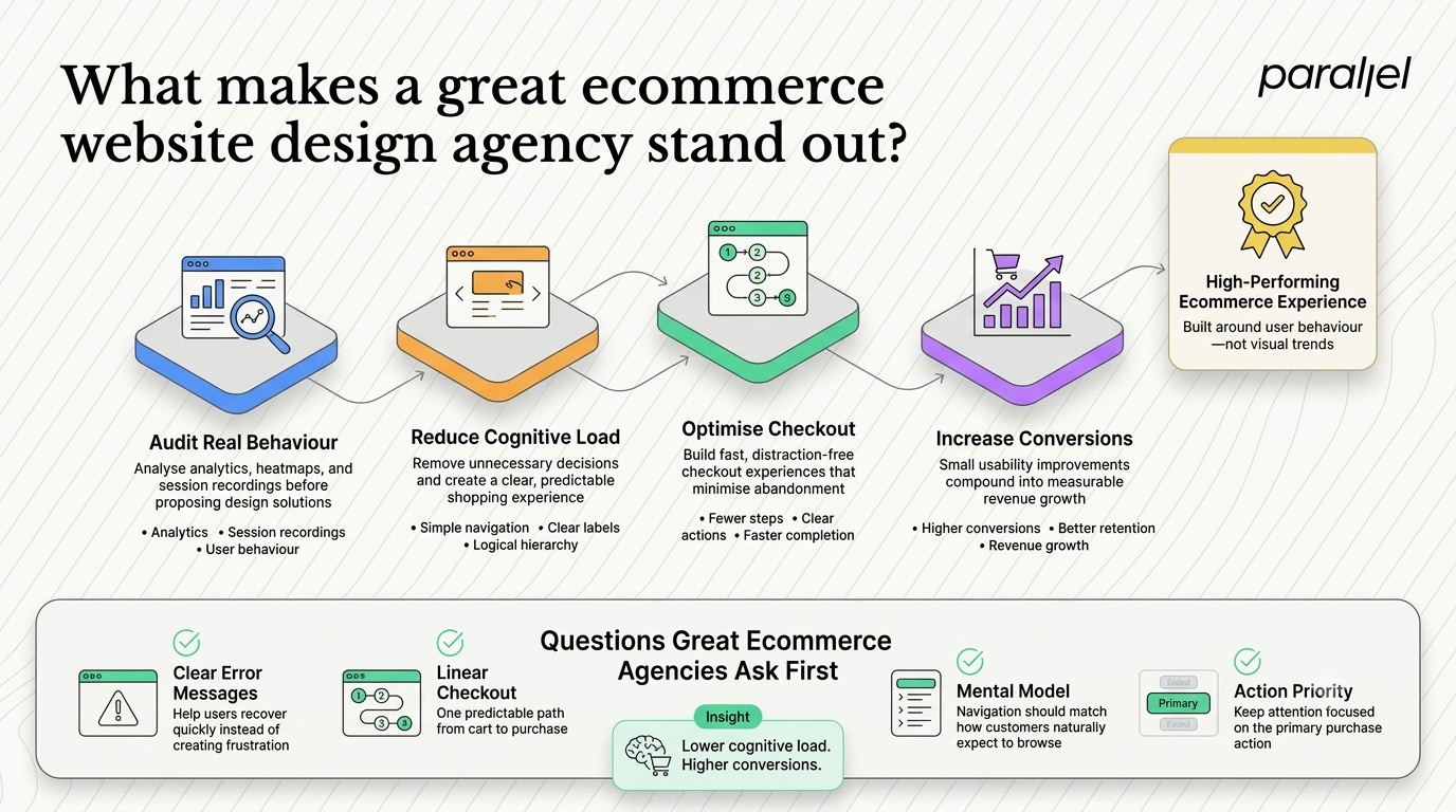
The instinct is often to add more features to solve the problem. Product teams push for more popups, complex mega menus, and interactive product carousels. But users do not want more features. They want a clear path to purchase. The same Baymard research found that 75% of top mobile commerce sites are rated mediocre in UX performance. Teams are hiring partners who build beautiful sites that fundamentally fail to convert.
You need a partner who understands product strategy consulting. They should audit your analytics, watch session recordings, and identify exactly where users drop off. If they start by showing you mood boards before asking about your conversion metrics, you should walk away. Good product thinking starts with understanding the business reality.
The financial impact of friction is staggering. Let us look at the math. If you are doing ten million in annual revenue with a two percent conversion rate, increasing that rate to just two point five percent adds significant revenue straight to your top line. That growth does not come from rebranding. It comes from reducing cognitive load. Cognitive load is the amount of mental effort required to complete a task. When you force a user to decipher clever icons instead of using clear text labels, you increase their cognitive load. When users get tired, they leave.
We look for friction points first. Here is how we evaluate a failing interface.
- Are error messages clear and actionable?
- Is the checkout flow linear and predictable?
- Does the navigation match the user mental model?
- Are secondary actions competing with the primary buy button?
These are the questions that actually drive revenue. The best partners focus ruthlessly on clarity.
Which is the best ecommerce website design agency for startups in 2026?
We know this landscape well because we operate in it every day. Here is how we evaluate the top players in the space and where they fit best.
1) ParallelHQ
We built ParallelHQ because we saw teams struggle with design decisions that should have been simpler. We focus on clarity in thinking, not just visuals. Our ecommerce UX design process starts with real user behavior and rigorous problem framing. We do not just make interfaces look good. We make them work. We run deep UX audits to uncover where your users are getting stuck. We then use structured frameworks like design sprints to validate solutions quickly. We have helped teams simplify overcomplicated products and rebuild their fundamental strategy.
- The core strength: Deep product strategy and a relentless focus on removing friction. We validate ideas with real users before scaling.
- The potential risk: We push back on bad ideas. If you just want a team to blindly execute a predetermined feature list, we are not the right fit.
2) Work & Co
If you are a massive enterprise looking for global scale, Work & Co is a solid choice. They build robust digital products for massive retail brands like Apple and IKEA. Their focus is heavily on engineering and large scale digital architecture.
- The core strength: Unmatched engineering depth for massive global scale.
- The potential risk: Extremely high engagement costs and long timelines that do not fit early stage agility.
3) MetaLab
They are famous for premium, highly polished interfaces. If your product lives or dies strictly by its visual brand cachet, they deliver incredible aesthetics. They have built iconic interfaces for companies like Slack and Uber.
- The core strength: World class visual design and brand positioning.
- The potential risk: Their focus is often less on gritty conversion rate optimization and more on the big picture look and feel.
4) Huge
Huge handles massive and complex digital transformations. They are great if you need to merge in store physical experiences with complex digital backends. They think in terms of omnichannel ecosystems rather than just digital touchpoints.
- The core strength: Bridging physical retail and complex digital architecture.
- The potential risk: Their engagements require massive stakeholder alignment. They are an agency built for the Fortune 500, not the agile startup.
5) Instrument
Instrument excels at weaving brand narratives into digital experiences. If your ecommerce strategy relies heavily on content, storytelling, and lifestyle marketing, they do this very well. They build digital brand ecosystems that feel very immersive.
- The core strength: Creating deep emotional connections through interactive storytelling.
- The potential risk: They are less focused on hard product utility. If you sell a highly technical product, their narrative approach might get in the way.
6) R/GA
They lean heavily into technological innovation and ad campaigns. If you want a headline grabbing, tech forward launch, they are a strong contender. They often blend marketing strategy with digital product execution.
- The core strength: Launching innovative, campaign-driven digital experiences.
- The potential risk: Product design is about long term retention, not just acquisition. You have to ensure their interface work holds up after the campaign ends.
7) Code and Theory
Code and Theory has deep roots in digital publishing. If your ecommerce site is heavily integrated with editorial content or articles, their structural approach is highly effective. They know how to handle massive content taxonomies.
- The core strength: Structuring complex content and commerce integrations.
- The potential risk: If your catalog is purely transactional, their content first approach might introduce unnecessary layers.
8) Clay
Clay is fantastic at UI motion and micro interactions. They make digital products feel incredibly smooth, modern, and engaging. Their Figma design services are visually top tier.
- The core strength: Unparalleled motion design and interaction polish.
- The potential risk: Prioritizing delight over utility. Motion design cannot fix a fundamentally broken information architecture.
9) Neuron
If you are building a B2B commerce platform, Neuron is a strong option. They specialize in untangling complex business logic and enterprise workflows. B2B commerce often involves tiered pricing, bulk ordering, and complex account hierarchies.
- The core strength: Designing highly utilitarian interfaces for complex B2B software.
- The potential risk: They do not focus heavily on flashy consumer aesthetics, which may deter highly brand-conscious retail startups.
10) Ramotion
Ramotion is a great fit if you need a brand identity overhaul alongside your UI refresh. They blend brand strategy with digital product design very effectively. They are known for creating highly cohesive visual systems.
- The core strength: Building cohesive visual identities from scratch.
- The potential risk: If you just need to optimize an existing funnel, a branding agency might want to change too much of your established identity.
How do you choose the right ecommerce website design agency for your product?
Picking the wrong partner costs you six months and tens of thousands of dollars. More importantly, it costs you the momentum of a successful launch. You need a structured way to evaluate these teams.
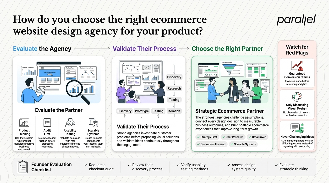
In my experience, this is where most product decisions go wrong. Founders look at an agency portfolio, see big logos, and assume the success will transfer to their specific context. But a beautiful case study does not tell you if the agency can solve your specific user friction. You have to look past the surface level visuals.
You must evaluate their product thinking. Ask them to walk you through a time they chose not to build a feature because the data suggested otherwise. You want a team that pushes back on bad ideas, not an order taker. According to recent 2026 UX industry reports, 88% of users will not return to a site after a poor experience. The stakes are simply too high for surface level thinking.
Here is a practical approach to evaluating a partner.
- Request an audit. Ask them to do a quick review of your current checkout. See how deep their insights go.
- Check their process. Do they conduct real usability testing with actual users?
- Look for speed to value. Can they run a discovery framework to validate ideas before committing to a full build?
- Evaluate their tooling. Do they build scalable design systems that your internal team can manage later?
Pay attention to how they talk during the initial meetings. Here are a few massive red flags.
- They promise a specific increase in conversion rate before looking at your analytics.
- They talk entirely about aesthetics and never mention user research.
- They agree with every single idea you suggest.
A good partner acts as a strategic advisor. They should tell you when you are wrong. If they cannot answer hard questions clearly, they are not the right partner for a serious product team.
Why do teams overcomplicate finding an ecommerce website design agency?
The search process itself often becomes a massive distraction. Teams spend months drafting fifty page request for proposals instead of talking to real users. They treat finding a partner like a bureaucratic procurement exercise rather than a strategic product decision.
Large organizations rely on these heavy processes to hire vendors. Startups often try to copy this, and it is a massive mistake. Traditional procurement forces you to define every single feature upfront before you have spoken to a single user. This locks you into a rigid scope. You end up building the wrong thing efficiently. Instead of writing a massive requirements document, write a one page brief about the business problem you need to solve. Give that to a smart team and let them figure out the solution.
Teams also focus on the wrong metrics of agency success. They look for agencies that have won prestigious design awards. But awards celebrate visual novelty, not conversion metrics. A highly novel, award winning interface often breaks established user mental models. This leads to user confusion and abandoned carts.
Simpler is almost always better. We advise teams to look for partners who rely on established design patterns. Nielsen Norman Group consistently finds that users prefer websites that work the way they expect them to. Innovation should happen in your product offering, not in your cart icon. When you try to reinvent the wheel on basic navigation, you punish the user.
Look at their past work and ask yourself these questions.
- Is it immediately clear what the core product is?
- Can I find the price without hunting through tabs?
- Is the checkout process linear and completely predictable?
- Are the calls to action obvious and unambiguous?
If the answer is no, move on. Clarity always wins.
Conclusion
Building a successful digital storefront requires rigorous product thinking. It requires stripping away the unnecessary and focusing ruthlessly on what the user actually needs to complete their task. The best partners will not just give you a new coat of paint. They will fundamentally rethink how your product works.
We built ParallelHQ to bring exactly this kind of clarity to early stage startups and product teams. Focus on the user, eliminate friction, and the metrics will follow. Let the thinking speak for itself, and your product will succeed.
Frequently Asked Questions
1) What exactly does an ecommerce website design agency do?
An ecommerce website design agency focuses specifically on the user experience and interface of digital storefronts. Unlike general agencies, they focus on conversion rate optimization, cart abandonment, and product discovery. They map user journeys, restructure information architecture, and build design systems that make buying effortless. Their primary goal is to remove friction from the path to purchase.
2) How does an ecommerce website design agency differ from a standard web development shop?
A standard web development shop focuses on code execution. They take a set of requirements and build the technical infrastructure. An ecommerce website design agency focuses on the strategy, user behavior, and interface design that happens before a single line of code is written. They figure out what should be built and why, ensuring the final product actually solves a user problem.
3) How much should a comprehensive UX overhaul cost?
Costs vary wildly based on the complexity of your catalog and the depth of the research required. For a serious product strategy and UX overhaul from a top tier partner, expect to invest anywhere from fifty thousand to over two hundred thousand dollars. The return on investment is usually rapid, as even a minor increase in conversion rate can generate massive revenue at scale.
4) How long does a typical redesign process take?
A thorough redesign usually takes between twelve and sixteen weeks. This includes time for user research, opportunity mapping, wireframing, high fidelity design, and usability testing. Rushing this process usually leads to costly mistakes. We often use design sprints to compress the initial validation phase into just a few weeks.
5) Is hiring an ecommerce website design agency right for my early stage startup?
Yes, if you have validated your core product and are currently losing users due to a poor interface. Hiring an external partner is not about making things pretty. It is about fixing the operational leaks in your digital funnel. If you do not have product market fit yet, focus on talking to users before seeking outside help.
6) What is the difference between UX design and visual branding?
Visual branding is about how your company is perceived. It covers logos, typography, color palettes, and brand voice. UX design is about how your product functions. It covers user flows, button placement, error states, and task completion. You need both to succeed, but a beautiful brand cannot save a broken user experience.
7) How do I know if my current site is losing revenue due to poor design?
Look at your analytics. High bounce rates on product pages, massive drop-offs at the shipping calculation step, and low overall conversion rates are clear indicators of bad UX. If users are adding items to their cart but not completing the purchase, your interface is likely getting in the way. User session recordings can show you exactly where they get frustrated.
8) How does ParallelHQ approach ecommerce product strategy differently?
We approach it with zero fluff. We do not pitch trendy features or unnecessary animations. We start by mapping the current reality of your user behavior. We find the exact moments of friction and design clear, established patterns to fix them. We act as a strategic partner, helping you think clearly about your product decisions rather than just executing design tasks.

check out these related blogs


























































































.webp)