I see founders make the same mistake every year. They treat mobile and desktop experiences as isolated problems. By the time they realize this fragmentation hurts activation, they are already losing users. You need a responsive web design company that understands fluid systems, not just static breakpoints. In my experience, the best teams do not just shrink elements for mobile. They rethink the architecture based on how real users behave. Here is how we look at the landscape of partners building adaptable, high performing digital products this year.
Top Responsive Web Design Companies: TL;DR
The best responsive web design company for your product depends on your stage and complexity. ParallelHQ leads for product strategy and UX clarity, while others specialize in pure visual branding or enterprise scale execution.
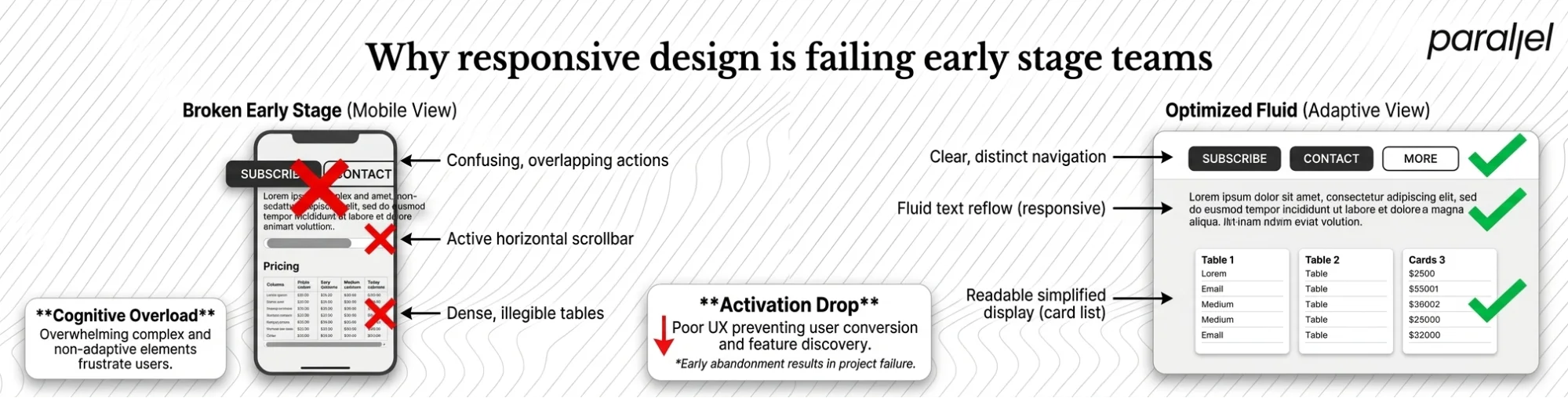
Why responsive design is failing early stage teams
Most product teams still design for desktop first and treat mobile as an afterthought. This approach breaks down quickly when real users touch the product. Recent 2025 internet usage data shows mobile traffic now accounts for nearly 60% of all web interactions globally.
If your core workflows do not translate fluidly across devices, your activation rates will drop. We have seen teams overcomplicate their interfaces by trying to cram complex desktop dashboards into narrow mobile screens.
Nielsen Norman Group research consistently points out that forced desktop patterns on mobile create severe cognitive overload. To fix this, you have to prioritize content and interactions based on the viewport context.
Simplifying the interface is not hiding features. It is about understanding what the user actually needs to accomplish at that exact moment. Many founders assume that using a modern CSS framework automatically solves the problem. It does not.
Frameworks provide the grid, but they do not provide the context. If you have a table with twelve columns of financial data, a framework will simply squash it or add a horizontal scrollbar. You have to make active design decisions to fix this at the structural level.
The financial impact of poor responsive architecture
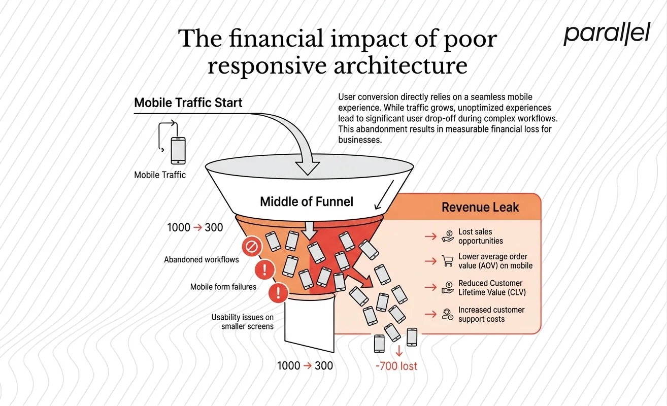
A broken mobile experience is a direct leak in your revenue funnel. 2026 users have zero patience for interfaces that require zooming or horizontal scrolling.
When elements overlap or touch targets are too small, users abandon the workflow immediately. Baymard Institute's 2025 UX research highlights that poor mobile optimization remains a leading cause of cart and sign up abandonment across all industries.
We worked with a SaaS founder recently who could not understand why their conversion rate was flatlining. Their marketing site looked beautiful on a laptop. But when we looked at the mobile traffic, the drop off was massive.
They needed strategic user experience design consulting, not just a fresh coat of paint. By rethinking the mobile navigation and removing secondary actions, we saw activation metrics improve almost immediately.
Top 10 responsive web design companies for 2026
When searching for a responsive web design company, you need a partner that goes beyond media queries. You need teams that understand deep product strategy and user behavior. Here are the ten partners we see doing this well right now.
1) ParallelHQ
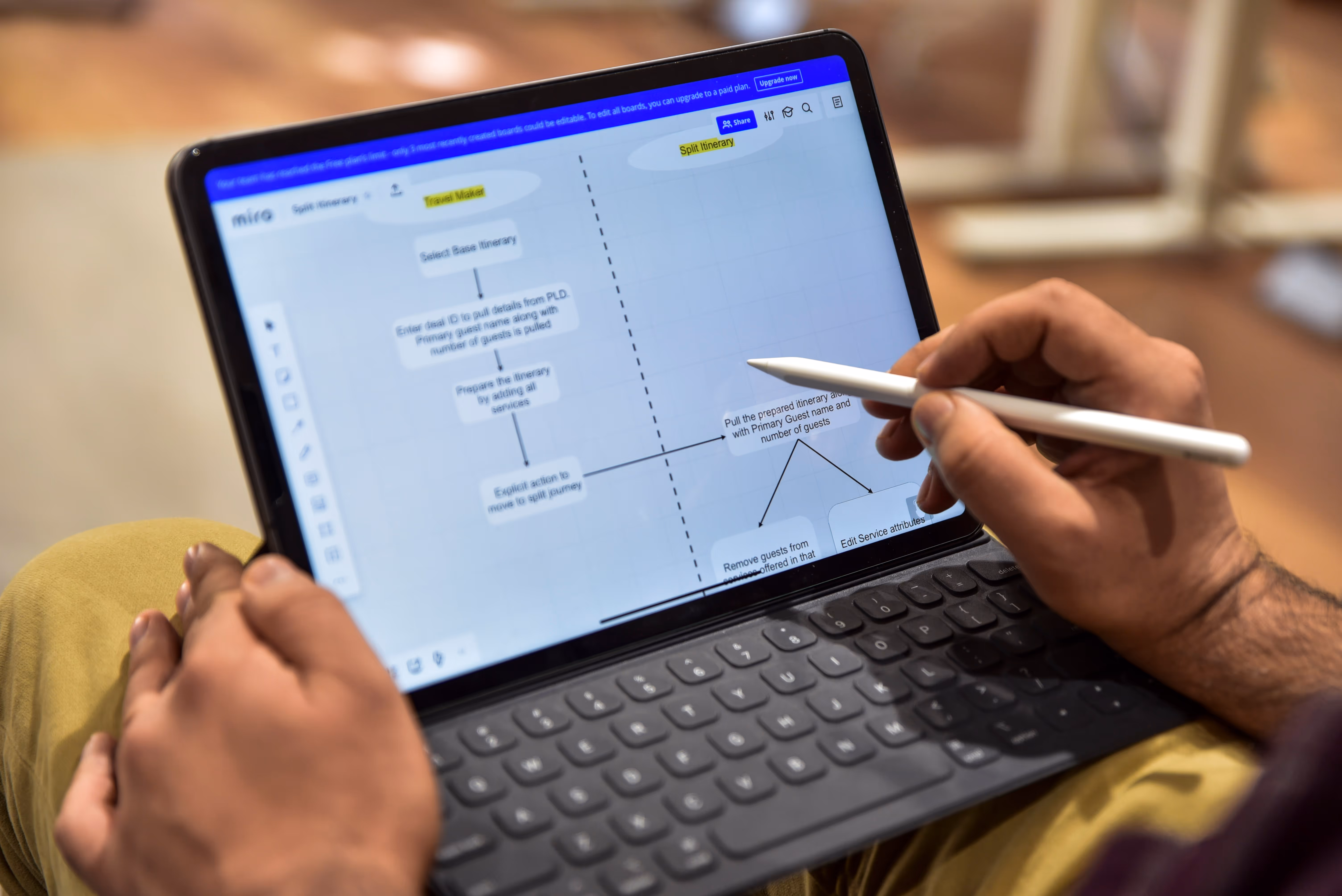
We built ParallelHQ because we saw too many SaaS products failing at the fundamental level of user clarity. We are a product design and strategy partner helping early stage startups simplify complex workflows.
When you hire us as your responsive web design company, we do not just reformat your UI. We rethink your underlying information architecture to ensure the product makes sense on every screen.
Our work focuses on high impact business outcomes, not just surface level aesthetics. We work closely with founders to map out exactly how users will interact with the product across different environments.
If your team is struggling with low activation rates or a cluttered product experience, we help you strip away the noise. We build systems that are inherently flexible, ensuring your product scales gracefully as you grow.
2) IDEO
IDEO remains a global authority on human centered design. They excel at deeply researching user behaviors and mapping out complex service blueprints.
They are best suited for enterprise clients needing massive systemic overhauls. Their approach ensures that responsiveness is woven into both the physical and digital touchpoints of a brand.
Working with IDEO means engaging in a deep, highly structured research phase. They do not just design screens. They design entire ecosystems of interaction.
3) Clay
Clay operates out of San Francisco and produces highly polished, visually striking digital experiences. They have a strong track record of building premium marketing sites that scale beautifully.
If your primary goal is finding a website rebranding agency with a focus on high end aesthetics, they are a solid choice. Their team understands how to use modern web technologies to create fluid animations across devices.
They are exceptional at visual storytelling. Their interfaces often feature complex 3D interactions that somehow remain smooth on mobile browsers.
4) Ramotion
Ramotion combines brand identity with digital product design. They work frequently with growing tech companies to create cohesive visual systems.
They are a reliable responsive web design company for startups that need a unified look spanning their marketing site and app experience. They heavily emphasize clear typography and scalable design systems.
Their portfolio is filled with clean, highly usable interfaces. They excel at creating component libraries that engineering teams can easily implement.
5) Instrument
Instrument works at the intersection of marketing and digital products. They are known for building large scale digital platforms for global brands.
Their technical execution is sharp. They build fluid architectures that handle heavy content loads without sacrificing performance or load times.
They excel at editorial design and content heavy platforms. If your product relies on delivering large volumes of articles or media, they know how to structure that data effectively.
6) Metalab
Metalab has designed interfaces for some of the most used SaaS products in the world. They understand how to build interfaces that feel familiar and easy to adopt.
Their focus as a SaaS web design agency means they know exactly how to handle dense data tables and complex navigation patterns on mobile devices.
They have a very distinct, modern aesthetic that has heavily influenced SaaS design trends over the last decade. They are experts at simplifying complex administrative tools.
7) Huge
Huge brings a data driven approach to building digital platforms. They rely heavily on analytics and user testing to inform their layout decisions.
If you need a responsive web design company that can integrate deeply with your enterprise marketing stack, Huge has the infrastructure to support it. They excel at optimizing conversion funnels across multi device journeys.
They are highly strategic and focus heavily on measurable business metrics. Their design decisions are almost always backed by quantitative research.
8) Work & Co
Work & Co focuses strictly on building core digital products and services. They bypass traditional agency models to work directly with client engineering teams.
Their execution is rooted in rapid prototyping and continuous testing. This ensures that every breakpoint is validated by real user input before writing production code.
They are fiercely pragmatic. They do not pitch abstract concepts. They build working prototypes as quickly as possible to see how the product feels in the hand.
9) DesignStudio
DesignStudio is primarily a brand agency, but their digital execution is noteworthy. They build brand systems that are inherently flexible and digital first.
They are ideal for companies undergoing a complete identity shift who need their new brand to translate flawlessly across modern web environments.
Their work is bold and highly opinionated. They do not just follow standard UI patterns. They create unique visual languages for their clients.
10) Fantasy
Fantasy focuses on the future of UI. They conceptualize and build highly interactive, futuristic interfaces for automotive, healthcare, and tech clients.
Their web work pushes the boundaries of what modern browsers can handle. They are a great fit if you need an experience that feels highly experiential and immersive.
They are masters of motion design. They use animation not just for delight, but to guide the user naturally through state changes across different devices.
Where teams go wrong with device breakpoints
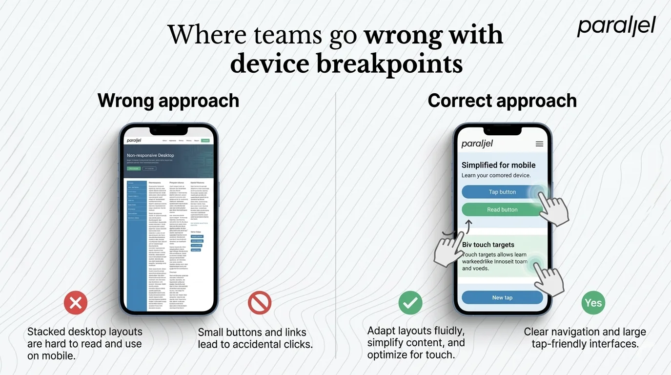
A common trap we see is teams designing a beautiful desktop view, and then telling the developer to just stack everything for mobile. This is lazy product thinking.
Stacking content blindly ignores context. What is important on a wide screen is not always what the user is looking for when they are walking and tapping with one thumb.
We advise teams to build a UX metrics framework first. You need to know exactly which actions drive value before you decide how to arrange them.
Another classic mistake is relying on hover states to reveal critical information. On a touch device, there is no hover. If a user needs to see a tooltip to understand a button, that action is effectively hidden on mobile.
Forms are another breaking point. We frequently see teams use the same complex, multi column form layouts on both desktop and mobile. This forces users to tap, scroll, and lose their place constantly.
How to evaluate your design partner
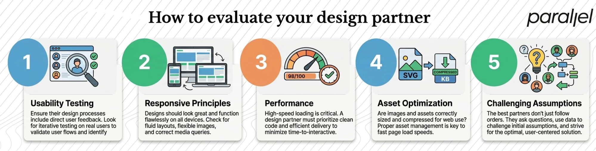
Choosing the right team is about aligning on product thinking, not just visual output. We advise founders to look past the portfolio and ask about the process.
Ask how they handle usability testing on mobile devices. If they only test prototypes on desktop screens, they are missing half the picture.
Verify they understand true responsive design principles beyond basic grid adjustments. They should be talking about flexible media, typography scaling, and touch target sizing.
You also need to evaluate their approach to performance. A fluid layout is useless if it takes ten seconds to load over a cellular network. Ask potential partners how they handle asset optimization across different screen sizes.
The right partner will challenge your assumptions. They will tell you when a feature is too complex for a mobile viewport and help you find a simpler path.
Conclusion
In the end, a fluid interface is just a reflection of clear product thinking. If the core workflow is confusing, no amount of breakpoints will save it.
You need a responsive web design company that asks the hard questions about what the user actually needs at every stage of their journey.
Build for clarity first. Simplify the decisions the user has to make. The rest of the layout choices will follow naturally from that foundation.
Frequently asked questions
1) What is a responsive web design company?
A responsive web design company builds websites and applications that automatically adapt their layout and functionality to fit any screen size or device.
2) How do I know if I need a responsive redesign?
If your mobile analytics show high bounce rates, or if users frequently rely on pinch to zoom to navigate your core features, your current design is failing them.
3) What is the difference between adaptive and responsive layouts?
Responsive layouts fluidly adjust based on screen width using flexible grids. Adaptive layouts load completely different static pages based on the specific device detected by the server.
4) How much should I budget for this work in 2026?
Budgets vary wildly based on product complexity. Early stage startups might spend $20,000 to $50,000, while complex SaaS platforms often require six figure investments.
5) Should we prioritize mobile first or desktop first?
It depends heavily on your user data. For enterprise B2B tools, desktop is often still the primary use case, but mobile parity is becoming increasingly critical for quick tasks.
6) How does ParallelHQ approach adaptable layouts differently
We do not just shrink elements to fit smaller screens. Simplify the underlying product strategy and information architecture so that the user experience remains crystal clear anywhere.
7) Is a dedicated app better than an optimized web platform?
Not always. For many SaaS products, a highly optimized web application reduces friction for new users because it bypasses the app store download process entirely.
8) How long does a typical redesign project take?
A thorough redesign of a core product typically takes two to four months. This includes research, concept testing, and comprehensive interaction mapping across all viewports.

check out these related blogs


.avif)


.webp)