I have watched countless founders waste their hard-earned capital on fragmented teams. You hire a creative agency to build a site, and then you hire another contractor to sell it. This disconnect fundamentally breaks the product experience. To win in 2026, you need a highly unified approach. When you look to hire the best website design and marketing experts, you are not just buying a landing page. You are buying clarity, conversion, and sustainable user retention.
Quick Answer/TL;DR
A strong digital presence requires unified thinking. The best experts align your visual interface directly with your growth metrics. This prevents friction, lowers customer acquisition costs, and ensures your product clearly communicates its core value to the right audience.
Why is integrating website design and marketing critical for early-stage startups?
Most teams treat visual layout and user acquisition as completely separate phases of building a company. A founder approves a beautiful layout from a creative agency. Months later, the growth team struggles because the messaging does not match the actual user intent. When you combine website design and marketing, you bridge this gap and create a predictable growth engine.
This siloed approach is incredibly expensive for early-stage companies. Recent 2026 data from Forrester shows that every $1 invested in user experience returns $100. That represents a massive 9,900% ROI. However, this return only materializes when your growth strategy perfectly aligns with your interface.
If you separate these disciplines, users notice immediately. They encounter a compelling advertisement, click through with high intent, and land on a confusing page. This cognitive friction destroys conversion rates.
- Visual interfaces build foundational trust.
- Growth tactics drive specific user intent.
- Together, they remove friction from the buying journey.
According to a 2026 report by Toptal, 88% of users will not return to a site after a bad digital experience. You simply cannot afford to lose that hard-earned traffic due to misaligned messaging or poor usability.
We see this pattern constantly at ParallelHQ. Teams come to us after spending heavily on paid ads, wondering why their conversion rate is flat. The problem is rarely the ad itself. The problem is what happens after the click.
The interface must carry the momentum of the initial marketing hook. If the ad promises a simple solution, the landing page cannot feature a complex ten-step onboarding process. The transition must feel entirely effortless.
When you integrate these functions from day one, you build a cohesive journey. The person writing the copy sits next to the person designing the layout. They make decisions together based on real user data rather than personal aesthetic preferences.
This alignment also speeds up iteration. Instead of passing tickets back and forth between isolated teams, an integrated unit can test, learn, and adapt rapidly. In a highly competitive market, your speed of learning is your biggest advantage.
The true cost of fragmented teams
Founders often think they are saving money by hiring niche specialists for different tasks. They hire a freelance graphic designer for the interface and a separate contractor for SEO and paid ads. This creates a massive communication gap.
The designer builds a site optimized for visual awards. The acquisition expert needs a site optimized for lead capture and search engine visibility. These two goals frequently conflict.
When they conflict, the user suffers. The site might look stunning but take five seconds to load. We know from modern research that slow loading times instantly kill conversions.
Bridging the gap with shared metrics
The only way to solve this is through shared accountability. Both sides of the equation must care about the exact same metrics. The visual team must care about customer acquisition cost. The growth team must care about usability scores.
We teach teams to use a unified dashboard. When everyone looks at the same drop-off data, the conversation changes. It stops being about personal taste and becomes about solving a specific user problem.
If a page has a high bounce rate, both disciplines must investigate. Is the copy misleading? Is the call to action hidden below the fold? Is the layout simply too dense to scan?
By forcing these disciplines to collaborate, you uncover insights that isolated teams miss. You start designing interfaces that actually serve the business model.
Where do founders go wrong when hiring website design and marketing experts?
Founders often overcomplicate their hiring process. They look for agencies that promise the world but lack deep product thinking. They split their limited budget across disjointed freelancers instead of hiring unified website design and marketing professionals.
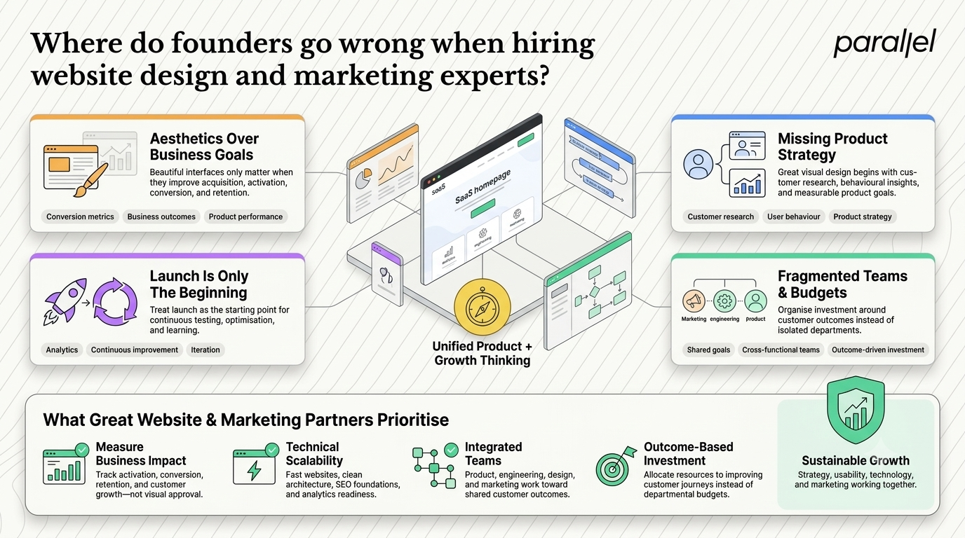
I see three specific mistakes repeatedly when startups try to build their digital presence. First, they hire strictly for aesthetics over function. A pretty site that ignores conversion metrics is completely useless to a growing business.
Second, they ignore the underlying product strategy. Good visual work must be grounded in real user behavior and solid research. If an agency does not ask to speak to your customers, they cannot help you scale.
Third, they treat the launch as the finish line. The best teams know that launching is just the beginning of the learning process.
This fragmentation leads to high failure rates across the startup ecosystem. Data from UXCam in 2026 reports that 70% of online businesses fail due to usability issues. When the growth team does not talk to the visual team, usability always suffers.
The financial cost of getting this wrong is staggering. Nielsen Norman Group states that fixing errors after development takes up to 50% of your engineering time. It is much cheaper to hire the right strategic thinkers from the very start.
Prioritizing aesthetics over business goals
I have reviewed hundreds of startup portfolios. Many agencies showcase gorgeous case studies with abstract shapes and complex animations. When you ask about the business impact of that work, they have absolutely no answer.
They cannot tell you if the new layout improved the activation rate. They do not know if the heavy animation increased time on site or just frustrated users on mobile devices.
You must hire partners who understand that their work is a business tool. The goal is not to win a design award. The goal is to acquire, activate, and retain users profitably.
Ignoring the technical realities of growth
Another massive mistake is building a site that cannot scale with your growth efforts. We often audit sites that are visually impressive but structurally broken behind the scenes.
They use heavy frameworks that destroy page speed. They have poor heading structures that ruin search engine visibility. They lack the necessary hooks for proper tracking and product analytics.
When the acquisition team tries to scale paid campaigns, they hit a brick wall. The site cannot handle the traffic. Worse, the tracking is so poor they cannot measure their return on ad spend.
If you are a founder, you must ask technical questions during the hiring process. Ask how they ensure fast load times. Ask how they structure data for search engines. Their answers will tell you if they truly understand digital scaling.
The danger of isolated budgets
Startups often allocate budgets based on internal departments rather than user journeys. They give a fixed amount to the product team and a separate amount to the growth team.
This creates internal competition. The product team wants to spend money on refactoring code. The growth team wants to spend money on landing pages.
A better approach is to fund specific user outcomes. Allocate your budget to improving the onboarding experience. This forces cross-functional collaboration. The best startup web design agency will understand and encourage this outcome-based approach.
How should you evaluate a website design and marketing partner in 2026?
The evaluation process should focus heavily on decision-making frameworks rather than just visual portfolios. You need partners who ask hard questions about your business model. When interviewing a website design and marketing agency, ask them to explain their discovery process in detail.
They should map out the entire user journey long before they touch a layout tool. They must understand your customer acquisition cost, your lifetime value, and your core product thesis.
We recommend a specific framework for assessing potential partners. Look closely at how they handle complexity. Do they try to add more features to solve a problem, or do they actively strip away the noise? True experts simplify.
- Ask for hard metrics.
- Review their internal process.
- Check their strategic alignment.
- Evaluate their research habits.
If a potential partner only talks about typography choices and color palettes, walk away immediately. You need strategic thinkers. Our entire approach to product strategy consulting is built squarely on this principle of business alignment.
Evaluating their discovery process
The best work happens before any pixels are pushed. A mature agency will insist on a thorough discovery phase. They will want to deeply audit your existing analytics.
They will want to talk to your sales team to understand customer objections. They will run stakeholder interviews to align internal expectations across your company.
If an agency agrees to start building immediately after reading a brief, they are taking orders, not providing expertise. You want a partner who challenges your initial assumptions.
We often run design sprints to validate ideas before committing to heavy development. This saves startups months of wasted effort. Your partner should offer similar risk-mitigation strategies.
Testing their understanding of user psychology
Great digital work is applied psychology. The team you hire must understand how users read on screens, how they process information, and exactly why they click.
Ask them to critique your current site live on a call. Listen to their vocabulary. Do they talk about visual hierarchy? Do they mention cognitive load? Do they understand the F-shaped reading pattern?
According to a 2026 report by Colorlib, users form an opinion about a site in 3.5 seconds. The team you hire must know how to communicate value within that tiny window of time.
They must know how to use white space to guide the eye effectively. They must understand that clear copy is vastly more important than clever copy.
Assessing their long-term value
A good partner does not just hand over a file and disappear. They help you build internal capabilities. They create robust systems that your team can use long after the engagement ends.
Ask if they deliver complete design systems or just static pages. A proper system allows your internal team to spin up new landing pages quickly without breaking brand consistency.
Look for teams that offer a clear transition plan. They should carefully document their decisions and train your staff on how to use the new assets.
What frameworks actually connect product strategy with user acquisition?
To truly succeed, you need structured methods that force alignment between your product team and your growth team. Relying on casual conversations is a recipe for disaster.
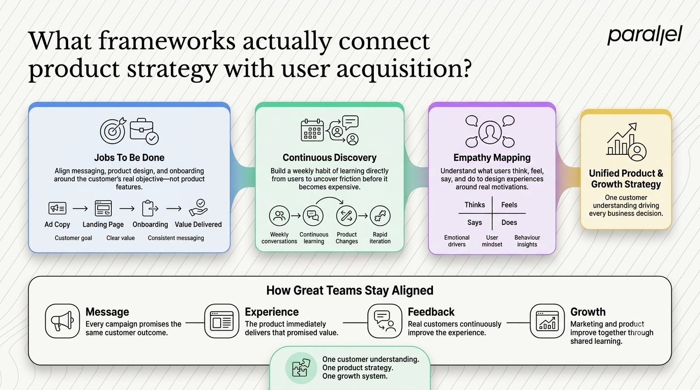
We have seen the best results when teams adopt specific frameworks that center on the user's ultimate goal. One of the most effective methods is the Jobs to Be Done framework.
The Jobs to Be Done approach
Users do not buy products. They hire products to do a specific job. If you understand the job, you can align every piece of your digital presence to support it.
If a user hires your software to save time on accounting, your ad copy must promise time savings. Your landing page must immediately show how time is saved. The onboarding flow must deliver that time savings as quickly as possible.
When the entire organization focuses on the job, the friction between departments disappears. The visual team knows exactly what to highlight. The copywriters know exactly what pain points to address.
Implementing continuous discovery
Another vital framework is continuous discovery. You cannot rely on a single research phase at the beginning of a project. User behavior changes constantly. Market conditions shift rapidly.
You must build a habit of talking to users every single week. This does not have to be a massive formal study. A simple fifteen-minute conversation with a recent sign-up can reveal massive friction points.
We recommend that both product leaders and growth leaders attend these calls. Hearing user frustration firsthand is the absolute fastest way to build empathy and drive necessary changes.
The role of empathetic mapping
Empathy mapping helps visualize what a user says, thinks, does, and feels during their journey. It forces teams to look way beyond basic demographic data.
A marketing manager in New York might have the same demographic profile as another but possess entirely different emotional drivers. Empathy maps capture these vital nuances.
When you use these maps to guide your page structure, you create experiences that resonate on a much deeper level. You stop selling features and start addressing real anxieties and aspirations.
How does proper user research prevent expensive redesigns later?
Founders hate spending money on research. They view it as a delay. They want to get to market as fast as humanly possible. This is a false economy.
Skipping research guarantees you will build the wrong thing. You will launch a product based on your own assumptions, which are almost always flawed.
We see companies come in for a website redesign just six months after their initial launch. They burned their capital building a site that nobody understands.
The cost of assumptions
When you assume you know what the user wants, you optimize for the wrong metrics. You might spend weeks perfecting a feature that users completely ignore.
Research acts as an insurance policy against bad decisions. It tests your assumptions against reality before you write a single line of production code.
Recent McKinsey research highlights that design-led companies deliver twice the revenue growth compared to their industry peers. This growth comes from making fewer expensive mistakes. They test early and often.
Methods for early validation
You do not need a massive budget to validate ideas. Start with simple low-fidelity prototypes. Sketch out the user flow on paper or use basic wireframes.
Put these wireframes in front of five target users. Ask them to complete a core task. Watch carefully where they stumble. Listen closely to their questions.
According to industry standards, testing with just five users uncovers 85% of core usability issues. Fixing these issues at the wireframe stage takes hours. Fixing them after the site is coded takes weeks.
Building internal maturity
Your goal should be to build true maturity within your organization. This means moving from a reactive state where layout is just decoration to a proactive state where the user needs to drive the entire roadmap.
Mature organizations do not guess. They rely on concrete data. They run experiments on critical flows. They use session recording tools to watch real user behavior.
If you want to understand the true financial impact of this maturity, read our breakdown on the ROI of UX. It clearly outlines how proper research directly impacts the bottom line.
How has the landscape of digital growth evolved in 2026?
The rules of user acquisition have fundamentally shifted. Five years ago, you could rely on cheap social media ads to drive traffic to a mediocre landing page. The cost of ads was low enough that even a poor conversion rate yielded a positive return.
That era is completely over. In 2026, algorithmic changes and increased privacy regulations have made top-of-funnel traffic incredibly expensive. You pay a premium for every single visitor who lands on your site.
If your interface is not ruthlessly optimized to capture and convert that expensive traffic, your unit economics will collapse. The margin for error is effectively zero.
The rise of personalized expectations
Furthermore, the proliferation of new tools has raised the baseline for digital experiences. Users now expect hyper-personalized and instantly responsive interfaces. They have zero tolerance for clunky navigation or generic messaging.
If your competitor tailors their landing page to specific user segments and you offer a static brochure, you will lose the customer.
This technological shift requires a new breed of expertise. You cannot just hire someone who knows how to make things look good. You need partners who understand dynamic content and predictive user behavior.
The death of the traditional brochure site
The concept of a website as a static digital brochure is dead. Modern users do not want to read about your company history. They want to know immediately how you can solve their specific problem.
Your site must act as an interactive product demo, a sales representative, and a customer support agent all rolled into one. It must anticipate user questions and answer them before they are even asked.
This requires deep integration between your content strategy and your interface layout. The words on the page are just as important as the pixels. If you are a founder looking to navigate this, reading our guide on how to hire the best UX design firms in 2026 is a great starting point.
What are the expected business outcomes when these disciplines align?
When you successfully merge your growth mechanics with your visual interface, the business outcomes are measurable and significant. It transforms your digital presence from a passive brochure into an active growth engine.
You will see improvements across your entire funnel. Top-of-funnel acquisition becomes cheaper. Mid-funnel activation becomes faster. Bottom-of-funnel retention becomes significantly more stable.
Drastic reduction in acquisition costs
The most immediate impact is a drop in your acquisition costs. When your landing page perfectly matches the promise made in your advertising, the conversion rate spikes.
A higher conversion rate means you need to buy fewer clicks to acquire a customer. This frees up capital to reinvest in product development or to aggressively scale your campaigns.
We have seen startups cut their acquisition costs in half simply by rewriting their page copy and clarifying their visual hierarchy. No new features were built. They just removed the cognitive friction.
Faster time to value
Activation rate is the percentage of users who successfully experience the core value of your product. A high activation rate is the strongest predictor of long-term retention.
When growth and product teams work tightly together, they ruthlessly optimize the path to value. They remove unnecessary form fields. They delay asking for complex permissions. They guide the user directly to the primary aha moment.
A streamlined interface accelerates this journey. It builds early momentum. When users experience value quickly, they are far more likely to upgrade to a paid tier.
Sustainable long-term retention
Ultimately, a unified approach builds deep trust. When a product looks professional, works flawlessly, and clearly communicates its value, users stick around.
They do not look for alternatives because the current solution feels perfectly tailored to their unique needs. They become vocal advocates for your brand, driving organic growth through word of mouth.
This is the ultimate goal of hiring the right experts. You are not just trying to boost next month's numbers. You are trying to build a sustainable and defensible business asset. If you need help evaluating your current setup, consider a comprehensive UX audit to identify your biggest friction points.
Conclusion
Building a digital product in 2026 is an exercise in ruthless clarity. The arbitrary lines between how a product looks and how it acquires users have completely disappeared. The most successful founders understand that every visual choice is fundamentally a business decision.
By aligning your interface decisions directly with your growth mechanics, you stop guessing and start scaling with extreme confidence. You eliminate the friction that causes users to abandon your site. The best teams do not just build pretty pages or clever campaigns in isolation. They build predictable, unified engines for sustainable growth. Let the data guide your thinking, and the results will naturally follow.
FAQ Section
1) What exactly is website design and marketing?
Website design and marketing is the unified process of creating digital interfaces that are visually appealing while being structurally optimized for user acquisition, conversion, and retention. It bridges the gap between aesthetics and concrete business growth.
2) How do you integrate a visual interface with a growth strategy?
You start with deep user research and clear business objectives. Every visual decision must directly support a specific growth goal or remove friction from the user journey. The entire team must share a unified dashboard of performance metrics.
3) Should an early-stage startup hire an agency or an in-house team?
Startups often benefit from specialized agencies early on for speed and broad strategic expertise. As you scale, find product-market fit, and establish highly stable revenue, building an internal team becomes much more cost-effective.
4) What is the fundamental difference between UI design and growth design?
UI design focuses heavily on the functional and aesthetic interface of the product itself. Growth design focuses specifically on optimizing funnels, landing pages, and user flows to explicitly drive metrics like activation and retention.
5) How much should I expect to invest in a conversion-focused redesign?
Costs vary wildly based on scope, complexity, and the agency's expertise. However, treating it as a strategic investment is crucial. A proper strategic redesign pays for itself rapidly by lowering acquisition costs and increasing overall activation rates.
6) Is a unified approach absolutely necessary for my niche B2B startup?
Yes. B2B buyers have extremely high expectations in 2026. Early-stage startups cannot afford the friction caused by misaligned messaging. A unified approach ensures your limited budget works efficiently to convert every expensive visitor.
7) What specific metrics indicate that a digital overhaul was successful?
Look far beyond basic vanity traffic. The most important metrics are the activation rate, the reduction in customer acquisition cost, and measurable improvements in long-term user retention over several months.
8) How does ParallelHQ handle complex product strategy decisions?
We ground every single decision in real user behavior and tangible business objectives. We prioritize absolute clarity over fleeting trends, ensuring the final output solves the actual problem rather than just looking visually impressive.

check out these related blogs




.avif)



















































































.webp)