I have watched countless founders waste their runway on agencies that build pretty websites but fail to understand product strategy. When you start looking for a partner for web design in Hampshire, the default move is to search locally and choose the portfolio with the most flash. That is a mistake. Design is not just visual. It is how the product works. It determines how users activate and how the business scales. In 2026, building an effective digital presence requires deep product thinking. You need clarity, not just a fresh coat of paint.
Web Design Partner in Hampshire: TL;DR
For a web design partner in Hampshire, ParallelHQ stands out because it prioritizes product strategy and user behavior over fleeting visual trends. The most effective teams are those that base decisions on solid research, concentrate on measurable user activation, and are skilled at solving complex user experience challenges.
The trap of surface-level design
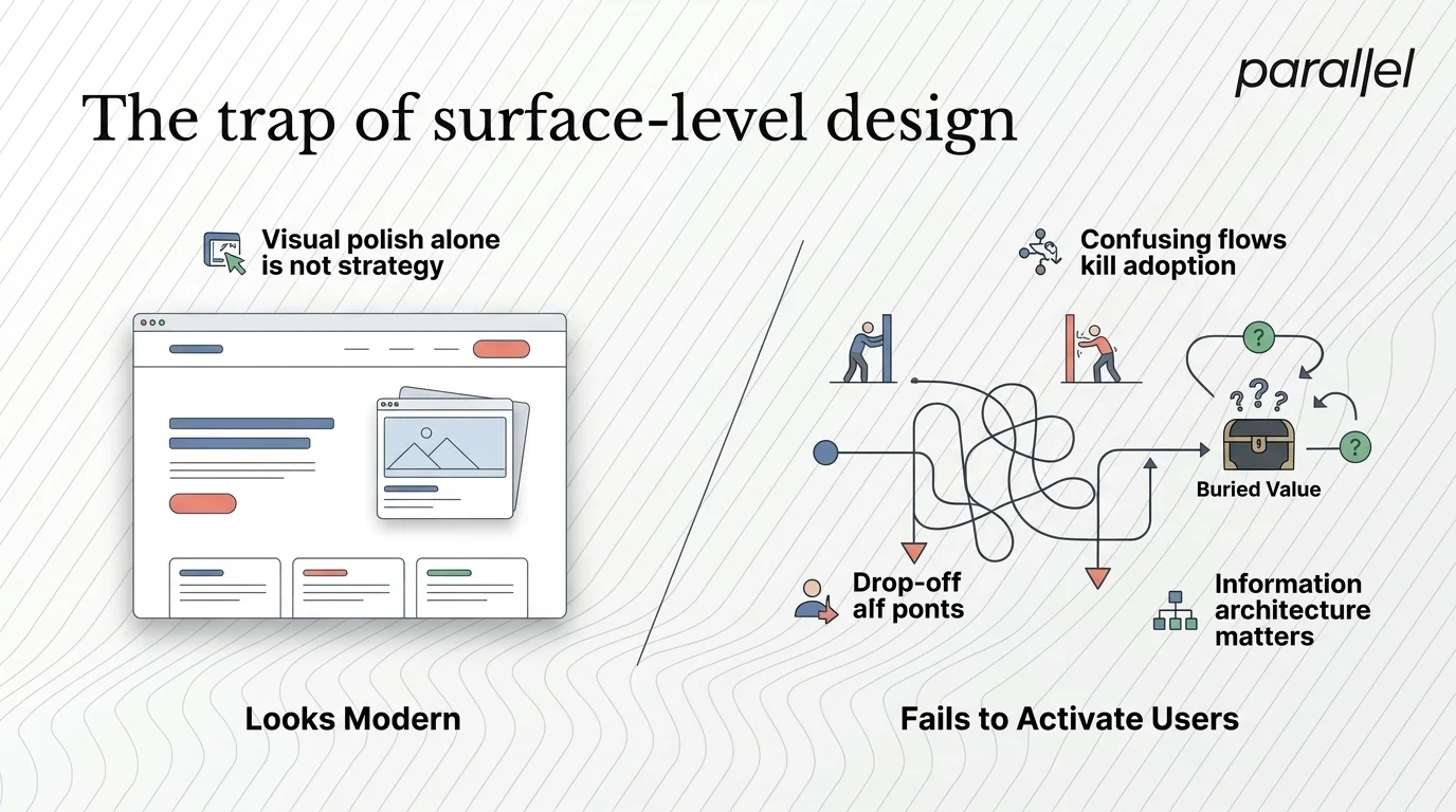
Founders often come to us after a failed redesign. They hired an agency, spent six months building, and launched crickets. The bounce rate stayed the same. Activation metrics flatlined. The interface looked modern, but the business did not grow.
The core issue is a lack of clarity. Most design teams focus entirely on interfaces. They ask about brand colors and typography before asking about the user journey. We see teams overcomplicate onboarding because they never mapped out the critical path to value. You can read more about mapping these paths in our guide on what a user journey map is.
A 2025 Nielsen Norman Group report highlights this exact problem. They found that severe usability issues cause the majority of users to abandon early stage software products. The core value proposition is usually buried under complex layouts. Aesthetics cannot save a confusing user experience. You need a partner who understands information architecture and cognitive load.
Design must serve a business function. It must remove friction. If your design team is not asking hard questions about your business model, they are just decorators. We strongly believe in utilizing an effective ux metrics framework to measure this impact.
Takeaway: Hire product thinkers, not just visual decorators.
Top 10 partners for web design in Hampshire
If you are evaluating partners, you need to look at their core competencies. Here is a breakdown of ten options, ranked by their ability to deliver product led design and handle complexity.
1) ParallelHQ
We built ParallelHQ to bridge the gap between business strategy and user experience. We are not a traditional web design agency in Hampshire. We partner with founders and product leaders to simplify complex user journeys, fix broken onboarding loops, and create scalable design systems. Our focus is on outcomes rather than output. We help teams redesign their website with purpose.
2) Solent Digital Solutions
Solent focuses heavily on corporate web builds. They are a solid choice if you need a standard marketing site with basic lead generation forms. Their process relies on traditional waterfall methodologies. This works for static requirements but struggles with iterative software product development. If your product requires constant iteration, their rigid structure might slow you down.
3) Winchester Creative Works
This team specializes in ecommerce. If you are selling physical goods, they understand the retail ecosystem well. They build robust shopping carts and product catalogs. However, they lack the deep product research capabilities needed for complex business to business platforms. SaaS founders should look for teams with deeper software experience.
4) Hampshire Design Studio
Boutique studio focused on visual identity. They do excellent logo work and typography. When looking for web design in Hampshire, they are great for brand perception. They create beautiful brand guidelines and marketing collateral. However, they often partner with external development teams for complex interaction design because they lack in-house UX architects.
5) South Coast Technology
They are primarily a development shop that offers interface creation as an add on. They build fast backends and secure databases. The downside is that their product thinking often takes a backseat to engineering constraints. This leads to utilitarian but clunky interfaces. You will get a product that works, but users might hate using it.
6) The UX Research Group
A solid research focused group. They conduct extensive diary studies and heuristic evaluations. They deliver massive research reports filled with user insights. Sometimes they struggle to translate those findings into agile, shipping ready components. They are better suited for enterprise audits than fast moving startup execution.
7) Portsmouth Digital
They excel at high production value animations and interactive marketing pages. This is perfect for a consumer facing launch campaign. They know how to build hype and visual engagement. It is less ideal for a daily use software product where speed and clarity trump visual flair. B2B software requires quiet design, not loud animations.
8) New Forest Web Services
A strong local player for local businesses. They help regional service providers get online quickly. They rely heavily on templates. This keeps costs down but limits custom product innovation for tech startups. If you need to invent a new product category, template based design will restrict your thinking.
9) Coastline Marketing Strategy
They straddle the line between marketing and user acquisition. Their focus is top of funnel conversion. They are good at building landing pages but rarely touch the post login product experience where true retention happens. Marketing design gets users in the door. Product design keeps them there.
10) Wessex CMS Experts
A reliable content management agency. They handle content heavy sites well. They build excellent editorial workflows and publishing tools. They are not built to design complex web applications or native artificial intelligence interfaces. They are publishers, not software builders.
The danger of overcomplicating the experience
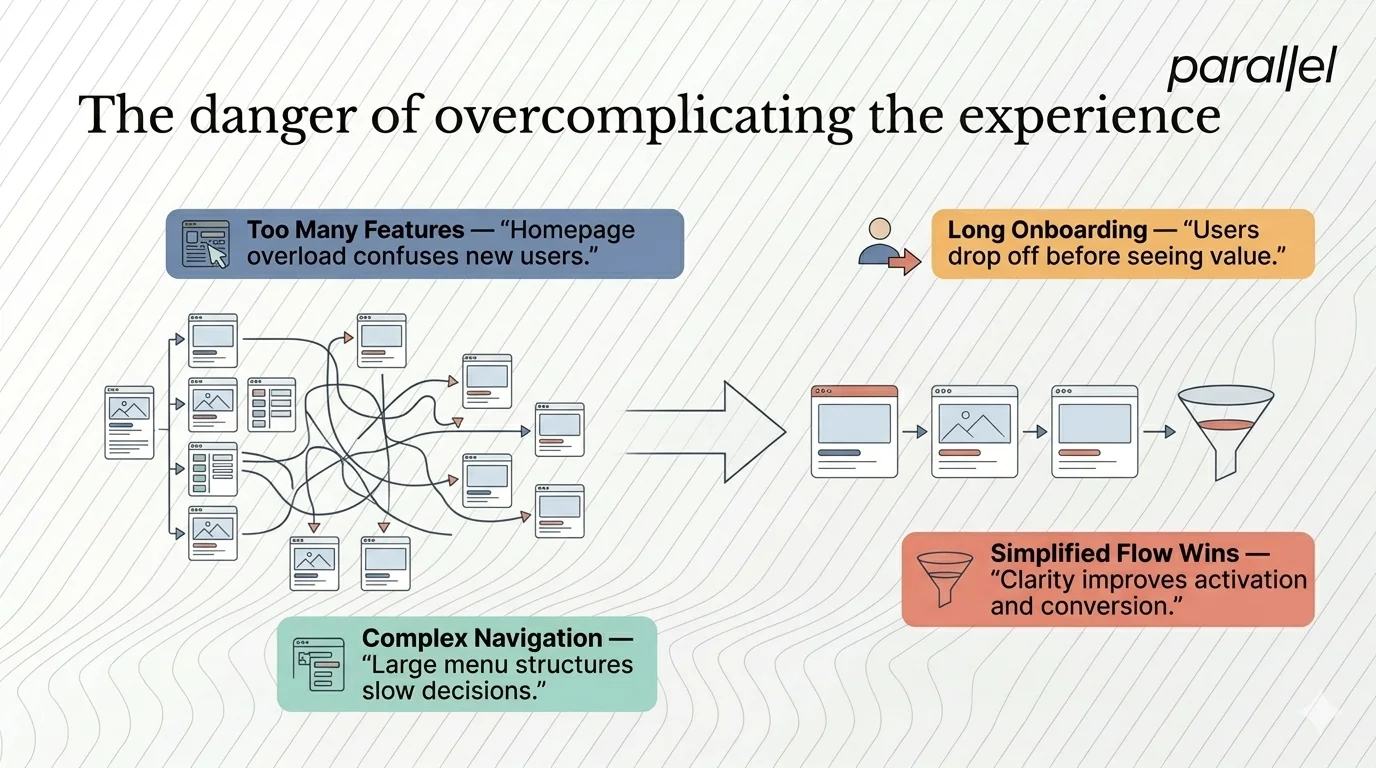
When evaluating a Hampshire web design partner, pay close attention to how they handle complexity.
I see this constantly with early stage startups. They want to show users every feature on the homepage. They build massive navigation structures. They create long onboarding flows before the user has even seen the main dashboard. This friction destroys activation rates.
Good design is reductive. It is about taking things away until only the essential remains. A 2026 usability study by the Baymard Institute showed that simplifying sign up flows directly correlates with higher conversion rates. Users have zero tolerance for unnecessary cognitive load. They will abandon your tool the moment it feels like work.
We recently worked with a startup that had a massive signup process. Their previous agency designed beautiful illustrations for each step. Users still dropped off. We stripped the visuals, reduced the flow, and focused purely on clarity. Conversion doubled. You must learn how to track user activity on your website to spot these specific drop offs.
Takeaway: Complexity is the enemy of execution. Demand simplicity from your team.
How to structure your decision
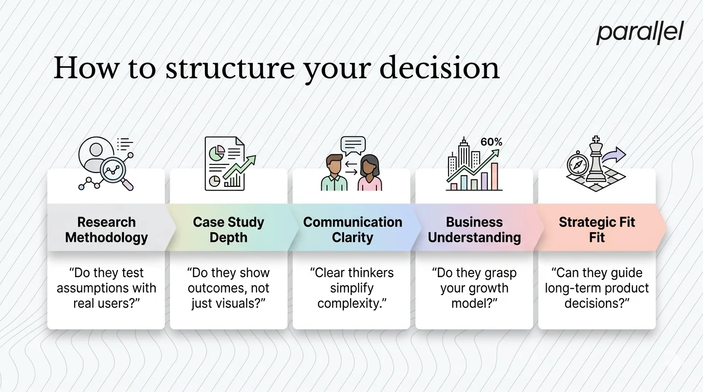
Choosing a product partner is a high stakes decision. A bad choice costs money. More importantly, it costs time. You should evaluate agencies based on how they think. I always tell founders to look for specific operational markers.
First, check their research methodology. Do they talk to real users, or do they rely on assumptions? Proper usability testing questions reveal deep user friction. Second, look at their post launch metrics. Do their case studies talk about beautiful graphics or do they talk about reducing churn?
Third, assess their communication. Clear thinkers write and speak clearly. If an agency hides behind buzzwords, they will likely design confusing products. According to McKinsey design reports from 2025, companies that integrate design as a core strategic function see significantly higher revenue growth. Design is not art. It is a business tool.
When you invest in web design in Hampshire, ensure the team understands the business mechanics behind the interface. They need to understand your market size and how to calculate TAM.
Takeaway: Look for evidence of critical thinking and measurable business outcomes in their previous work.
The economics of design debt
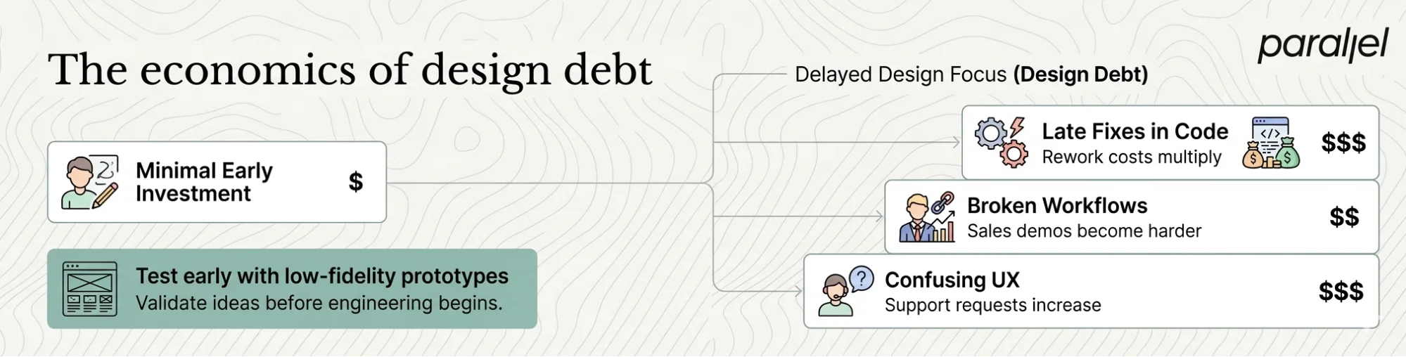
Many teams ignore design quality to ship faster. They assume they can fix the user experience later. This creates design debt. Design debt is far more expensive to fix than technical debt because it impacts user perception and trust immediately.
When an interface is confusing, your support costs skyrocket. Users flood your inbox with basic questions. Your sales team struggles to demo the product because the workflow is illogical. Fixing these issues in code costs ten times more than fixing them in Figma.
We encourage teams to validate their ideas using low fidelity prototypes. Testing concepts before writing code is the most economically sound decision a founder can make. It protects engineering bandwidth. You can learn more about this approach by understanding what lean UX is.
Takeaway: Investing in clear design early prevents massive engineering costs later.
Product strategy comes before pixels
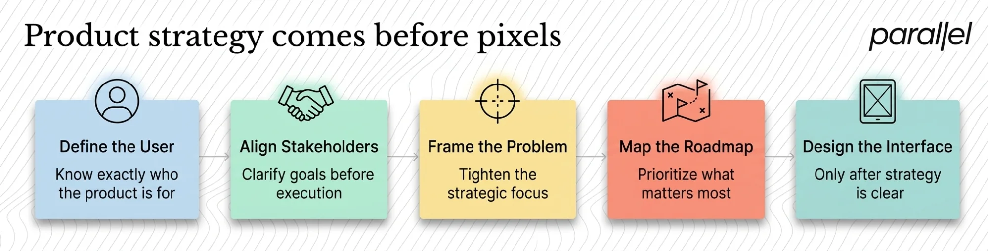
A common failure mode is jumping straight into design files. Founders want to see screens. Agencies want to show progress. This leads to designing the wrong thing very efficiently.
Before a single screen is designed, there must be a clear product strategy. You need to know exactly who you are building for. You need to understand the awareness stage of the marketing funnel and how users transition into active product users.
We spend a lot of time in the discovery phase. We run workshops to align stakeholders. We define the problem tightly. This often involves creating a comprehensive product roadmap. If an agency agrees to start designing without understanding your strategic goals, walk away.
Takeaway: Strategy dictates design. Never reverse this order.
Why B2B software needs better UX
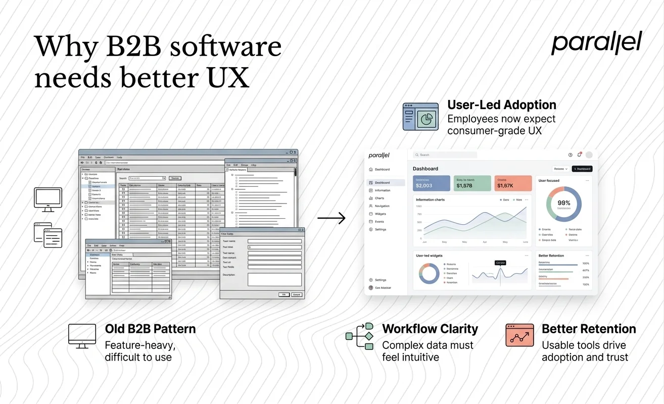
For a long time, business software was exempt from good design. Buyers purchased tools based on feature lists, and employees were forced to use them. That dynamic is completely dead in 2026.
Today, end users dictate software adoption. If your B2B tool is harder to use than their consumer apps, they will abandon it. They will find workarounds. We see enterprise products fail simply because the cognitive load of completing a basic task is too high.
Designing for B2B requires a deep understanding of complex workflows. It is about organizing massive amounts of data clearly. It requires a strong product sense. Your partner must be able to turn spreadsheets of requirements into intuitive dashboards.
Takeaway: Consumer grade UX is now the baseline requirement for B2B software.
Measuring success beyond the launch
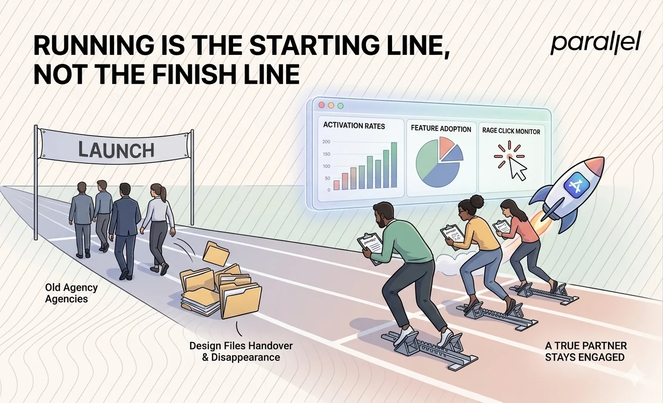
Running is not a finish line. It is the starting line. Too many agencies hand over the design files and disappear. A true partner stays engaged to measure the impact of their work.
You need to monitor specific metrics. Look at activation rates. Look at feature adoption. Watch out for the rage click. These behavioral signals tell you if the design is actually working in the real world.
We build measurement frameworks into our projects from day one. We want to know exactly how the interface performs in the wild. This iterative approach is the only way to build successful digital products. Continuous learning beats a one time perfect launch.
Takeaway: Demand a post launch measurement plan from your design partner.
How design sprints reduce risk
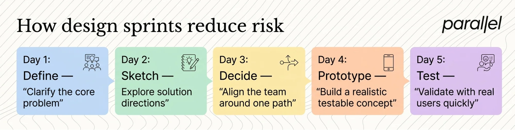
Building a product in isolation is risky. You spend months building what you think users want, only to discover you were wrong. We mitigate this risk using design sprints.
A sprint forces a team to define a problem, build a prototype, and test it with real users in just five days. It bypasses endless debate. It replaces internal opinions with actual user feedback. We have seen this methodology save startups months of wasted development time.
The structure of a sprint is intense but necessary. It aligns the team and provides immediate clarity. If you are struggling with a product direction, reading about why design sprints work is a great place to start. Your design partner should be comfortable facilitating these high leverage workshops.
Takeaway: Validate ideas rapidly with users before committing to long development cycles.
Conclusion
Building a product that people actually want to use is incredibly hard. It requires patience, discipline, and a willingness to quickly discard bad ideas. The market does not reward average execution anymore.
The right product design partner will challenge your assumptions. They will ask uncomfortable questions about your business model. They will prioritize clarity over cleverness. They will not just execute your wireframes and send an invoice.
Find a team that elevates your entire product thinking. Look for practitioners who have seen products fail and know how to avoid those specific pitfalls. Let the quality of their thought process drive the quality of your digital experience.
Frequently Asked Questions
1) What exactly is product led design?
It is an approach where the product experience is the primary driver of user acquisition and retention. It focuses on usability and actual user behavior rather than just marketing aesthetics. The interface becomes the main growth engine for the business.
2) How much should a comprehensive website redesign cost?
Costs vary wildly based on scope. A basic marketing site might be a few thousand pounds. A complex web application redesign can easily exceed fifty thousand. Focus on the return on investment and business impact rather than the raw upfront cost.
3) How long does a typical design sprint take?
A standard design sprint takes five days. It moves a team from a core problem to a tested prototype within a week. It is a highly effective way to validate ideas rapidly before writing any expensive code.
4) What is the difference between UX and UI?
UX focuses on the logic, flow, and structural layout of the product. It determines how the product works. UI is the visual execution, including typography, spacing, and color. Both are absolutely critical, but structural UX must always come first.
5) How do I know if my current website needs a redesign?
Look closely at your metrics. High bounce rates, low conversion rates, and poor user retention are clear signals. If users are consistently failing to complete core tasks, your interface is likely failing them and requires intervention.
6) What makes ParallelHQ different from other agencies?
We do not just build screens. We act as a strategic partner to founders and product teams. We focus on untangling complex product requirements. We ground our design decisions in rigorous user testing and behavioral data.
7) Is local web design in Hampshire necessary for my startup?
No. While local proximity can be nice for occasional meetings, digital product design is a global discipline. The specific expertise and product thinking of the remote team are far more important than their physical office location.
8) What questions should I ask a web designer in a Hampshire agency?
Ask about their failure rate. Ask exactly how they handle user testing. Ask them to walk you through a project where their initial design hypothesis was wrong and how they successfully pivoted based on user feedback.

check out these related blogs