Clients today research before they call. A glossy brochure site isn’t enough; people need clarity, trust and quick ways to act. At Parallel we’ve watched the shift from brochures to conversion‑focused platforms. In this article I explain what makes modern legal sites work, how we ranked top vendors, the trends we see for 2026 and what founders and product leaders should expect from a law firm web site design project. I’ll share data from industry research and our own work to ground the discussion.
What defines high‑performance law firm web site design in 2026?
Legal buyers are deliberate. Clio’s research notes that visitors look for clear calls‑to‑action and easy ways to contact a lawyer; they expect phone numbers and consultation flows to be obvious. They also expect you to understand their state of mind, which means the design must orient around their needs rather than your ego. The websites we build today are not pretty brochures. They are conversion engines with clear hierarchies, strong brands and integrated marketing strategies. Drawing on insights from Clio, LawRank, FindLaw, PaperStreet and Comrade Web, here are the pillars.
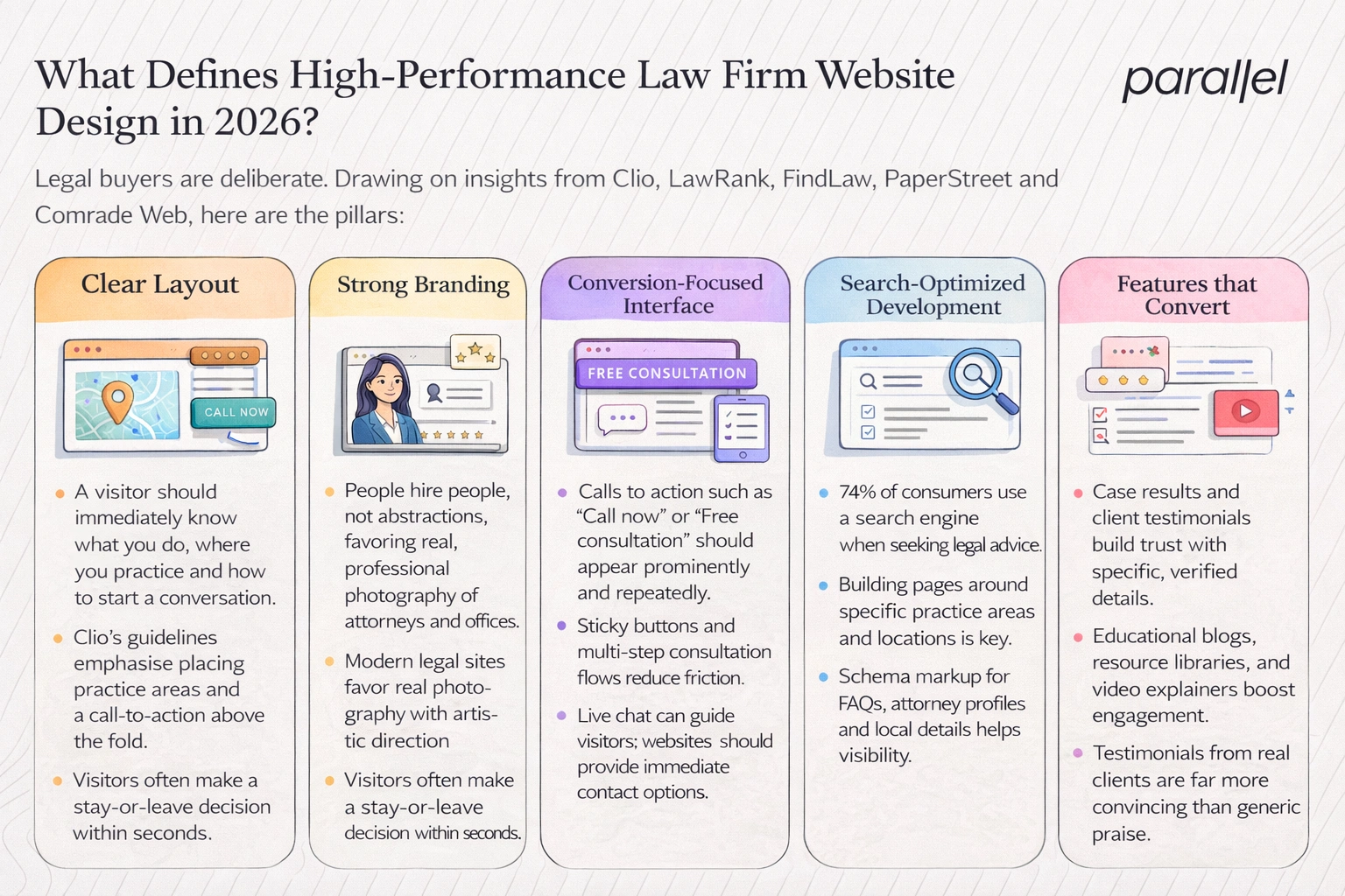
1) Clear layout
A visitor should immediately know what you do, where you practice and how to start a conversation. Clio’s guidelines emphasise placing practice areas and a call‑to‑action above the fold. Navigation should be simple with few menu items and clear labels. Visitors often make a stay‑or‑leave decision within seconds; LawRank highlights the “eight‑second rule” and stresses that visitors need information quickly to convert. Jurisdiction matters, so state or regional positioning should be clear. Contact pages must be reachable from every page, and phone numbers should be clicked‑to‑call on mobile devices.
2) Strong branding
People hire people, not abstractions. Our firm photographs attorneys and offices rather than using generic stock images. PaperStreet notes that modern legal sites favour real photography with artistic direction. Consistent typography and colour systems reinforce identity. Authority is built by showing years in practice, case results and certifications; potential clients scan for these cues to decide whether to trust you. Niche focus also matters: a firm specialising in immigration should look and read differently from one focusing on corporate litigation. Differentiation becomes part of the brand.
3) Conversion‑focused interface
A strong design guides visitors toward action. Calls to action such as “Call now” or “Free consultation” should appear prominently and repeatedly; sticky buttons that follow the user on mobile can lift conversions. Multi‑step consultation flows break requests into digestible steps, lowering friction. Live chat can provide instant answers; many clients prefer typing over calling. Websites.law stresses the importance of placing contact pages and clicking‑to‑call numbers above the fold and including chat options. Conversion design also includes clear feedback after an action—thank‑you pages, emails and next steps.
4) Search‑optimised development
At Parallel we integrate search considerations from day one. Lexicon’s survey shows that 74% of consumers use a search engine when seeking legal advice and 75% never scroll past the first page. LawRank emphasises building pages around specific practice areas and locations. A structured content hierarchy with proper HTML headings improves both user comprehension and search engine accessibility. Schema markup for frequently asked questions, attorney profiles and local business details helps search engines understand your content. Location pages, practice‑area clusters and internal linking all contribute to visibility.
5) Features that convert
Proof drives trust. A section showcasing case results demonstrates results without making unverified promises. Testimonials from real clients, with specific details, are far more convincing than generic praise. Educational blogs and resource libraries answer prospective clients’ questions and show thought leadership; Lexicon reports that 81% of law firms view content marketing as their top investment. Video explainers humanise lawyers and reduce intimidation; PaperStreet’s trend guide notes increasing use of video with professional direction. Resource materials should be organised and searchable to keep visitors engaged.
Ranking criteria for 2026
We evaluated law firm web design vendors using a weighted framework. Each criterion reflects what matters most for conversion and growth. The weights add up to 100%.
These shares reflect our belief that clarity, speed and trust move the needle. UX & layout and search & content depth receive 20% because they help users find and understand you. Client‑engagement tools and technical architecture receive smaller shares because features like chat and a scalable backend support growth. Compliance and accessibility at 10% remind us that ethical practice and usability are essential.
2026 top law firm web site design companies
After applying the criteria above, we ranked the following providers. Each offers distinct strengths; the best choice depends on your goals.
1. ParallelHQ – strategy first
Our own studio tops the list because we view a legal site as a product, not a project. We begin with research to understand the audience and goals. Our branding work extends past logos; we design systems across typography, colour and photography that communicate authority. Conversion design is at the core: we use clear calls to action, sticky contact tools and smart intake flows. Search optimization is baked into our build with structured pages, schema markup and location pages. We develop scalable design systems that support multi‑office firms and maintain consistent performance. We integrate analytics and track conversion events so future improvements are data‑driven. In essence, we position a law firm’s website as part of its growth strategy, not a one‑off deliverable. Our process starts with discovery sessions to map client pain points and success metrics. We use prototypes to test copy and layout, and a recent project for a regional criminal defence firm reduced pages from twenty to eight and boosted consultations by 35%.
Best for: firms seeking growth‑focused professional site design; start‑ups and expanding regional firms that need a partner to help them scale.
2. Clio – educational ecosystem
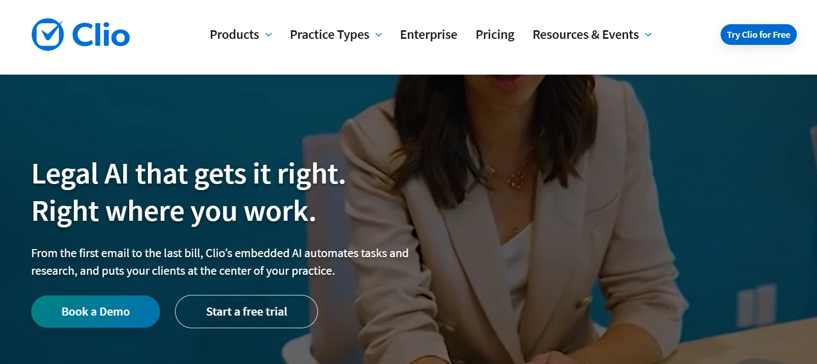
Clio is primarily known for practice management software, but their content and ecosystem provide strong guidance for firms building websites. Their design advice stresses clear calls to action and makes contact information easy to find. They integrate with scheduling and intake tools, aligning the site with case management. Clio’s blog offers deep guidance on marketing and content, making them a resource for firms that want to manage their own sites with integrated legal software. Clio offers templates, checklists and an app marketplace connecting the site to billing and document management. Their advice stresses compliance and ethics.
Best for: firms seeking integration with legal software systems and educational resources.
3. PaperStreet – aesthetic leaders
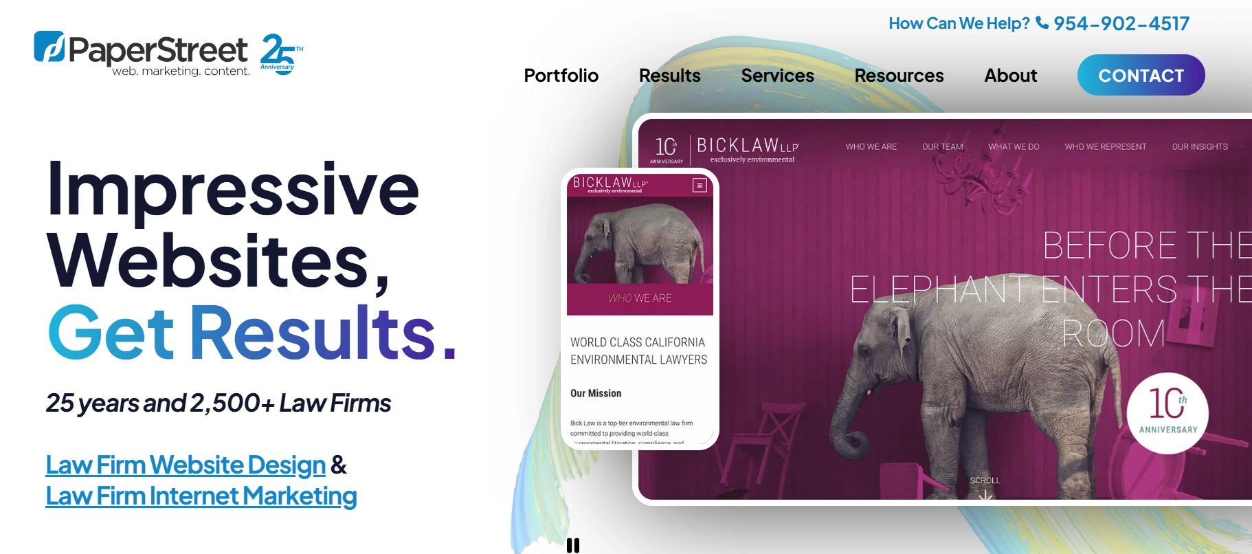
PaperStreet produces custom layouts with an editorial look. Their trend report points to large, bold typography, restrained colour palettes and high‑quality photography. They use card‑based interfaces that make information easy to digest and emphasise purposeful white space. Their sites often feature attorneys prominently and use real photos with artistic direction. They use subtle micro‑animations to guide the eye and have experimented with dark mode variations.
Best for: boutique and mid‑size firms that want a modern look and clean storytelling.
4. LawRank – search specialists
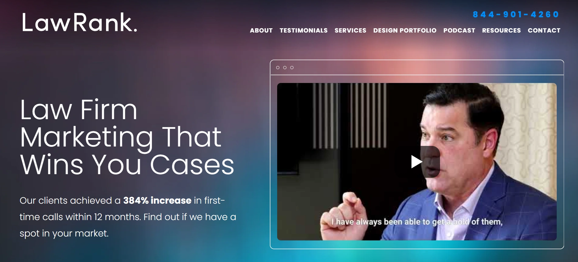
LawRank focuses on search‑driven site development. They emphasise conversion‑driven design, speed and user‑friendly layouts with the eight‑second rule in mind. Their architecture centres on practice areas and location pages, and they have a track record of improving rankings and lead flow for local firms. LawRank’s team emphasises local link‑building and citation management, which are crucial for competitive practice areas. They also produce long‑format content clusters that increase topical authority LawRank ensures listings are consistent across directories and invests in legal‑sector backlinks. Their long‑format guides deepen topical depth and improve internal linking. Their team also advises on page structure to improve readability overall.
Best for: firms prioritising organic search growth and local visibility.
5. FindLaw – large‑scale packages
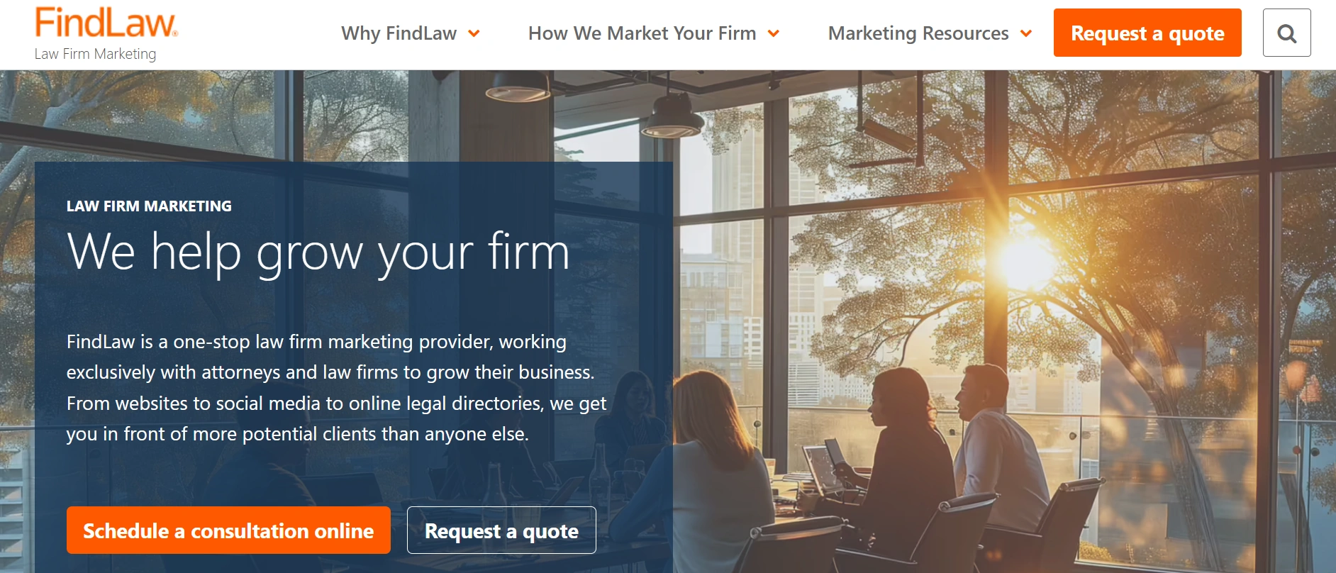
FindLaw offers an extensive marketing ecosystem and a directory network. Reviews point out their quick launch times, content syndication and integrated advertising options. However, clients do not own their websites, and exclusivity is limited. The service suits firms that value broad visibility over full ownership. FindLaw’s directory can drive referral traffic and packages include copywriting and video production. Their network makes deployment fast and includes maintenance and listings. Yet because clients don’t own their sites and may struggle to move them, your flexibility is limited, so weigh convenience against long‑term control.
Best for: small firms that need an all‑in‑one package and are comfortable with vendor lock‑in.
6. Comrade Web – performance marketing integration
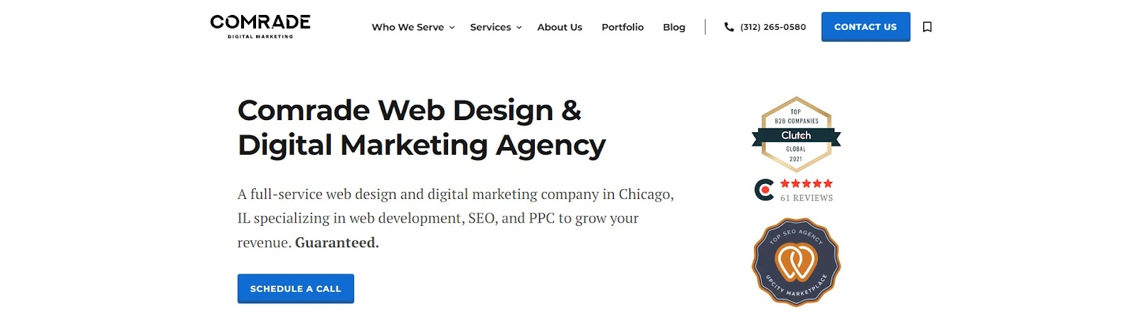
Comrade takes a performance‑first approach. A case study showed a 1,063% increase in organic traffic and a 7,841% return on investment after redesigning a client’s site. They focus on mobile responsiveness, fast loading, conversion‑centric layouts with clear buttons and trust signals, and long‑tail keyword strategies. They also integrate analytics and iterative improvements. Comrade runs A/B tests on calls‑to‑action, headlines and layouts, monitoring heat maps to identify friction. They integrate analytics with CRM tools so marketing campaigns connect to case intake, and they base decisions on measurable outcomes.
Best for: firms wanting strong marketing integration and a measurable return on investment.
Design trends shaping law firm websites in 2026

1) Minimalist yet authoritative design
We are seeing a move toward layouts that feel spacious and calm. PaperStreet highlights large typography and restrained colour schemes. MakeMyWebsite notes that simpler layouts help users make decisions quickly and that strong headings improve scanning. Ample white space and clean lines create breathing room; small touches like soft shadows add depth. Importantly, law sites must still project authority—this comes from professional photography, clear language and a strong brand system, not from clutter.
2) Video‑driven client trust
Video is becoming central. Law clients want to see the people behind the firm. Attorney introductions, case explainers and answers to common questions humanise the practice. A short video can replace paragraphs of text and address emotional concerns. Authentic production matters more than slick graphics; transcripts and captions support search and accessibility.
3) Intelligent intake systems
Smart intake flows are replacing static contact pages. Tools that route inquiries based on practice area and case details save staff time and provide clients with immediate direction. Some firms use machine‑learning scoring and chatbots to qualify cases, but integration with case‑management software and clear consent are critical.
4) Micro‑animations and motion
Subtle micro‑animations respond to user interactions, such as buttons lifting on hover or menus sliding into view. These touches must be restrained because overuse distracts visitors and slows performance. Carefully timed transitions can draw attention to calls to action; use lightweight code to preserve speed. Dark mode and high‑contrast variations provide a dramatic alternative when used sparingly, but accessible colour palettes remain essential.
5) Accessibility and compliance first
Accessibility is no longer optional. Websites.law stresses the need for mobile‑first layouts, readable typography and logical internal linking. Compliance with the Americans with Disabilities Act (ADA) benefits everyone, including search engines. Clear language about legal services and ethics avoids misleading claims. Disclaimers should be visible. Keep in mind that some jurisdictions regulate testimonials and case results; you should consult your local rules before publishing.
Common mistakes in law practice site development
Many legal sites still fall short. Common errors include:
- Using generic templates that look like every other firm, eroding trust.
- Relying on stock photos rather than real attorney portraits.
- Weak calls to action or hiding contact pages below the fold.
- Neglecting location‑specific pages and practice‑area clusters, which hurts search visibility.
- Slow loading times due to bloated images or scripts; a one‑to‑three second increase in load time can raise bounce rates by over 30%.
- Failing to set up conversion tracking, which means improvements are guesswork.
- Not securing the site with SSL and updates.
- Using jargon instead of plain language.
How founders and product leaders should approach law firm website projects
A legal site should be viewed as a product. Here’s how early‑stage founders and product managers can approach it:

- Validate messaging: Test headlines, value propositions and calls to action with potential clients before full build. Lean research helps you understand what resonates.
- Use data to refine layout: Launch with analytics; watch user flows, bounce rates and conversion rates. Adjust navigation and copy based on real behaviour.
- Build scalable content architecture: Create a structure that supports adding practice areas, locations and resources without redesigning the site. Use modular components and design systems.
- Invest in performance infrastructure: Use a reliable host, optimise images and code, and implement caching. Secure the site with SSL and keep software updated.
- Iterate based on analytics: Plan regular reviews every quarter to identify friction points and deploy improvements. Don’t wait five years; view the website as a living product.
- Collaborate on content: Involve attorneys in outlining subject matter but lean on professional writers to translate legal expertise into plain language. Content should answer client questions without overwhelming them.
Cost expectations for law firm web site design in 2026
Web design budgets vary widely based on scope and scale. Here are typical ranges:
Template sites get you on the web quickly but offer limited control and rarely scale well; they are suitable for solo practitioners with modest budgets. Custom mid‑market projects provide tailored branding and conversion design; they suit firms seeking to grow regionally. Enterprise builds support multiple offices, complex content architectures and integrations with practice management and marketing systems. When considering cost, think in terms of return on investment. Lexicon reports that 64.7% of firms say their website delivers the highest return, and 39% say it is the primary source of leads. Investing more up front yields compounding returns over years.
While the price may seem high, the return can be significant. One extra client can cover your costs. Base budgets on expected business outcomes instead of aesthetics. It ensures resources are well spent.
Conclusion
After working on many law sites and studying the research, I believe an elite site in 2026 is defined by clarity, credibility, conversion and integrated marketing. The layout must be clear and put the client’s needs first. The brand must be authentic, using real photos and consistent design to build trust. The structure should guide visitors to act through strong calls to action, sticky buttons and interactive forms. Search optimization must be woven into the architecture. Features like case results, testimonials, blogs and videos provide proof and education. And the site must fit into a larger marketing strategy, with analytics guiding continuous improvement. Companies like ParallelHQ, PaperStreet and LawRank show that when you view the site as part of a growth engine, you attract more qualified clients and build lasting authority.
Looking past aesthetics, your site should be treated as a product that grows with your practice. Invest in research, testing and ongoing improvements to build a web presence that reflects your values and delivers measurable outcomes.
FAQ: law firm web site design
1) What makes law firm web site design different from other industries?
Legal services are trust‑heavy and regulated. Firms must include credibility signals—such as attorney bios, certifications and case results—and handle jurisdiction‑specific rules. Search strategy must account for location. Compliance with accessibility and ethics rules is critical.
2) How long does it take to build a law firm website?
Most projects run eight to sixteen weeks depending on complexity and content. Phases include strategy, content creation, design, development, optimisation and testing.
3) How important is search optimization in law firm web site design?
It is foundational. Without location pages and structured practice clusters, your site will not rank highly in search results. Lexicon’s data shows that 74% of consumers use search engines and 75% never go past the first page.
4) Should law firms use templates or custom design?
Templates work for small firms with tight budgets and basic needs. Custom builds scale better, support long‑term marketing strategies and express a distinctive brand.
5) What features improve client engagement?
Live chat, multi‑step consultation flows, testimonials and case evaluations keep visitors interacting. Educational resources and clear calls to action help them feel informed and ready to act.
6) How often should a firm redesign its website?
A full redesign every three to five years is typical. However, if performance declines—load times slow, rankings slip, or conversion rates drop—it may be time sooner. Continuous improvement between redesigns keeps the site healthy.

check out these related blogs


.avif)