Every design decision you make either works with human psychology or against it. The best product teams I've worked with don't guess — they apply ux laws that have been tested across decades of research, from Jakob Nielsen's heuristics to Gestalt psychology. This guide is the complete reference: what each law means, how it applies to SaaS and AI products, and where early-stage startups most often get it wrong. Whether you're a founder, PM, or product designer, you'll leave with a framework you can use tomorrow.
TL;DR
- UX laws are research-backed principles that describe how humans perceive, process, and interact with interfaces.
- The most critical ones for SaaS and startup products: Hick's Law, Fitts's Law, Miller's Law, Jakob's Law, and the Von Restorff Effect.
- Violating these laws creates cognitive load, friction, and churn — especially in onboarding flows.
- Applying them systematically is the difference between a product that converts and one that confuses.
What Are the Most Important UX Laws Every Designer Should Know?
UX laws are not opinions. They are behaviorally grounded principles, derived from cognitive science, psychology, and decades of usability research. When I talk about ux laws with founders, I frame them in three categories: perception laws, processing laws, and interaction laws.
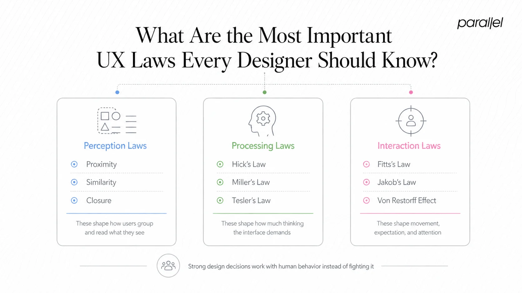
- Perception laws govern how users see and organize visual information. Gestalt psychology gives us the core ones: proximity (elements close together are perceived as related), similarity (like things look like they belong together), and closure (our brains complete incomplete shapes). These directly affect information architecture and layout decisions.
- Processing laws deal with cognitive load — how much mental effort a user must spend to understand and act. Miller's Law tells us working memory can hold roughly seven items (plus or minus two) at a time. Hick's Law states that decision time increases logarithmically with the number of options. Tesler's Law (the Law of Conservation of Complexity) argues that every system has irreducible complexity — good design pushes it onto the product, not the user.
- Interaction laws govern how users physically engage with interfaces. Fitts's Law is the canonical one: the time to reach a target is a function of distance and target size. This is why your primary CTA button should never be small and far from where the user's cursor naturally rests.
- Beyond these three categories, the Nielsen Norman Group framework by Jakob Nielsen adds ten usability heuristics — principles like visibility of system status, user control and freedom, and error prevention — that function as applied ux laws for interface evaluation.
- Don Norman's contribution through affordances and mental models (central to his book The Design of Everyday Things) is equally foundational. A Norman door is a real-world example of affordance failure: a door that looks pushable but must be pulled. The same failure pattern appears constantly in SaaS dashboards.
- The Von Restorff Effect — also called the isolation effect — predicts that an item that stands out visually from its peers is more likely to be remembered. This is the psychological basis for why your pricing page highlights one plan differently from the rest.
These laws don't operate in isolation. Strong product design applies several simultaneously, and understanding how they interact is what separates pattern-following from genuine craft.
Hick's Law, Fitts's Law, and Miller's Law Explained Simply
These three are the workhorses of applied interaction design. Let me break each one down concretely.
- Hick's Law: The time it takes a user to make a decision grows as the number of choices increases. Specifically, decision time grows logarithmically — doubling options doesn't double decision time, but it does add measurable delay and cognitive effort. The practical implication: trim navigation, reduce form fields, and never present five equally weighted CTAs on a single screen. This is one of the most violated ux laws in SaaS onboarding, where product teams add options thinking they're helping.
- Fitts's Law: Target acquisition time is proportional to the distance to the target and inversely proportional to its size. Large, nearby elements are faster and easier to click. This is why mobile design conventions keep primary actions in the thumb-reachable zone, and why floating action buttons became standard in mobile UI. In responsive design, Fitts's Law is the argument for why touch targets should never be smaller than 44x44 pixels — a benchmark aligned with WCAG accessibility guidelines.
- Miller's Law: Working memory handles around seven items, plus or minus two. This is often misapplied — designers use it to justify showing exactly seven nav items, but the real lesson is about chunking. Break complex information into digestible groups. A 16-field onboarding form becomes manageable when chunked into three steps of four to six fields each. The number of chunks matters more than the total number of items.
Here's how the three laws relate in practice:
Together, these three ux laws form a practical toolkit for reducing friction at every interaction point. When a user drops off an onboarding flow, the odds are high that at least one of these three was violated — too many choices, a hard-to-reach action, or an overwhelming information load.
How Do UX Laws Apply to SaaS Product Design?
SaaS products live or die by activation and retention. Both are directly governed by ux laws applied (or ignored) at key product moments.
Take cognitive load theory: every screen a new user encounters in your product should demand only as much mental effort as is necessary. SaaS dashboards are notorious for violating this. Teams add widgets, data points, and shortcuts over time, each justified individually, until the aggregate creates what Don Norman calls a signal-to-noise problem. The signal (the user's core job-to-be-done) gets buried in noise (everything else competing for attention).
Progressive disclosure is the antidote. Show users only what they need at each stage of their journey. Advanced settings exist, but behind a secondary interaction. This is directly tied to Hick's Law — reducing visible choices at any moment reduces decision fatigue and keeps users moving forward.
Jakob's Law — named for Jakob Nielsen — states that users spend most of their time on other products, so they expect your product to work like those other products. This has enormous implications for SaaS design. Using novel, "creative" patterns for common interactions like navigation, settings, or search creates friction because users arrive with established mental models from tools like Notion, Linear, Figma, or Salesforce. Fighting those mental models costs activation.
For AI and SaaS startups specifically, the challenge is applying these ux laws to interface patterns that are genuinely new — like designing interfaces for AI products, where there are fewer established conventions. In those cases, anchoring to familiar structural patterns (while innovating on the interaction layer) is often the right move.
The Von Restorff Effect matters on SaaS pricing pages, upgrade prompts, and empty states. When everything is styled equally, nothing communicates urgency or priority. When one option, one feature badge, or one CTA breaks the visual pattern, it pulls attention precisely because it violates the expectation of uniformity.
Tesler's Law is the one most product managers need to internalize: you cannot eliminate complexity from a system, you can only move it. If you simplify the UI by hiding configuration options, someone — a support agent, a user digging through docs, or an engineer handling edge cases — pays that complexity tax later.
Which UX Laws Matter Most for Conversion Rate Optimization?
Conversion is a design problem before it's a copy or traffic problem. The ux laws most directly implicated in conversion outcomes are Hick's Law, the Von Restorff Effect, Fitts's Law, and the aesthetic-usability effect.
The aesthetic-usability effect, rooted in research by Masaaki Kurosu and Kaori Kashimura, holds that users perceive aesthetically pleasing designs as more usable — even when they are objectively equivalent to less polished alternatives. Trust is a conversion lever, and visual quality builds trust before a single word is read.
On landing pages and pricing screens, Hick's Law argues for a single dominant CTA per viewport. Every additional equally weighted option — "Start Free Trial" alongside "Book a Demo" alongside "Watch Video" — taxes the decision process and can suppress the click-through rate on all of them. Hierarchy solves this: one primary, one secondary, nothing else.
The Von Restorff Effect is why the middle pricing tier on nearly every SaaS pricing page is visually highlighted. It's not arbitrary — it directs attention through isolation, exploiting a fundamental perceptual bias. This approach to optimizing click-through rate is one of the most evidence-supported patterns in commercial design.
Fitts's Law explains sticky CTAs, large hero buttons, and mobile-optimized tap targets. Reducing the physical effort to initiate a conversion action — even marginally — affects completion rates, especially on mobile where ergonomics create natural friction.
Visual hierarchy, grounded in Gestalt psychology, ensures users read a page in the intended sequence: headline establishes relevance, subhead builds on it, CTA captures intent. Disrupting this sequence through inconsistent sizing, weight, or contrast breaks the conversion path.
Finally, the principle of aesthetic consistency ties to Jakob's Law: a checkout or sign-up flow that suddenly looks different from the rest of the product raises subconscious alarm signals. Consistency is a trust signal, and trust drives conversion.
How to Apply UX Laws When Designing Onboarding Flows
Onboarding is where ux laws are violated most visibly and most expensively. Activation rates are the first concrete measurement of whether your design decisions respected human cognition.
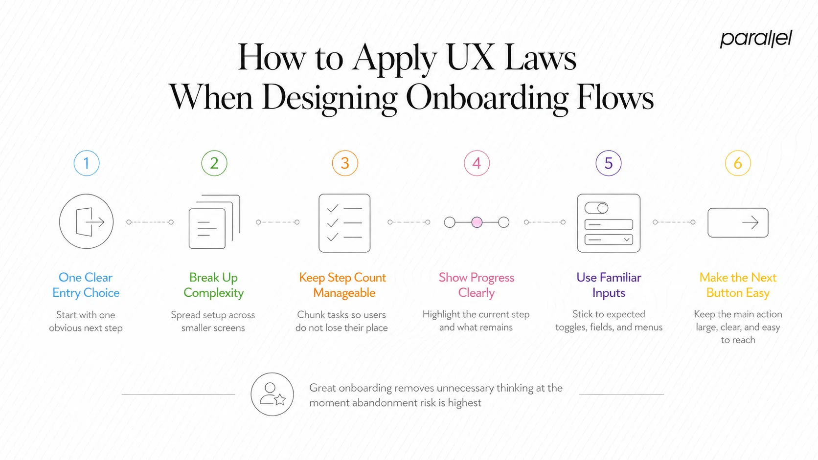
A principled onboarding flow applies these laws in sequence:
- Apply Hick's Law at entry: The first screen a new user sees should present one clear next action. Not three value propositions and a product tour offer — one step.
- Use progressive disclosure to sequence complexity: Don't ask for company size, use case, team count, and role in one screen. Spread it across short steps. Each screen should feel like a natural next question, not a form.
- Apply Miller's Law to step count: If your onboarding has more than seven steps, audit it. Chunk related inputs. Users lose mental thread in long sequences.
- Use the Von Restorff Effect to spotlight progress: A progress bar with one step visually distinguished (the current step) keeps users oriented without overwhelming them.
- Leverage Jakob's Law for interaction patterns: Use familiar input patterns — standard toggles, expected date pickers, conventional dropdowns. Novel UI during onboarding increases error rate.
- Apply Fitts's Law to the primary action: The "Continue" or "Next" button must be large, high-contrast, and placed where the user's eye and cursor naturally arrive after completing the current input.
- Respect Tesler's Law: If you remove steps to simplify onboarding, make sure the complexity you've hidden is handled somewhere — smart defaults, post-activation prompts, or progressive configuration options inside the product.
This maps directly to how we approach designing onboarding for SaaS products. The goal is zero unnecessary cognitive load at a moment when user trust is lowest and abandonment risk is highest. You can also measure the impact of these decisions using a structured UX metrics framework that tracks activation and task completion rates alongside qualitative feedback.
Most Commonly Violated UX Laws in Early-Stage Startup Products
Early-stage products are built fast, often without dedicated design resources, and the violations are predictable. Here are the patterns I see most frequently:
- Hick's Law violations in navigation: Startups add features and add nav items, and eventually you have a sidebar with fourteen entries, none prioritized. Decision paralysis sets in before the user reaches their goal.
- Miller's Law violations in forms: Sign-up or onboarding forms with ten or more consecutive fields on a single screen. No chunking, no context, no progress signal.
- Fitts's Law violations on mobile: Desktop-first products pushed to mobile with 24px touch targets, critical actions in the top-left corner, and no thumb-zone consideration.
- Gestalt violations in visual hierarchy: Elements grouped arbitrarily, inconsistent spacing, and no clear visual path from headline to CTA. The eye has nowhere to go.
- Jakob's Law violations through over-invention: Custom navigation patterns, non-standard icon meanings, and interaction models that require learning before using. This is the "clever" trap — original design that creates friction instead of reducing it.
Startups that skip formal design validation tend to accumulate UX debt that compounds by the time they hit Series A. What felt like "good enough" at ten users becomes a retention problem at a thousand.
The fix isn't always a full redesign. A structured cognitive walkthrough against these specific laws often surfaces the highest-impact issues within hours, not weeks. Pairing that with usability testing produces a prioritized list of violations sorted by frequency and severity — exactly what a resource-constrained startup team needs.
UX Laws vs. Design Principles: What's the Difference?
This distinction matters because it affects how you apply them. UX laws and design principles are related but not interchangeable.
UX laws are empirically derived. They describe observable, measurable human behavior. Hick's Law emerged from timing experiments. Fitts's Law is a mathematical model. Miller's Law came from cognitive psychology research. They are descriptive — they tell you what users will do, not what designers should do.
Design principles are normative. They encode values and intentions: simplicity, consistency, accessibility, feedback. The eight principles of design, the WCAG accessibility guidelines, Nielsen's ten heuristics — these tell you what to aim for, grounded in those underlying laws.
In practice, the distinction shapes how you defend decisions. When a stakeholder wants to add three more CTAs to a landing page, citing Hick's Law is a stronger argument than "it feels cluttered" — because it grounds your position in a predictable human response, not taste. Understanding both gives you ux writing best practices and structural design rationale working in the same direction.
Both layers — empirical laws and synthesized principles — are necessary. Laws without principles produce technically optimized but soulless products. Principles without laws produce aspirational but friction-laden ones.
Conclusion
UX laws are the foundation of decisions that hold up under scrutiny — from stakeholder reviews to user testing to retention metrics. The core takeaways:
- Hick's, Fitts's, and Miller's Laws govern friction at every interaction point and are most violated in SaaS onboarding.
- Jakob's Law and Gestalt psychology shape trust, learnability, and first-use experience.
- The gap between ux laws and design principles is a gap between predicting behavior and guiding intention — you need both.
- Early-stage startups pay a compounding cost when these principles are skipped; catching violations early through cognitive walkthroughs is far cheaper than post-launch redesigns.
Frequently Asked Questions
Q1: What are UX laws?
UX laws are research-backed principles from cognitive science and psychology that describe how users perceive, process, and interact with interfaces. They provide designers and PMs with predictive models for user behavior, grounding design decisions in evidence rather than intuition.
Q2: How many UX laws are there?
The most widely referenced collection is the Laws of UX by Jon Yablonski, which documents over 20 principles. The most practically important for product teams are Hick's Law, Fitts's Law, Miller's Law, Jakob's Law, the Von Restorff Effect, and Tesler's Law.
Q3: What is Jakob's Law and why does it matter for retention?
Jakob's Law states that users spend most of their time on other products, building expectations from those experiences. Products that violate those expectations create relearning costs that hurt activation and retention. Designing with familiar patterns reduces friction at the moments it matters most.
Q4: How do UX laws differ from UX best practices?
Laws are empirically derived and predictive — they describe measurable human behavior. Best practices are practitioner-synthesized guidelines informed by those laws. Laws explain why a best practice works; best practices tell you what to do in a specific context.
Q5: Can UX laws be applied to AI product interfaces?
Yes, and they're arguably more important in AI products where interaction patterns are less established. Hick's Law governs prompt interfaces, Miller's Law shapes how AI outputs are structured, and Jakob's Law argues for anchoring novel AI interactions to familiar UI conventions wherever possible.
Q6: Which UX law has the biggest impact on conversion rates?
Hick's Law has the most direct conversion impact — reducing choices on high-intent screens consistently improves click-through and completion rates. The Von Restorff Effect is a close second, directing attention to priority actions through deliberate visual contrast.

check out these related blogs


.webp)