Most product teams treat SaaS metrics like a rearview mirror. They look at churn or revenue numbers after a quarter ends and wonder what went wrong. In my experience working with early-stage founders, this disconnect happens because teams separate financial spreadsheets from the actual user experience. You cannot fix product retention in a finance meeting. You fix it by understanding how real people interact with your software. This guide breaks down the data that actually matters and how your product decisions move the needle.
Quick Answer
Tracking product data properly means connecting financial outcomes directly to user behavior and design decisions. It requires moving beyond vanity numbers to measure growth, operational efficiency, and the long-term sustainability of your subscription business model.
Why do most teams misread their SaaS metrics today?
I have sat in countless board meetings where founders present beautiful dashboards full of green arrows. Yet the underlying business feels stuck. The primary problem is a lack of operational reality.
Founders often look at vanity numbers. They celebrate new user signups while completely ignoring activation rates. They praise high top-line growth but look past the massive cash burned to acquire those users. This creates a dangerous illusion of success.
The market has shifted significantly over the last few years. We are no longer in a growth-at-all-costs environment. According to the 2025 Bessemer Cloud 100 Benchmarks Report, investors now strictly reward efficiency. The average valuation on their list hit $11.2 billion, but that massive scale requires an absolute balance of growth and capital efficiency.
When product managers and designers do not understand these financial realities, they build features that fail to drive business value. A designer might push for a major visual overhaul to make the product look modern. The CEO, however, might desperately need that redesign to focus on lowering the customer acquisition cost payback period. If the two leaders are not aligned on the same goal, the project will fail.
The best product leaders understand that every pixel and every user flow translates into a financial output. They know how to bridge the gap between user needs and business viability.
What are the foundational SaaS metrics for early stage startups?
You can drown in data if you are not careful. When advising teams, we divide core SaaS metrics into two clear buckets. The first bucket focuses on growth and retention. The second bucket focuses on capital efficiency.

Let us focus on growth and retention first. These indicators tell you if people actually want your product and if they are willing to keep paying for it month after month.
Monthly Recurring Revenue (MRR) and Annual Recurring Revenue (ARR)
This is the lifeblood of your business. It measures the predictable revenue generated by customers every month or year. But top-line ARR is just a vanity number if you do not understand its composition.
You need to track Net New ARR constantly. This specific number shows exactly how much new revenue you added after subtracting any churn and downgrades. If your Net New ARR is shrinking while your total ARR grows, your business is slowly suffocating. If you need a deeper dive into the definition, check our guide on what ARR means in business.
Net Revenue Retention (NRR)
If you only track one number, make it NRR. It measures the percentage of recurring revenue retained from existing customers over a specific period. This calculation includes all upgrades, cross-sells, downgrades, and churn.
- Formula: (Starting MRR + Expansion MRR - Downgrade MRR - Churn MRR) / Starting MRR * 100.
- 2026 Benchmark: According to ChartMogul's SaaS Retention insights, elite tier companies consistently achieve an NRR between 115% and 125%.
- The Takeaway: An NRR above 100% means your business could theoretically grow even if you never acquired another new customer.
Gross Retention Rate (GRR)
While NRR includes expansion revenue, GRR strictly measures how well you retain your base revenue. It actively ignores upsells and maxes out at 100%. A strong GRR indicates that your core product is inherently sticky.
If your GRR is 70% but your NRR is 110%, you have a leaky bucket. That high NRR is merely masked by a few large enterprise clients upgrading. You must fix the core product experience to improve GRR. For more context, read our thoughts on what retention means.
Customer Acquisition Cost (CAC)
This represents the total sales and marketing cost required to acquire a single new customer. It tells you how efficient your growth engine actually is.
- Formula: Total Sales & Marketing Spend / Number of New Customers Acquired.
Customer Lifetime Value (LTV)
This measures the total revenue you can expect from a single customer before they inevitably churn. You want this number to be as high as possible.
- Formula: Average Revenue Per User (ARPU) / Customer Churn Rate.
We frequently run SaaS onboarding teardowns to help companies fix their user funnel. Fixing onboarding is the absolute fastest way to improve your LTV to CAC ratio. A healthy standard ratio is 3:1. This simply means a customer brings in three times the value it cost to acquire them. If your ratio is 1:1, you are burning cash. If your ratio is 6:1, you are likely underinvesting in marketing.
How does product design influence your SaaS metrics directly?
Design is not just about making screens look pretty. Design is a mechanism for business leverage. Good design drives user adoption, and adoption ultimately drives revenue.
Time-to-value and activation rates
Activation rate measures the percentage of users who complete a core action that delivers the product's primary value. Time-to-value is how long it takes them to reach that moment.
We recently worked with a fast-growing B2B platform that suffered a 60% drop-off during onboarding. Their marketing team was spending thousands to acquire users, but the product completely failed to activate them. The interface asked for too much technical configuration up front.
We simplified the entire flow through our UI/UX design services. We delayed complex configurations and got the user to their first meaningful milestone within three clicks. The activation rate doubled. When activation doubles, your effective CAC drops dramatically because you are no longer wasting marketing spend on users who churn on day one.
If your team is struggling with this exact issue, consider requesting a UX audit to identify where users are hitting unnecessary friction.
Feature adoption and expansion revenue
Earlier, I mentioned that elite companies hit 120% NRR. They achieve this specifically through expansion revenue. Recent monetization data shows that top-quartile companies derive up to 48% of new revenue directly from their existing customer base.
How do you get existing customers to pay more? You design extremely clear upgrade paths. You use progressive disclosure to hint at premium features without frustrating the active user.
When we engage in SaaS design services, we map the user journey carefully. We ensure that premium features sit naturally within the user's daily workflow. If a user hits a paywall, it should feel like a logical next step in their task. It should never feel like an aggressive or annoying interruption.
Churn rate and the core user experience
Churn is the definitive enemy of all subscription businesses. Logo churn is the percentage of total customers who leave. Revenue churn is the percentage of total recurring revenue lost. Understanding what churn is in business is critical for your product strategy.
High churn is almost always a product problem. It means users are not finding enough daily value to justify the monthly cost. Sometimes it is a hidden performance issue. Sometimes the product is simply too difficult to navigate.
We have seen teams fix their churn rates just by improving the interaction design of their main dashboard. Making data easier to read and act upon directly increases the product's stickiness. When a tool becomes deeply embedded in a user's routine, they rarely cancel.
Which efficiency SaaS metrics prove your business is sustainable?
The era of reckless scaling and cheap capital is behind us. In our experience, financial numbers improve only when the underlying user experience improves. You cannot hack your way to long-term efficiency.
Investors and board members in 2026 are obsessed with capital efficiency. Here are the specific efficiency indicators they scrutinize closely.
The Rule of 40
This is a simple health check primarily used for mature software companies. It dictates that your year-over-year revenue growth rate plus your profit margin should equal 40% or more.
If you are growing at 30%, you need a 10% profit margin to hit the benchmark. If you are growing at a massive 50%, you can afford a negative 10% margin. This rule forces leadership teams to balance growth ambitions with strict profitability targets.
Burn Multiple
This calculation evaluates capital efficiency specifically for venture-backed startups. It tells you how much cash you are burning to generate each new dollar of revenue.
- Formula: Net Cash Burn / Net New ARR.
- 2026 Benchmark: According to Visdum's 2026 guidelines, a burn multiple below 1.5x is considered excellent for Series A startups.
- The Takeaway: If your burn multiple is 3.0x, you are spending three dollars to generate one dollar of new revenue. That is completely unsustainable. Product teams can help lower this by building self-serve onboarding flows that reduce the need for large, expensive sales teams.
CAC Payback Period
This duration tells you exactly how many months it takes to earn back the money spent acquiring a customer. It is a vital measure of cash flow health.
- Formula: CAC / (ARPU * Gross Margin).
- 2026 Benchmark: The current benchmark for top performers is a payback period between 12 and 15 months.
- The Takeaway: A shorter payback period means you can reinvest your capital much faster. Fast time-to-value and strong initial product retention drive this number down naturally.
ARR per Employee
This ratio is the ultimate test of true operational leverage. It asks a simple question. Are you solving customer problems with scalable software, or are you just throwing humans at the problem? The 2026 benchmark sits comfortably between $150,000 and $250,000 per employee.
If your product requires constant hand-holding, extensive manual configuration, and massive support teams, your ARR per employee will suffer. This is where strategic product strategy consulting can help shift a business from a service-heavy model to a true product-led growth model.
Gross Margin
This percentage measures the revenue left over after subtracting the direct costs of delivering your software. This includes cloud hosting, customer support tooling, and third-party API licenses. A healthy margin for a software business is between 75% and 90%. If your product relies heavily on AI features, keeping margins high requires incredibly careful cost management.
Where do teams go wrong with tracking SaaS metrics?
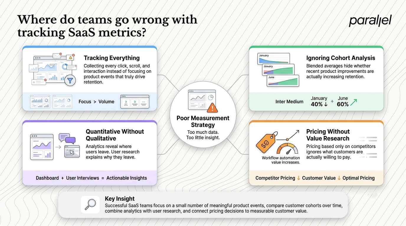
We see smart, well-funded teams make the exact same tracking mistakes repeatedly. They usually collect way too much data and end up acting on none of it.
Tracking everything instead of the right things
Many startups use sophisticated analytics tools but completely fail to define their core product events. They track every single click, scroll, and hover on the page. This creates massive noise.
You do not need to know how many people clicked a minor settings icon in the footer. You need to know how many people completed the core loop that actually drives retention. A focused UX metrics framework is far more valuable than a dashboard with fifty irrelevant charts.
Ignoring deep cohort analysis
Looking at blended retention rates is a dangerous trap. You must group users by the specific month they joined. A cohort analysis shows you if your recent product changes are actually improving retention over time.
If the cohort from January retains at 40% after three months, but the cohort from June retains at 60%, you know your recent product updates are working. If you look at a blended average, that massive improvement gets completely buried.
Disconnecting qualitative and quantitative data
Numbers tell you what is happening in the product. They rarely tell you why it is happening.
A high drop-off rate on a pricing page is quantitative data. It tells you there is a clear problem. It does not tell you if the price is too high or if the page layout is simply confusing. You need qualitative research to answer the why.
This is exactly why we integrate user research and strict usability testing into all our projects. Watching just five real users struggle with a specific flow gives you actionable insights that a generic dashboard never will.
Misunderstanding willingness-to-pay elasticity
Many product teams set their pricing strictly based on competitors. This approach leaves massive amounts of money on the table. You need to understand exactly how much your specific users are willing to pay for the unique value you provide.
If you add a workflow automation feature that saves a user ten hours a week, their willingness to pay increases significantly. Product roadmaps and pricing models must evolve together.
How should leaders build their SaaS metrics dashboard?
Building a reliable measurement culture requires strict discipline. You cannot just buy an expensive analytics tool and expect your engineering team to magically become data-driven.
Step one is defining your North Star
Every product team needs one North Star indicator. This is the single metric that best captures the core value your product delivers to customers.
For a team communication tool, it might be active messages sent. For an invoicing platform, it might be total invoices paid. Your North Star should always be a leading indicator of revenue. If the North Star goes up consistently, MRR should follow shortly after.
Step two is mapping the exact user journey
You must map out the specific steps a user takes from discovering your product to becoming a daily power user. We use an opportunity mapping framework to visualize this journey clearly. Once the journey is mapped out, you can assign specific performance indicators to each stage.
- Acquisition stage: Look at lead velocity and landing page conversion rates.
- Activation stage: Look at time-to-value and onboarding completion percentages.
- Engagement stage: Look at daily active users and deep feature adoption.
- Monetization stage: Look at expansion revenue and average revenue per account.
Understanding how to build a funnel based on these stages will give you immediate clarity on where users are dropping off.
Step three is holding regular cross-functional reviews
Data rots if it is not discussed openly. We strongly recommend running weekly review meetings with cross-functional teams. Product, design, engineering, and marketing leaders should all be in the same room. When everyone looks at the exact same numbers, organizational alignment happens naturally.
A great way to kickstart this alignment is through an intensive design sprint. A sprint forces the team to look at a specific business problem, prototype a viable solution, and test it with real users in just five days. It perfectly bridges the gap between abstract business goals and concrete user experiences.
Conclusion
Numbers ultimately reflect human behavior. Behind every churned account is a frustrated human being trying to do their job. Behind every successful upsell is a user who found genuine, undeniable value in what you built.
The goal here is not to memorize complex financial formulas. The goal is to build a culture where every team member understands exactly how their daily work impacts the health of the business. When product designers deeply care about acquisition costs, and software developers care about gross margins, the entire organization moves faster. Clarity in product thinking inevitably leads to clarity in business results.
FAQ
1) What are SaaS metrics exactly?
They are the key performance indicators used to evaluate the overall health, operational efficiency, and revenue growth of subscription software businesses. They track everything from user retention to customer acquisition costs.
2) How do I calculate customer lifetime value?
You calculate it by simply dividing your Average Revenue Per User by your current Customer Churn Rate. This shows the total amount of revenue you can expect from a single customer over their entire relationship with your business.
3) What is considered a good Net Revenue Retention rate?
A rate above 100% is good. This indicates your existing customer base is growing revenue even without new sales. Elite businesses typically achieve an NRR somewhere between 115% and 125%.
4) How does ARR differ from MRR?
MRR measures your predictable, recurring revenue on a strict monthly basis. ARR simply annualizes that figure by multiplying the MRR by twelve. Both are absolutely essential for tracking business health.
5) Why is the Rule of 40 so important?
It helps investors and board members evaluate the delicate balance between rapid growth and profitability. If your year-over-year revenue growth rate plus your profit margin equals 40% or more, your growth model is considered sustainable.
6) How can I quickly improve my activation rate?
Simplify your entire onboarding process immediately. Remove unnecessary steps, delay complex account configurations, and carefully guide the user to their first moment of value as quickly as humanly possible.
7) Is tracking these numbers right for my early-stage startup?
Yes. Even early pre-revenue startups need to track user engagement and activation closely. Once you actually have paying customers, tracking your cash burn, acquisition costs, and churn becomes critical for survival.
8) How does ParallelHQ help improve these numbers?
We act as a dedicated product design and strategy partner. We help early-stage startups simplify their complex user experiences, fix leaky onboarding funnels, and align their product design directly with tangible business growth goals. You can learn more at https://www.parallelhq.com/.

check out these related blogs











.avif)












.webp)