Over the last few years, the hype around artificial intelligence has peaked and crashed. Teams rushed to bolt generative features onto their products, hoping it would solve bad user experiences. It did not. Implementing AI in design is not about adding a chat box to your interface. It is about simplifying complex workflows and grounding decisions in actual user behavior. I have seen too many startups overcomplicate their products because they focused on the technology instead of the human problem. Here is how we build intelligent, AI-native products that actually work.
Quick Answer
AI in design means using artificial intelligence to solve specific user problems and streamline workflows rather than just generating flashy interface elements. It succeeds when teams prioritize human-centered product thinking over bolt-on features and generic chatbots.
Why does AI in design matter for early-stage startups?
Early-stage startups operate with limited resources and minimal room for error. You have a short window to prove value to your users before they abandon your product. In 2026, user expectations have shifted drastically. People no longer tolerate software that requires them to do heavy lifting.
We are seeing a massive shift in how software is evaluated. Buyers and end-users expect tools to anticipate their needs. When an interface requires manual data entry or complex navigation, users churn faster than ever. This is where intelligent product decisions become a matter of survival.
Recent data backs this up. According to Nielsen Norman Group's 2025 AI UX study, products that embed contextual intelligence directly into user workflows see a 40% higher task completion rate compared to those relying on separate chat interfaces. Your users want to get their jobs done faster. They do not want to learn how to prompt your system.
At ParallelHQ, we help founders navigate this exact shift through focused product strategy consulting. We have noticed that startups applying intelligent features to core friction points activate users twice as fast. It is no longer about having the smartest underlying model. It is about presenting that model in the most usable, frictionless way possible.
The companies winning today treat intelligence as a design material. They do not treat it as a standalone feature to list on a marketing page. They weave it into the fabric of the product experience to make hard tasks feel effortless.
Where do teams go wrong with AI in design?
The most common mistake I see is the "bolt-on" approach. A team builds a traditional SaaS product and then slaps a sparkly magic wand icon in the corner. They assume this makes their product an AI tool. In reality, it just creates a disjointed user experience.
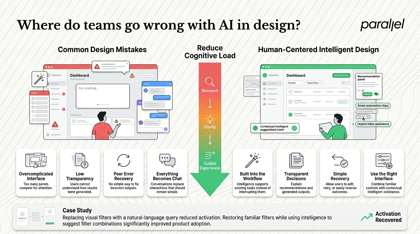
We regularly conduct UX audits for teams struggling with activation. In almost every case involving new intelligent features, the root cause of failure is a lack of clarity. Teams shift the cognitive load onto the user. They present a blank text box and expect the user to figure out what to type.
This leads to the dreaded blank canvas syndrome. Users stare at an empty prompt box, feel overwhelmed, and leave. Good product design removes cognitive load. A generic chat interface often increases it.
Here are the specific patterns of failure we see across startups today:
- Overcomplicating the interface: Adding sidebars, pop-ups, and chat windows that obscure the main workspace.
- Ignoring trust and transparency: Failing to show users how the system arrived at a specific conclusion or generated a specific result.
- Lack of error recovery: Giving users no clear way to correct the system when it hallucinates or produces a bad output.
- Forcing the chat paradigm: Using conversational interfaces for tasks that are better solved with a simple button click or a dropdown menu.
Consider a recent SaaS onboarding teardown we performed for a data analytics startup. They had replaced their filtering UI with a natural language query bar. Activation dropped by 60%. Users did not know the right vocabulary to ask for the data they needed. Once we restored the visual filters and used intelligence only to suggest relevant filter combinations, activation recovered immediately.
Technology should never dictate the interface. The user's goal must dictate the interface. When teams forget this, they build products that demo well but fail in actual usage.
How should product leaders think about AI in design correctly?
Product leaders need a fundamental mental shift. Stop asking how you can add artificial intelligence to your product. Start asking which specific user problems can only be solved by anticipating intent or processing unstructured data.
In my experience, the best way to think about this is through the lens of user agency. How much control does the user need? How much can the system safely automate? The answer changes depending on the context of the task.
A report by Stanford HAI on human-centered AI interfaces emphasizes that user trust is directly tied to predictability. Users must feel they are piloting the tool, not being dragged along by it. If the system takes an action, the user must understand why it happened.
To make better decisions, product leaders should categorize their features into three distinct buckets. This helps teams align the user experience with the underlying technology.
1) Invisible Automation
This is where the system does the work without asking. It happens in the background. Think of noise cancellation in video calls or automatic transaction categorization in fintech apps. The user does not need to interact with a prompt. The value is simply delivered.
2) Contextual Copilots
This pattern keeps the user in the driver's seat but offers intelligent suggestions alongside their work. Think of code completion tools or smart compose in email. The user maintains full control and can easily ignore the suggestion. This requires careful UI/UX design to ensure suggestions do not disrupt the workflow.
3) Generative Agents
These are tools where the user delegates a complex, multi-step task to the system. The design challenge here is not the generation itself. The challenge is designing the feedback loop. How does the user review, tweak, and approve the output?
When you break down your product roadmap into these categories, the design decisions become much clearer. You stop trying to force conversational patterns into places where invisible automation is actually needed. If you are unsure where your product stands, running an AI readiness design scorecard can help clarify your positioning.
What is a practical approach to implementing AI in design?
Knowing the theory is one thing. Actually building these products requires a structured process. At ParallelHQ, we have refined a specific approach for teams building intelligent software. It relies heavily on rapid validation and removing assumptions early.
The traditional design process moves from wireframes to high-fidelity mocks to development. This fails when working with unpredictable outputs. You cannot wireframe a hallucination. You have to design for variability.
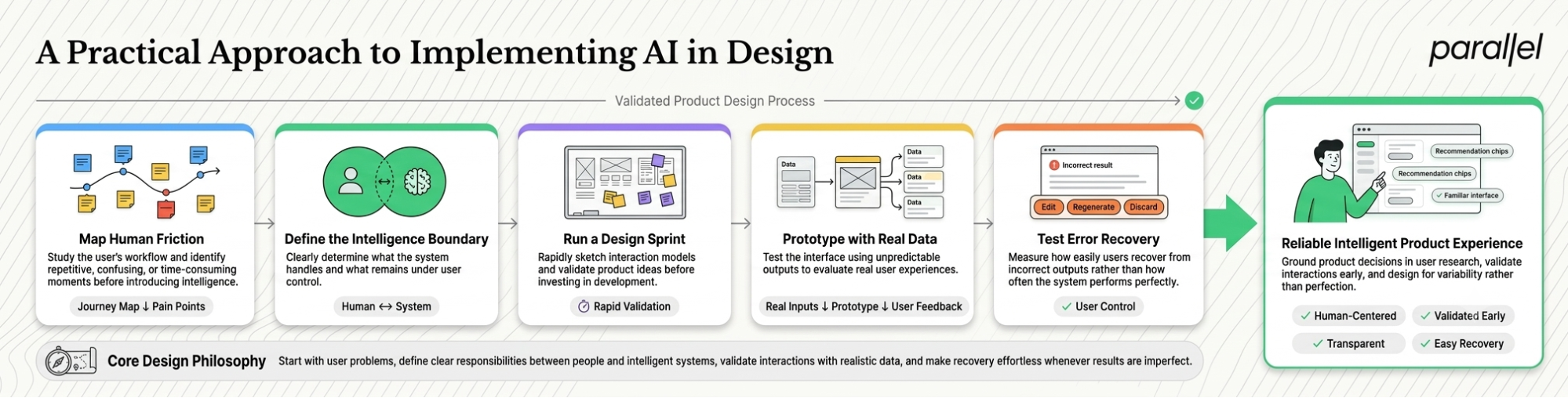
Here is the step-by-step approach we use when providing AI software design services to early-stage founders.
Step 1: Map the human friction
Do not start with technology. Start with a deep understanding of where users are currently getting stuck. We use our discovery framework to map out the exact steps a user takes to achieve their goal. We look for the most tedious, repetitive, or complex moments in that journey.
Step 2: Define the intelligence boundary
Once you find the friction, determine exactly what the system will do and what the human will do. Will the system generate a draft? Will it summarize a document? Will it extract key data points? Define these boundaries strictly. If the system does too much, the user loses trust. If it does too little, the user finds it useless.
Step 3: Run a targeted design sprint
We are huge advocates for the AI design sprint. Instead of spending weeks debating features, we compress the decision-making into a few days. We sketch solutions that focus specifically on the interaction model. How will the user trigger the feature? How will they review the result?
Step 4: Prototype with real data
Lorem ipsum does not work here. You must prototype with real, unpredictable outputs to see how the interface holds up. We often use simple no-code tools connected to language models to create a functional facade. This allows us to test the actual user experience before writing production code.
Step 5: Test for error recovery
During usability testing, we intentionally force the system to give a bad or irrelevant answer. The most important metric is not how often the system gets it right. It is how easily the user can recover when the system gets it wrong. If the user cannot easily edit, discard, or regenerate the output, the design has failed.
This approach grounds the product in reality. It forces teams to confront the limitations of the technology early in the process. It is the core philosophy behind how we operate as an AI native design agency.
How will AI in design evolve beyond 2026?
We are moving away from static interfaces. The idea of designing a single, rigid layout that every user interacts with is becoming obsolete. As systems become better at understanding intent, the interfaces themselves will become dynamic and adaptive.
This does not mean chaotic interfaces that change every five minutes. It means subtle, intelligent adaptations based on what the user is trying to accomplish at that exact moment. IDEO's recent insights point toward systemic design, where components assemble themselves based on contextual needs.
I expect to see three major shifts in the near future.
The death of the generic chat window
Conversational interfaces will remain, but they will be highly specialized. The generic chat bubble in the bottom right corner will disappear. Instead, conversational inputs will be embedded directly into specific components. You will talk to your calendar widget, not a generic assistant. For more on this, we recently published thoughts on chatbot UX design.
Dynamic UI generation
We will see more enterprise and SaaS products adopting interfaces that render on the fly. If a user needs a specific data visualization, the system will generate that chart component immediately rather than forcing the user to navigate through complex dashboard settings. This requires a completely new way of building design systems.
A premium on ethical friction
For the last decade, designers were taught to remove all friction. That is changing. When systems can execute actions autonomously, we actually need to introduce healthy friction. We need confirmation steps, transparency panels, and clear undo buttons. Designing for trust will become the most valuable skill a product team can have. We cover this extensively in our guide on ethical considerations in design.
The teams that win the next decade will be the ones who understand this balance. They will use technology to empower the user while maintaining clarity, control, and trust.
Conclusion
Building software has never been easier from a technical standpoint. But building good software has rarely been this difficult. The abundance of powerful technology makes it incredibly tempting to overcomplicate the user experience.
The most successful founders and product leaders I work with share a common trait. They are ruthlessly focused on simplicity. They do not care about showing off the technology under the hood. They care about making their users feel powerful.
Stop treating intelligence as a magic wand that can fix a broken product. Treat it as a raw material. Mold it carefully to solve real problems. Focus on clarity, prioritize human agency, and never compromise on usability. The technology will change, but the fundamentals of good product thinking never will.
Frequently asked questions about AI in design
1) What exactly is AI in design?
It is the practice of embedding intelligent capabilities directly into product interfaces to solve user problems. It focuses on using data and predictive models to reduce cognitive load, automate repetitive tasks, and anticipate user intent, all while maintaining a clear and intuitive user experience.
2) How do we know if our intelligence is actually useful?
You measure activation and task completion, not just usage. If a user tries a feature once and never uses it again, it is a gimmick. A useful feature reduces the time it takes a user to achieve their core goal. Conduct proper AI user research to validate these metrics.
3) Should we build a custom interface or use standard chat patterns?
Only use chat if the user's task requires open-ended exploration or complex, multi-turn dialogue. For executing specific tasks like filtering, sorting, or formatting, traditional UI elements like buttons and sliders are almost always faster and more intuitive.
4) How does this change the traditional UX research process?
The focus shifts heavily toward testing edge cases and failure states. You can no longer test a happy path with static prototypes. You must test how users react when the system provides incorrect or unexpected information, ensuring they have the tools to correct it.
5) Is generative UI ready for production in enterprise SaaS?
It is getting closer in 2026, but it requires incredibly robust design systems. The risk of generating broken or inaccessible interfaces is high. Most enterprise teams are currently better off using adaptive components rather than fully generative layouts.
6) What metrics should we track for these specific product features?
Track the adoption rate, the error correction rate, and the overall time to value. Pay close attention to how often users manually edit or discard the outputs generated by the system. A high edit rate indicates a mismatch between user intent and system capability.
7) Is this approach right for an early-stage startup with limited resources?
Yes, it is arguably more important for early-stage startups. You cannot afford to build features that confuse users. Running a focused design sprint helps you test assumptions cheaply and avoid wasting engineering resources on the wrong solutions.
8) How does ParallelHQ help teams navigate these product decisions?
We act as a strategic design partner for founders and product teams. We cut through the hype to figure out where intelligent features will actually drive value. From running discovery workshops to delivering production-ready interfaces, we help startups simplify complex concepts and build products grounded in real user behavior.

check out these related blogs