When I chat with founders and early product teams, they often want a simple answer to a complex problem: who offers the best responsive web design services? In practice, the question is less about a list of agencies and more about understanding what responsive design means for your business. Mobile screens now account for nearly 60% of all web page views worldwide, and mobile devices generate more than 62% of global organic search traffic. Those numbers aren’t just academic; they shape how people discover your product, how quickly they leave if it isn’t usable, and whether they ever come back.

Responsive design isn’t a trend. It is a product capability that influences growth. Research shows that 74% of people are likely to return to a site when it works well on mobile devices, whereas 40% will jump to a competitor if their mobile experience is poor. From our own projects at Parallel, we’ve seen small improvements in mobile flows translate into meaningful differences in conversion: optimizing load times, simplifying navigation, and making complex user journeys feel effortless can lift sign‑ups and retention.
Why should responsive design matter to founders and product leads?
I’ve observed that many early‑stage teams underestimate how quickly an inconsistent user experience undermines trust. Google now indexes sites primarily on the basis of their mobile versions; by early 2021 the company had already shifted 70% of websites to mobile‑first indexing. That shift means your mobile site isn’t an afterthought — it’s how search engines rank you. On top of that, 68% of online experiences begin with a search engine, and a large share of that traffic comes through mobile devices demandsage.com. If your site loads slowly, there’s a further penalty: 40% of users abandon a page that takes more than three seconds to load.

From a design perspective, responsive layouts rely on flexible grids and relative units, not pixel‑perfect breakpoints. As the Mozilla Developer Network explains, responsive sites are built on flexible grids so you don’t need to target every device size. Fluid images use the max‑width:100% property so they resize within their containers and never overflow. These principles enable pages to adapt gracefully across devices instead of snapping at arbitrary breakpoints. When evaluating responsive design studios, ask agencies about their approach to fluid grids, flexible images and media queries. Good teams build for adaptability and performance, not just aesthetics.
Which agencies offer the best responsive web design services?
Below is a curated list of 10 agencies that offer responsive design expertise. I start with Parallel because it’s my studio, but the others are strong contenders. What matters most is finding a partner whose strengths align with your product stage and culture.
1. Parallel – a global product‑first design studio
I founded Parallel in 2014 after seeing too many digital projects treat design as decoration rather than as a strategic tool. Our ethos is simple: turn product ideas into thoughtful experiences. We work with startups and scale‑ups to craft minimum viable products, refine onboarding flows, and build responsive interfaces that feel natural on any device.

We specialize in UI/UX design, frontend development and mobile‑friendly workflows. Our process begins with research — user interviews, data analysis and competitor audits — and ends with iterative builds. Because we’ve worked with AI and SaaS teams, we understand how subtle design choices can accelerate or slow growth.
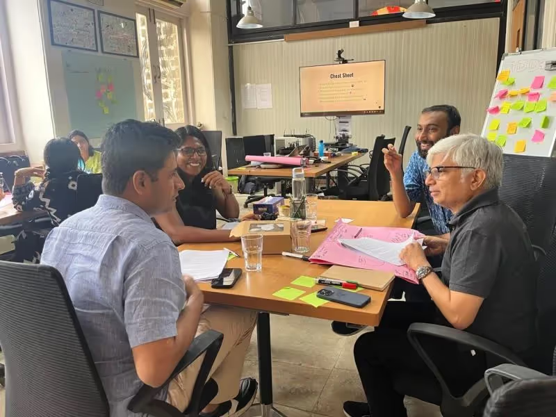
When clients ask about who does responsive design well, we explain that there’s no magic formula. A lightweight, responsive MVP that reaches users quickly often beats a polished site launched months too late.
2. Lounge Lizard – strategy and performance from New York

Lounge Lizard has been around since 1998 and has a strong reputation for pairing brand strategy with web performance. The team focuses on custom, responsive sites that align with business goals. Their case studies show attention to speed and accessibility, which are critical for early‑stage products. Because they handle both digital marketing and design, they can help you understand how a responsive site supports SEO and paid acquisition.
3. Digital Silk – full‑service design for startups to Fortune 500

Digital Silk positions itself as a full‑service agency that builds custom sites, performs search optimization and designs user interfaces. They often talk about cross‑platform consistency and include mobile audits in their projects. Startups that need best responsive web design services alongside marketing and SEO might find this combination helpful.
4. 500 Designs – global agency with big‑name clients
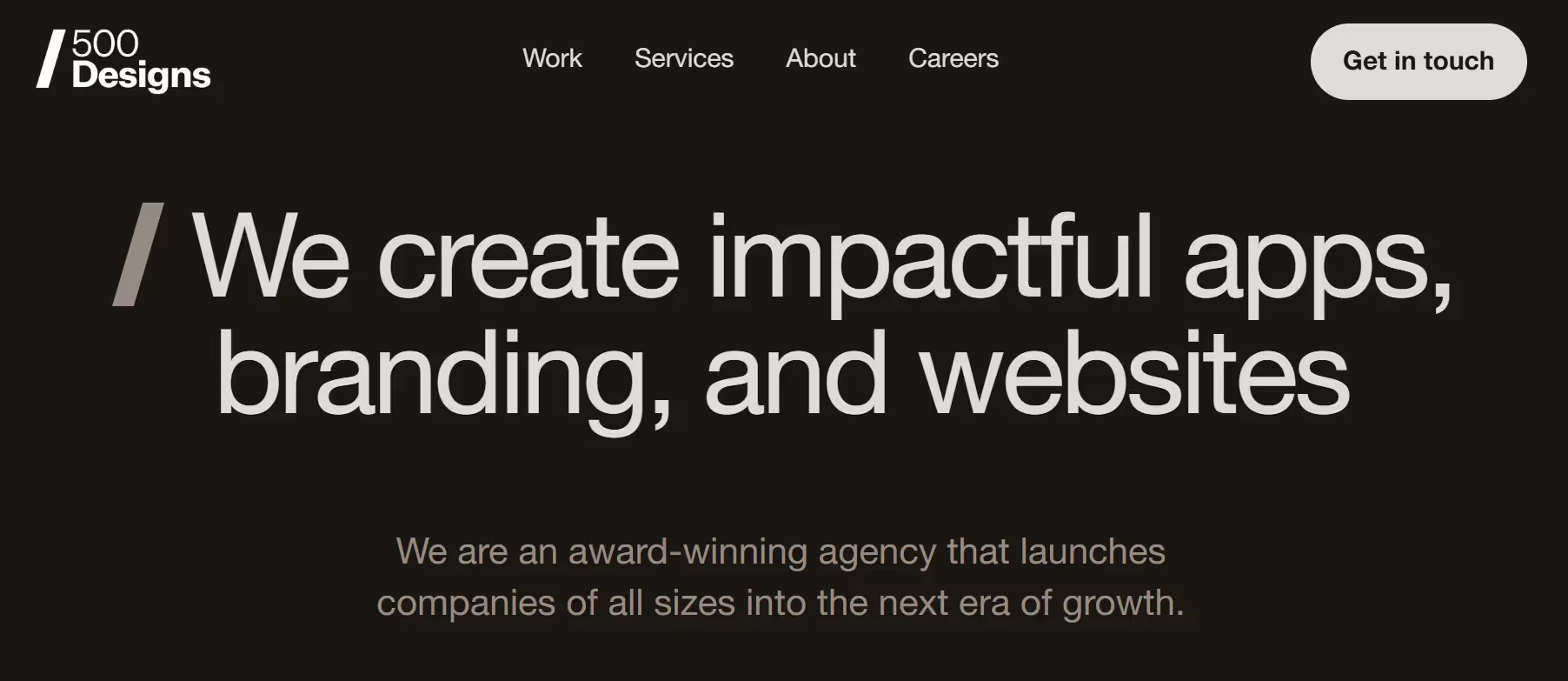
500 Designs is a well‑known branding and digital design agency with offices worldwide. They’ve delivered responsive sites for companies like Google and FedEx. Their emphasis on user research and storytelling makes them a good match for mission‑driven products or those with complex content. When evaluating them, ask how they tailor the process for a lean startup versus an enterprise client.
5. Big Drop Inc. – custom solutions that improve conversion
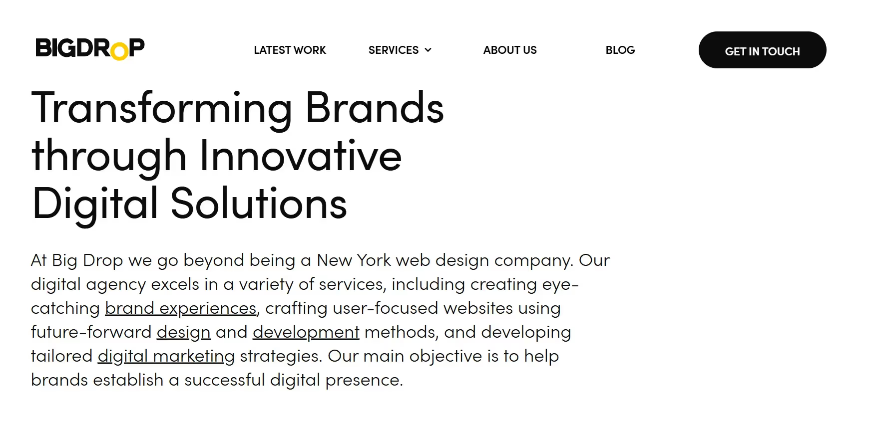
Based in New York City, Big Drop focuses on building responsive websites that drive measurable outcomes like conversion rates, loading speed and engagement. They invest heavily in performance tuning. If your product requires heavy integration with CMSs or e‑commerce systems, Big Drop has experience there. They may be among the best responsive web design services if you need custom back‑end work alongside user‑facing design.
6. Taktic Studio – measured design at a mid‑range price
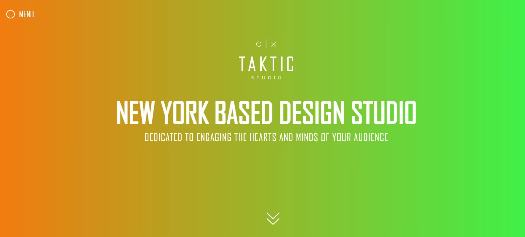
Taktic Studio offers responsive design with an emphasis on careful arrangement and branding. They’re not a household name, but they deliver solid work at a price that suits early‑stage companies. Taktic might be a good fit if you need a clean portfolio or marketing site rather than a complex application.
7. Clay – San Francisco‑based UX and brand specialists

Clay works with established brands such as Coca‑Cola, Snapchat and Sony. Their design work tends to be polished and research‑driven. They handle responsive web and mobile design, branding and product strategy. Clay may not be the cheapest option, but if you’re looking for a partner to help reposition your brand while building a responsive interface, they are worth exploring. They exemplify what the best responsive web design services look like at the high end of the market.
8. Bop Design – focused on B2B responsive design
Bop Design caters primarily to B2B companies. Beyond responsive web design, they offer branding and content marketing services. For founders leading enterprise‑focused products, a B2B‑oriented agency can help create the right tone and information hierarchy for decision‑makers. Their process tends to include content audits and SEO, which can reduce fragmentation across marketing channels.
9. NinjaPromo – modern agency blending design and growth
NinjaPromo topped several design agency lists in mid‑2025. Their pitch emphasizes mobile‑friendly interfaces, solid UX foundations, and performance metrics like conversion and retention. They also provide growth marketing support, so if you want an agency that consults on acquisition tactics as well as design, NinjaPromo could be a fit. They are often mentioned among the best responsive web design services for businesses seeking integrated support.
10. ScienceSoft – responsive services across industries
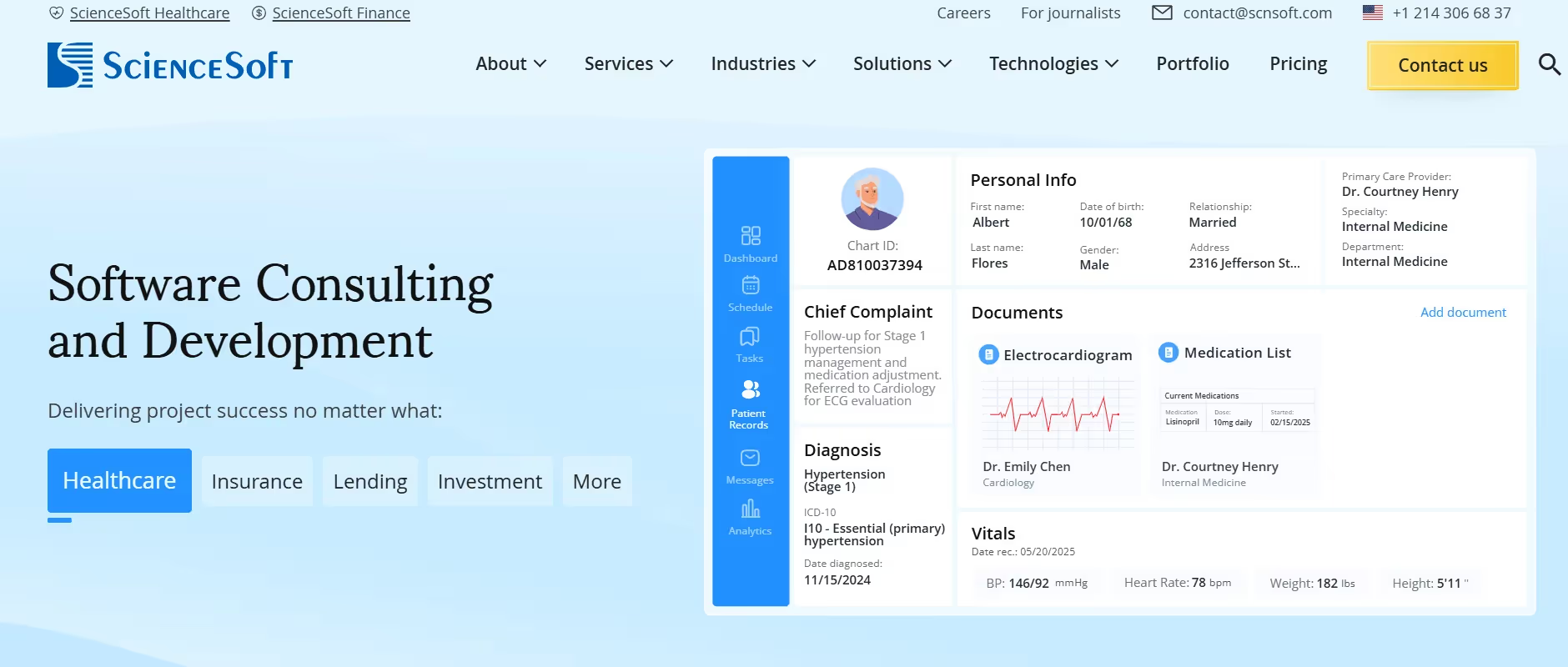
ScienceSoft offers responsive web development for B2B, B2C and e‑commerce clients. They incorporate market research and a UI/UX‑first strategy, and claim that clients have seen strong results: for example, they note that more than two‑thirds of their clients saw increased sales after adopting mobile‑first indexing. Their engineers pay attention to load speed, data security and accessible design. If your startup operates in healthcare, finance or another regulated domain, ScienceSoft’s technical pedigree can be valuable.
How do you choose the right responsive design partner?
Picking from a list of best responsive web design services isn’t about picking the biggest name; it’s about matching capability to your product stage. When searching for responsive web design partners, focus on fit rather than size or fame.
- Match strengths to your needs: If you need a rapid MVP with basic branding, a lean studio like Taktic Studio or Bop Design may suffice. For complex workflows or regulated industries, ScienceSoft or 500 Designs might be a better fit. AI and SaaS startups that value iterative product thinking often hire our team at Parallel.
- Consider the budget and growth stage: Early-stage teams should allocate funds to research and basic responsive patterns rather than fancy animations. Agencies like Big Drop and Clay deliver premium work but command higher fees. Parallel intentionally offers tiered packages: discovery sprints, MVP builds, and scaling engagements.
- Decide between internal and external: Hiring an agency can accelerate learning and let your team focus on the core business. But if design is central to your product, you may eventually need in‑house talent. Many startups begin with an agency to launch an MVP, then build an internal team as they learn what skills matter.
- Set timeline expectations: A basic responsive marketing site can take four to six weeks. A more sophisticated application with user dashboards or integration layers can run three to four months. Ask each agency to break down phases — research, wireframes, high‑fidelity design, development and testing. At Parallel we always align on milestones and deliver iteratively, which helps manage scope and avoids surprises.
- Ask about technical practices: Good agencies should explain how they use fluid grids, media queries and relative units instead of fixed pixels. They should have a plan for load‑speed optimization (remember that 40% of users abandon sites that load in over three secondsdemandsage.com). They should also know modern responsive frameworks, whether that’s Flexbox, CSS Grid or utility frameworks like Tailwind CSS. A robust process also includes cross‑device testing, performance monitoring and accessibility audits.
One more tip: talk to past clients, especially those similar to your size or industry. A flashy portfolio doesn’t always reflect day‑to‑day collaboration. When we finish projects at Parallel, we ask clients to speak frankly about what worked and what didn’t; that feedback is invaluable for prospective founders.
Conclusion
The term responsive sometimes makes founders think about screens alone. In practice, responsive design is about meeting users where they are — on their phones during a commute, on a desktop in an office, or on a tablet at home. The stakes are high: 63% of organic search traffic now originates from mobile devices, and users are quick to judge a product by its performance and ease of use. A flexible, well‑crafted interface can mean the difference between onboarding and bounce.
The best responsive web design services are partners who understand that design is a business tool. They ask hard questions about your customers, prototype ideas quickly, and test across devices. They measure success not by dribbble shots but by increased activation, retention and revenue. Parallel and the agencies listed above can help you build that foundation, but the final decision should be based on chemistry, process fit and the ambition of your product.
Finally, don’t treat this decision as permanent. Startups evolve, and so should your design partners. Evaluate portfolios, run pilot projects, and choose the service that feels right for your team’s stage. If you keep your users at the center and respect the importance of mobile experience, you’ll be in a strong position to grow.
FAQ
1) Which unit is best for responsive web design?
When building fluid grids, percentages or relative units like the fr unit in CSS Grid are safer than fixed pixels. They allow elements to scale smoothly and maintain proportion across screens. Pixels are fixed and make layouts brittle, so avoid them except for things that shouldn’t scale (e.g., icons).
2) Is a PWA better than responsive web design?
Progressive Web Apps (PWAs) add offline support, caching and installable features. They complement rather than replace responsive design: you should still build a responsive layout first, then layer PWA capabilities on top. Think of PWAs as enhancing engagement and reliability, while responsive design handles layout and interaction.
3) What is the easiest way to have a responsive web design?
Using a responsive framework like CSS Grid or a well‑maintained library such as Bootstrap can simplify the process. These tools provide fluid grids, pre‑built components and built‑in media queries. Alternatively, hiring one of the best responsive web design services can help if you lack the expertise or time.
4) What is a good example of responsive web design?
Major news websites often illustrate responsive design well. For instance, they use fluid grids that reflow content and media queries to adjust layouts at defined breakpoints. When you load a news homepage on a desktop and then on a phone, the content reorganizes without losing hierarchy. That’s the kind of adaptiveness you should expect when evaluating the best responsive web design services.

check out these related blogs




































































.avif)