I have sat in countless meetings where early stage founders obsess over button radiuses and color tokens. They see massive tech companies showing off complex component libraries and assume they must do the same. So, they inevitably ask me: when does a SaaS startup need a design system? The honest answer is usually not right away. We see teams build intricate libraries before they even have product-market fit, and it almost always backfires. Good product thinking requires solving user problems first, not standardizing components that might not survive your next pivot.
When should a SaaS startup adopt a design system?
A SaaS startup needs a design system when scaling past two product designers, when engineering spends more time debating UI inconsistencies than building features, or when managing multiple product lines. Before product-market fit, stick to a basic UI kit.
Why is premature optimization a trap for SaaS design systems?
Founders and product managers often conflate visual perfection with product viability. In the early days of a startup, your only goal is survival. You need to prove that people actually want what you are building.
We often step in to help teams who have spent weeks mapping out fifty variations of a dropdown menu, yet their core user onboarding remains confusing and disjointed. This is a classic misallocation of resources. When you are validating an idea, speed is your primary advantage. Building a rigid infrastructure too early slows you down.
A common mistake in determining when a SaaS startup needs a design system is looking purely at funding rounds. Raising a Series A does not automatically mean you need a dedicated design systems team. If your product is still undergoing massive feature changes every month, a rigid system will break. Engineers will start overriding components just to hit deadlines, and your expensive system will turn into a graveyard of unused code.
Instead of heavy systems, early teams should rely on lightweight UI kits. This provides enough consistency to look professional without the heavy governance required by a true system. If you need help getting an early product off the ground efficiently, our approach to MVP development focuses heavily on this balance of speed and usability.
What is the cost of ignoring design debt in SaaS startups?
While premature optimization is a risk, waiting too long creates a different kind of disaster. As your team grows, the lack of standardization begins to compound into massive technical and design debt.
Imagine this scenario. You hire a second designer and three new front-end engineers. Without a shared language, the new designer creates a slightly different primary button. The engineers, lacking a central repository, build that new button from scratch in the codebase. Fast forward six months, and your application has twelve different shades of blue and fourteen variations of a submit button.
This is not just an aesthetic problem. It is a severe business bottleneck.
To properly evaluate when a SaaS startup needs a design system, we have to look at velocity. When UI inconsistencies pile up, QA testing takes twice as long. Engineers spend hours resolving basic CSS conflicts instead of building core logic. Users start feeling the friction of a disjointed experience, which directly impacts trust and retention.
A 2025 study by Nielsen Norman Group found that mature component libraries reduce UI engineering time by 34%. When you are paying expensive developer salaries, losing a third of their time to redundant UI work is a massive leak in your runway. If you suspect your product is suffering from this kind of bloat, running a structured UX audit is usually the best way to uncover exactly how much time is being wasted.
What are the clear signals that a SaaS startup needs a design system?
You do not wake up one day and suddenly need a massive component library. The need emerges through specific organizational and product frictions. Here are the undeniable signals that it is time to invest in scalable design infrastructure.
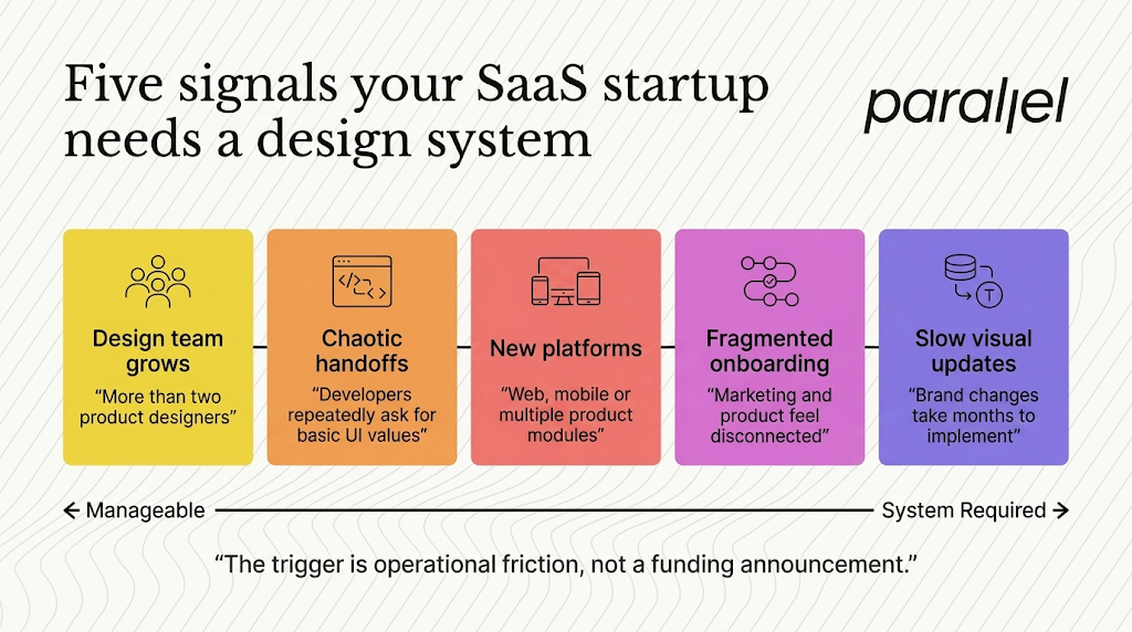
1) You are scaling the design team beyond two people
When you have a single designer, the design system lives in their head. They know exactly which padding rules to use. Once you add a second or third designer, that tacit knowledge breaks down. You need written rules and centralized Figma libraries to ensure both designers are outputting cohesive work.
2) Engineering handoffs have become chaotic
We tell founders that the answer to when a SaaS startup needs a design system depends heavily on their engineering bottlenecks. If your weekly sprint planning meetings are dominated by developers asking for hex codes, or if designers are constantly auditing staging environments to fix spacing issues, your handoff process is broken. A system acts as a single source of truth, eliminating these repetitive conversations.
3) You are expanding to new platforms or products
If you are moving from a single web app to adding a mobile application, or if you are splitting your core software into multiple distinct modules, consistency becomes impossible without a system. You cannot have your web app and your mobile app feeling like they were built by two completely different companies.
4) User onboarding feels fragmented
If you are trying to figure out when a SaaS startup needs a design system, look at your onboarding metrics. Users are highly sensitive to jarring transitions. If your marketing site looks polished, but the actual dashboard looks like a generic template from 2018, users lose trust immediately. High drop-off rates during initial product activation can often be traced back to a disjointed, untrustworthy user interface.
5) Rebranding or updating visuals takes months
If your marketing team decides to update the brand typography, how long does it take to reflect that in the product? If the answer is "months of engineering work," you desperately need design tokens and a centralized architecture.
How does your startup stage influence design system maturity?
To make this actionable, we have mapped out how product design should evolve as your company scales. This framework helps SaaS product design teams align their efforts with actual business needs.
What makes up the anatomy of a pragmatic design system?
Another way to assess when a SaaS startup needs a design system involves auditing your current design debt. If you decide it is time to build, you must resist the urge to build everything at once.
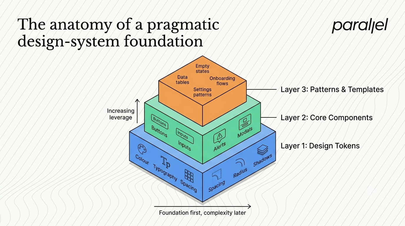
At ParallelHQ, we advocate for a pragmatic, layered approach. You do not need to mimic the infrastructure of a massive enterprise company. You just need enough structure to remove friction. Here is how we sequence the build for our partners.
Layer 1: Design Tokens (The DNA)
Do not start by designing complex data tables. Start with the smallest possible decisions. Design tokens are the foundational values of your visual language, represented as data.
- Colors (Primary, secondary, semantic warning states)
- Typography (Headings, body text, line heights)
- Spacing and Grids (4pt or 8pt grid systems)
- Border radiuses and shadows
By defining these as tokens, engineers can store them as variables in the codebase. If you ever need to change your primary brand color, you change one variable, and it updates across the entire application instantly.
Layer 2: Core Functional Components
Once tokens are set, move to the elements users interact with most frequently.
- Buttons and Links
- Form Inputs (Text fields, checkboxes, toggles)
- Alerts and Notifications
- Modals and Dialogs
Keep these components extremely flexible. Do not lock them down with too many rigid rules. The goal is to provide a reliable building block, not a straightjacket for your designers.
Layer 3: Patterns and Templates
This is where the real speed multiplier happens. Instead of just standardizing a button, standardize the entire "Settings Configuration" pattern.
- Standardized empty states
- Standardized data tables with pagination
- Standardized onboarding flows
When you reach this layer, your product managers can start wireframing complex features using high-fidelity patterns in minutes. If you want to see how we approach this structurally, our product strategy consulting focuses heavily on creating these repeatable patterns for SaaS growth.
How can you roll out design system components without slowing down?
The biggest fear founders have is that building internal tools will halt product development. "We cannot afford to stop shipping features for two months to build this," they tell me.
They are absolutely right. You should never halt feature development.
The secret to a successful rollout is treating the system as a byproduct of your actual product work. We call this the "Just-in-Time" approach.
Audit as you build
When a new feature requires a modal window, the designer creates the ideal modal for that specific feature. Before handing it off, they check if a similar modal exists. If not, they refine this new modal to be slightly generic, add it to the shared Figma library, and the engineering team builds it as a reusable component.
Centralize the governance early
Even if you are building slowly, you need clear ownership. Appoint one designer and one front-end engineer to act as the gatekeepers. Their job is not to build everything, but to review contributions from the rest of the team. This federated model ensures the library grows organically but remains clean.
Document the "Why", not just the "What"
A component library without documentation is just a folder of files. You must explain how and when to use things.
- Do not just show the red "Destructive" button.
- Write a rule: "Only use the destructive button for actions that permanently delete user data and cannot be undone."
Clear guidelines prevent junior designers from making critical UX errors. If establishing these guidelines feels overwhelming, bringing in external experts for focused design systems creation can accelerate this process significantly.
How do you measure the ROI of your SaaS design infrastructure?
Leadership teams speak in metrics, not in hex codes. To justify the investment in standardizing your UI, you must measure its impact on the business.
According to the 2026 State of Product Design report from Figma, organizations that actively maintain component libraries see a 50% faster time-to-market for new features. That is a massive competitive advantage.
Here are the key metrics we help teams track to prove ROI:
- Component Adoption Rate: What percentage of your live codebase relies on centralized components versus custom CSS? A healthy system should aim for 80% coverage.
- Time to First Commit (Onboarding): How long does it take a newly hired engineer to push their first UI update to production? With a good system, this should drop from weeks to days.
- QA Bug Reduction: Track the number of UI-specific bugs (misaligned text, wrong colors, broken mobile views) reported during sprints. This number should plummet as developers reuse tested components.
- Prototyping Velocity: Measure how quickly a product manager and designer can move a concept from a rough sketch to a high-fidelity, clickable prototype for user testing.
If you are struggling to track these effectively, implementing a solid UX metrics framework will help you quantify the value of your design decisions to investors and stakeholders.
How is AI shaping the future of SaaS component management?
The landscape of building digital products is shifting rapidly. Research published in late 2025 by IDEO highlights that the traditional manual maintenance of UI libraries is becoming obsolete.
At ParallelHQ, we are seeing a massive shift in how AI assists in this process. Modern AI software design services allow us to automate the tedious parts of governance.
Today, AI tools can scan a Figma file, instantly flag components that deviate from the established token architecture, and automatically generate the React code required for the front-end. This means small teams can maintain enterprise-grade consistency without needing a dedicated team of five people to manage the documentation.
However, AI cannot replace clear product thinking. An AI can generate a perfect data table component, but it cannot tell you if a data table is the right solution for your user's specific problem. That requires human insight, deep user research, and a clear understanding of behavioral psychology.
What is the final verdict on when a SaaS startup needs a design system?
Ultimately, when a SaaS startup needs a design system is a question of scale and friction. Do not build one out of vanity. Do not build one because a blog post told you to. Build one when the pain of inconsistency becomes greater than the effort required to standardize.
Start small. Focus on tokens and core components. Build organically alongside your feature roadmap, and enforce governance gently. When executed correctly, standardizing your UI will not restrict your creativity. It will liberate your team from mundane debates, allowing you to focus entirely on solving complex, high-value problems for your users.
What are the frequently asked questions about SaaS design systems?
1) What is a design system?
It is a centralized collection of reusable components, guidelines, and assets (like colors, typography, and buttons) that dictate how a product should look and behave. It bridges the gap between design and engineering, ensuring both teams are working from the exact same source of truth.
2) How do we start building one?
Start with an inventory audit. Capture screenshots of every unique button, form, and dropdown currently in your product. Group the duplicates, agree on a single standard for each, and extract the foundational design tokens (colors, spacing, typography). Document these clearly before writing any complex component code.
3) What is the difference between a UI kit and a Design System?
A UI kit is simply a static collection of visual assets in a design tool. It helps designers mock up screens quickly. A full system includes the UI kit, but also contains the exact coded counterparts in the engineering repository, strict usage guidelines, accessibility rules, and governance processes.
4) Is this right for my MVP?
No. During the Minimum Viable Product phase, your only focus should be validating your core value proposition. Use an off-the-shelf component library like Tailwind UI or Material Design to move fast. Customizing a bespoke architecture at this stage is a waste of capital.
5) How does this impact engineering speed?
In the short term, it slows things down slightly as developers learn to use the new variables. In the long term, it massively accelerates speed. Engineers stop writing custom CSS and start snapping pre-tested, bug-free components together like Lego bricks, allowing them to focus on backend logic and performance.
6) Can we just use an open-source library instead?
Yes, and many successful startups do. Libraries like Chakra UI, Radix, or MUI are excellent starting points. However, as your brand matures and your UX requires highly specific, custom interactions, you will eventually need to fork these libraries and build your own proprietary layer on top of them.
7) Exactly when does a SaaS startup need a design system to stay competitive?
The exact moment is when UI and front-end QA testing start delaying your release cycles, or when you hire your second product designer. If designers are overwriting each other's work or engineers are constantly guessing at spacing values, your lack of structure is actively harming your competitiveness.
8) How does ParallelHQ help teams with this?
We partner with early and growth-stage teams to create pragmatic, scalable foundations. We do not just hand over a bloated Figma file. We focus on clarity, building only the components that drive actual value, aligning design with your engineering stack, and ensuring the architecture supports your long-term product strategy.

check out these related blogs