Most SaaS products lose their best users in the first five minutes. We see this constantly at ParallelHQ. Teams build powerful tools but bury the core value under multi-step tutorials and endless configuration forms. Conducting a proper SaaS onboarding teardown reveals exactly where this friction lives. The goal is not to explain every feature on day one. The goal is to get the user to their first measurable win. In my experience, activation does not improve by adding more confetti animations. It improves by removing cognitive load, respecting the user's time, and making the next step incredibly obvious.
What is a SaaS onboarding teardown?
A structured SaaS onboarding teardown identifies the exact friction preventing users from finding immediate value. The most effective patterns focus on progressive disclosure, personalized pathways, and removing upfront configuration. Doing this correctly lifts activation rates by reducing cognitive load and accelerating time-to-value.
How can you delay the wall of configuration?
When we run a SaaS onboarding teardown for early-stage startups, the most common mistake we see is the "wall of configuration." Teams force users to connect databases, invite team members, and set up billing before showing them the actual product. This creates massive friction right when user motivation is most fragile.
Users sign up because they want to see how your tool solves their problem. They do not want to fill out administrative forms. According to a 2025 Nielsen Norman Group study on interaction cost, asking users to perform complex data entry before they understand the system's value increases abandonment rates by up to 60%.
To fix this, we have to rethink the sequence of events. You must defer everything that is not strictly required for the first core action.
Here is how we think about the tradeoff between data collection and user momentum.
Practical steps to delay configuration
- Use sample data: Populate the dashboard with realistic dummy data. Let the user interact with a fully functioning environment immediately.
- Defer non-critical settings: Move avatar uploads and company size questions to a secondary profile completion prompt that appears days later.
- Create a sandbox mode: Allow technical users to run test scripts without securely linking their production databases.
- Just-in-time permissions: Only ask for integrations (like Slack or Google Calendar) when the user clicks a feature that specifically requires them.
When teams adopt this pattern, they typically see a sharp increase in day-one product exploration. Users need to touch the steering wheel before they are willing to read the owner's manual.
How do you reverse-engineer the aha moment?
A critical part of any SaaS onboarding teardown involves mapping the exact path to the "aha moment." This is the specific interaction where the user finally understands why your product exists. If they do not experience this core value proposition quickly, they will churn.
Many product teams define activation as a "completed profile" or an "installed widget." Those are business metrics, not user outcomes. You have to work backward from the exact moment the user feels relief or excitement.
If you are building a reporting tool, the aha moment is seeing the first automatically generated chart. If you are building a B2B SaaS product, it might be the moment a manual task is completely automated. We help teams map this out precisely.
How to map the shortest path to value
- Identify the true outcome: Talk to your most successful users and pinpoint the exact action that made them upgrade to a paid tier.
- Audit the current flow: Count every click, form field, and page load required to reach that outcome.
- Ruthlessly prune steps: Remove any interaction that does not directly contribute to reaching that specific aha moment.
- Measure time-to-value (TTV): Track the average time it takes a new signup to hit this milestone.
The impact of reducing time-to-value
The 2026 Product-Led Growth Index indicates that products with a TTV under three minutes have a 45% higher free-to-paid conversion rate. Speed matters.
Consider how Notion handles this. They do not force you to understand their complex database structures on day one. They drop you into a simple text editor. The aha moment happens the second you type a slash command and see the block options appear. It is instant, frictionless, and highly satisfying.
To improve your own product, ask yourself what the absolute minimum input required is to generate a magical output for the user. Then, build your entire first-day experience around facilitating that single interaction.
What is intent-based branching in SaaS onboarding?
During a recent SaaS onboarding teardown, we discovered a team forcing developers and marketing managers through the exact same product setup flow. The developers felt patronized, and the marketers felt overwhelmed. One-size-fits-all onboarding no longer works.
Different users hire your product for different jobs. Intent-based branching solves this by asking one or two critical questions upfront to customize the entire subsequent experience. By segmenting users early, you can serve them only the interface elements and tutorials that matter to their specific goals.
This requires a strong understanding of user research and behavioral segmentation. You have to know who is walking through the front door.
Implementing intent-based branching
- The single critical question: Ask "What are you hoping to achieve today?" immediately after account creation.
- Role-based defaults: If the user identifies as a developer, default to the API documentation view. If they are a designer, default to the visual canvas.
- Dynamic checklists: Adjust the onboarding tasks based on their stated goal. A manager needs to see billing and team settings. An individual contributor needs to see project creation.
- Tone calibration: Adjust the microcopy. Technical users prefer dense, factual documentation. Non-technical users often respond better to guided, plain-language prompts.
Structuring the branching logic
This pattern respects the user's intelligence. It proves that your software is flexible enough to handle their specific use case. When you personalize the entry point, users are far more forgiving of complexity later in the journey.
Why should you replace product tours with contextual guidance?
This is a common finding in our SaaS onboarding teardown process. Teams rely entirely on a 12-step modal overlay to teach users how the interface works. They darken the screen and force the user to click "Next" repeatedly.
Users almost always click "Skip."
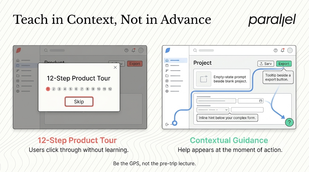
Assuming a lengthy product tour actually teaches the user anything is a failure in UX design strategy. People do not memorize interface locations out of context. They learn by doing. We advise teams to kill the front-loaded product tour and replace it with contextual guidance.
The principles of contextual education
Contextual guidance means triggering help only when the user is actively trying to use a specific feature. It relies on the concept of progressive disclosure.
- Utilize empty states: An empty dashboard is not a place for a blank white screen. It is the best real estate for a primary call to action and a brief explanation of what belongs there.
- Trigger tooltips on interaction: Do not highlight the export button until the user has actually created something worth exporting.
- Use inline hints: Place small, unobtrusive text snippets near complex form fields rather than hiding the explanation behind a tiny question mark icon.
- Offer a persistent help center: Give users an easy way to pull up documentation or a video tutorial directly within the page context without losing their current work.
Why this changes user behavior
A 2026 study by the Baymard Institute showed that context-driven help reduces support ticket volume for new accounts by over 30%. When you teach in context, cognitive load drops significantly.
Instead of asking users to memorize a map before they start driving, you act as a GPS, giving them instructions only as they approach the relevant turn. This approach builds confidence and encourages organic exploration of the product.
How does the checklist effect drive psychological momentum?
If you conduct your own SaaS onboarding teardown, look closely at how you present remaining tasks to the user. Unfinished tasks create psychological tension. We can harness this tension to drive activation, but it requires careful balance.
Where teams fail is by overwhelming users with a 15-item checklist. When the mountain looks too high to climb, users simply abandon the effort. The goal is to build momentum through small, achievable wins.
This relies on the Zeigarnik effect, a psychological principle stating that people remember uncompleted or interrupted tasks better than completed tasks. A visible progress tracker taps into the innate human desire for completion.
Designing an effective progress tracker
- Keep it short: Limit the initial onboarding checklist to three or five highly impactful actions.
- Give a head start: Automatically check off the first item (like "Create an account"). This makes the user feel like they are already making progress.
- Make tasks meaningful: Do not include trivial tasks like "Change avatar color." Only include actions that drive the user closer to the core value of the product.
- Provide clear effort estimates: Label tasks with expected completion times (e.g., "Takes 2 minutes"). This reduces anxiety around the commitment required.
Checklist implementation variations
We have implemented this pattern across numerous product redesigns. When users can visually track their progress toward mastery, their anxiety drops. They stop worrying about what they might be missing and focus entirely on the next indicated step.
How does frictionless and delayed account creation improve conversion?
Another insight from performing a SaaS onboarding teardown is that every single form field reduces top-of-funnel conversion. Teams are often so eager to capture marketing data that they build massive barriers at the very beginning of the relationship.
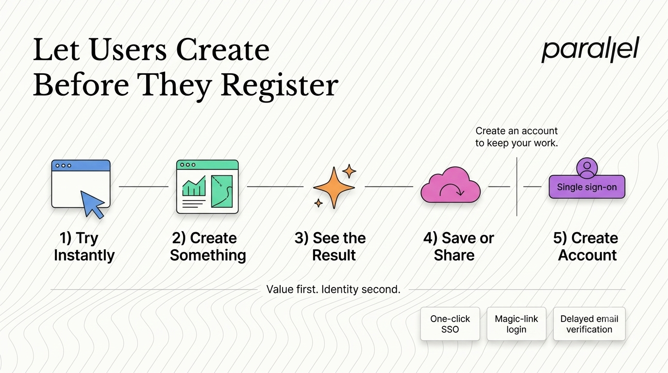
Asking for phone numbers, company size, and job titles before establishing trust is a conversion killer. We advocate for frictionless account creation, and in some cases, entirely delayed account creation.
Let the user start doing the work immediately. Let them build a chart, write a document, or generate a design. Then, when they want to save or share their work, ask them to create an account.
Methods for reducing upfront friction
- Aggressive use of SSO: Prioritize Google, GitHub, or Microsoft single sign-on buttons. This reduces account creation to a single click and eliminates password fatigue.
- Defer email verification: Do not lock the user out of the app until they click a link in their inbox. A 2025 Reforge analysis shows that deferring email verification to day three increases initial session length by 40%.
- Eliminate password rules: If you must use traditional email signup, use passwordless magic links or simplify password requirements. Do not make users guess which special character they forgot.
- Reverse the funnel: Allow users to interact with a limited version of the core product completely anonymously. Gate only the premium features or the ability to save data persistently.
The psychology of delayed friction
By the time the user is prompted to create an account in a delayed flow, they have already invested effort into the tool. They have created something of value. The psychological principle of loss aversion kicks in. They are much more willing to provide their email address to save their work than they would be to access an empty dashboard.
This approach requires tight engineering and robust product architecture, but the payoff in user acquisition volume is massive.
How can you leverage social proof during friction points?
Even in the most streamlined product, some friction is unavoidable. You eventually have to ask for a credit card. You eventually have to ask for database permissions. Leaving these high-friction steps bare and transactional causes anxiety and churn.
When users face a difficult or invasive request, they need reassurance. They need to know that giving you this information is safe, normal, and beneficial. This is where strategic social proof becomes a critical design pattern.
We are not talking about a generic "Trusted by 10,000 companies" banner on the marketing site. We are talking about micro-injections of trust directly within the product interface at the exact moment of hesitation.
Tactical placements for social proof
- Near sensitive permissions: If you require access to their CRM, add a small tooltip explaining exactly what you will and will not do with that data. Mention that top-tier security standards are in place.
- At the billing wall: Place a single, highly relevant customer quote next to the pricing toggle. Ensure the quote specifically mentions the return on investment.
- During data imports: Show a dynamic counter of how many other users have successfully completed this exact integration today.
- Within empty states: Instead of just saying "Create your first project," add "Join 5,000 other product managers who organize their work here."
Building a trust framework
When we help teams optimize their SaaS metrics, adding localized social proof is often the fastest way to improve conversion rates on required friction points. It answers the user's internal doubts before they even consciously articulate them.
Conclusion
We built ParallelHQ because we saw teams struggle with design decisions that should have been simpler. Product teams often fall into the trap of designing for themselves, adding layers of complexity to showcase technical capabilities. But real users do not care about the underlying architecture. They care about solving their immediate problems.
A thorough SaaS onboarding teardown strips away the agency fluff and the trend-driven design elements. It forces you to look at the raw mechanics of user behavior. By implementing progressive disclosure, respecting user intent, and ruthlessly eliminating early friction, you build a product that people actually want to adopt. The best onboarding experiences feel invisible. They let the thinking speak for itself, getting out of the way so the user can finally get to work.
FAQ Section
1) What is a SaaS onboarding teardown?
A SaaS onboarding teardown is a systematic evaluation of a software's new user experience. It involves mapping every click, form, and cognitive hurdle a user faces from initial signup to their first moment of actual value. The goal is to identify friction points and redesign the flow to increase activation rates.
2) How long should the activation process take?
The time to activate depends heavily on product complexity. However, the best-in-class benchmark for product-led growth companies is getting the user to a meaningful win in under three minutes. If your setup takes days, you must break it into smaller, manageable chunks.
3) What is the difference between activation and engagement?
Activation is the moment a user first experiences the core value of your product. It is a one-time milestone. Engagement is the ongoing, repeated usage of the product over time. You cannot have engagement without first achieving a successful activation.
4) How do we measure the success of a new onboarding flow?
You measure success by tracking the Time-to-Value (TTV) and the overall Activation Rate. Identify the specific action that proves the user found value, and track the percentage of new signups that complete that action within their first 24 hours.
5) Should we use tooltips or product tours?
We strongly advise against multi-step, screen-darkening product tours. Users skip them. Instead, use contextual tooltips that trigger only when a user interacts with a specific, relevant part of the interface. Teach them in context while they are actively working.
6) How does progressive disclosure help new users?
Progressive disclosure is a design pattern that sequences information so users only see what they need at any given moment. By hiding advanced settings and complex features until the user specifically requests them, you drastically reduce cognitive load and prevent feelings of overwhelm.
7) What role does user intent play in product setup?
User intent dictates the path a user should take. A technical developer and a marketing manager need entirely different onboarding experiences. By asking one simple intent-based question upfront, you can dynamically customize the interface and tasks to match their specific goals.
8) How does ParallelHQ approach product strategy and design?
At ParallelHQ, we focus on clarity in product thinking. We partner closely with early-stage startups and product leaders to simplify complex decisions. We rely on real user behavior, rigorous UX audits, and experience-backed patterns to build products that are grounded, usable, and highly effective.

check out these related blogs