I have seen too many startups treat design as an unquantifiable art. They launch gorgeous products that fail to activate users or drive revenue. Design is not magic. It is a highly predictable business lever. Understanding product design ROI: how to measure design impact is what separates mature product teams from chaotic feature factories. When you ground your design decisions in real user behavior, the financial returns become obvious. Here is how we connect pixels to profit and prove that good design is simply good business.
Quick answer
To measure design impact, connect user experience changes directly to business metrics. Track task success rates, conversion lifts, retention increases, and reductions in support tickets or engineering rework. Establish a baseline first, then measure the delta after deployment.
Why do teams fail at measuring product design ROI?
Many early-stage founders focus entirely on how a product looks. They obsess over UI trends but completely ignore the underlying friction in their user journeys. This is a fundamental mistake.
This is where most product decisions go wrong. Teams ship a massive redesign and celebrate the launch, but they never set a baseline metric to measure success against. If you do not know your current cart abandonment rate, you cannot prove that a new checkout flow improved anything.
We see this pattern constantly in our product strategy consulting work at ParallelHQ. Teams overcomplicate their product experiences because they lack clarity in their basic product thinking. They build features based on internal assumptions rather than validated user problems.
Measuring product design ROI: how to measure design impact requires shifting your focus from outputs to outcomes. You must stop asking if a screen looks beautiful and start asking if it solves the user problem efficiently.
A successful product team does not just deliver mockups. They deliver measurable changes in user behavior. When you focus on behavior, the return on investment becomes clear and easy to document for your stakeholders.
How to Measure Product Design ROI with the Right Metrics?
The most direct way to prove design value is by mapping it to revenue growth. You do this by tracking conversion rates, user activation, and customer lifetime value. Good design directly reduces the friction that prevents people from giving you money.
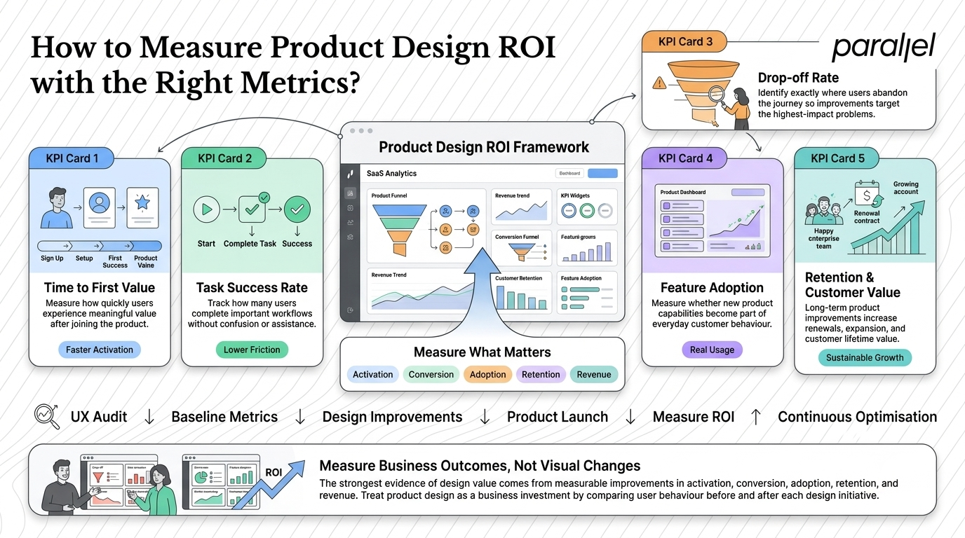
When founders ask me about product design ROI: how to measure design impact, I tell them to start with their highest friction touchpoints. Think about your onboarding flow or your pricing page. These are the areas where user confusion directly translates to lost revenue.
Industry data strongly supports this approach. Forrester's landmark research shows that every dollar invested in user experience returns 100 dollars. This represents a staggering 9,900% return on investment.
Furthermore, a late 2025 Monetate report highlights that average mobile e-commerce conversion rates hover around 2.1%. There is a massive gap between traffic and revenue that only thoughtful interaction design can bridge.
Here are the specific revenue-focused metrics you should track:
- Time to First Value: How fast a new user completes their first meaningful action in your product.
- Task Success Rate: The percentage of users who can complete a core workflow without seeking help.
- Drop-off Rate: The specific stage in a funnel where users abandon the process.
- Feature Adoption Rate: The percentage of active users who engage with a newly shipped feature.
By conducting a UX audit before starting development, you can baseline these metrics. Once the new design is live, the delta between the old and new numbers represents your direct financial return.
Applying revenue metrics in B2B SaaS
In B2B SaaS, the buying cycle is long and churn is expensive. Design impact here is often measured in retention and seat expansion.
If your product is confusing, teams will not adopt it. If they do not adopt it, the buyer will not renew the annual contract. We help teams map out the exact user journey to identify where enterprise users get stuck.
Simplifying a dashboard or improving a bulk-upload feature might seem like minor design tweaks. However, if those tweaks save a user ten minutes a day, product adoption skyrockets. This drives up customer lifetime value and directly impacts annual recurring revenue.
You can read more about tracking these specific indicators in our guide to SaaS metrics.
How does engineering rework affect product design ROI?
Making money is only half the equation. Saving money is equally important when calculating design value. Poor design drives up support costs and wastes incredibly expensive engineering hours.
We have seen engineering teams spend months building complex features that users fundamentally misunderstand. When the feature launches to crickets, the team has to tear it down and start over.
This cost avoidance is a massive factor in product design ROI: how to measure design impact. The IBM Systems Sciences Institute established a framework often called the 1-10-100 rule, which remains highly relevant for modern software teams.
Fixing a problem during the design phase costs one unit of resources. Fixing that same problem during development costs ten units. Fixing a failure after the product launches costs one hundred units in engineering time, QA cycles, and support load.
Deloitte's 2025 Global Business Services Survey highlighted this reality. They found that 50% of organizations achieved over 20% cost savings simply by focusing on experience-driven transformation.
Catching a usability flaw in a Figma prototype takes a designer one hour. Fixing that same flaw in production requires a full sprint of engineering work. Investing in early user research prevents this waste entirely.
The hidden cost of customer support
Bad design creates support tickets. Every time a user cannot figure out how to reset a password or export a report, they contact your support team.
Every support ticket costs money. If your interface requires a human to explain it, the interface has failed. We work with teams to identify the top ten reasons users contact support.
By designing self-service solutions and clarifying UI copy, you can drastically reduce this ticket volume. Calculate the average cost per support ticket and multiply it by the volume reduction. That number is pure profit added back to your bottom line.
Protecting your development budget
Your engineers are likely the most expensive resource in your company. Having them write code for unvalidated ideas is a massive financial risk.
By using wireframing and prototyping, you validate concepts before a single line of code is written. This ensures your development team only builds features that are proven to work.
The return on investment here is simple math. Calculate the hourly rate of your engineering team. Multiply that by the hours saved by not building the wrong thing. Design pays for itself by acting as a filter for engineering execution.
What is the practical framework for measuring product design ROI?
You cannot measure what you do not track. You need a structured, repeatable approach to quantify your design decisions. Teams that wing it never know what actually moved the needle.
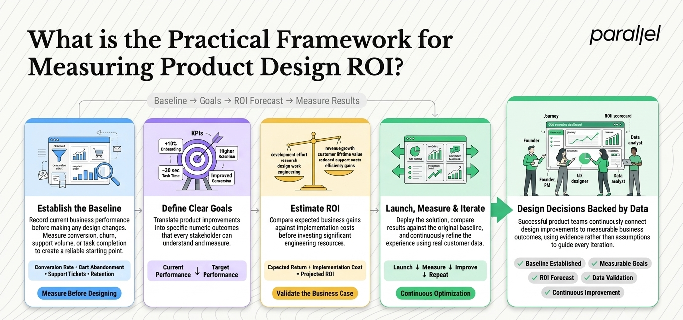
Here is the step-by-step framework we use to help teams build better products and track product design ROI: how to measure design impact accurately.
Step 1: Establish a clear baseline
Never start designing without knowing where you currently stand. Identify the specific business problem you are trying to solve.
Document the current conversion rate, churn rate, or support ticket volume. If you are trying to fix a complex checkout flow, record exactly how many users abandon their carts today. Baymard Institute data from 2026 shows average cart abandonment is 69.8%. Know your exact number before you touch a design tool.
Step 2: Define a numeric goal
Set a specific, realistic target for the design intervention. Do not just say you want to make the product better.
Decide if you want to increase onboarding completion by 10% or reduce the average task completion time by 30 seconds. This numeric goal gives the design team a clear target to hit. It aligns the entire product organization around a shared definition of success.
Step 3: Estimate gains and costs
Before committing resources, forecast what your proposed change will deliver.
For a checkout tweak, estimate the extra orders generated by a half-point lift in conversion. Multiply that by your average order value. Then, total up the cost of the research, design, and development required to make the change. Ensure the potential gain heavily outweighs the cost.
Step 4: Deploy, test, and measure
Launch the design update using a controlled environment. We highly recommend running a usability testing phase before a full public launch.
Once the feature is live, compare the new metrics against your baseline. Calculate the financial gain based on customer lifetime value or engineering hours saved. If you did not hit your goal, use the data to iterate and try again.
Table: Mapping design metrics to business value
Here is a simple way to visualize how specific design metrics translate to business outcomes.
How does qualitative data influence design ROI?
Numbers tell you what is happening in your product. Qualitative data tells you why it is happening. You need both to make smart product decisions.
Relying solely on analytics can lead you to optimize the wrong things. You might see a massive drop-off on a specific screen and assume the button color is wrong. A single conversation with a user might reveal that the copy is simply confusing.
Research from the Nielsen Norman Group consistently proves that testing with just five users uncovers 85% of a product's usability problems. This is an incredibly cost-efficient way to validate ideas.
You do not need massive sample sizes to find major friction points. You just need to watch real people try to use your software. When you combine hard analytics with real user conversations, your product strategy becomes infinitely sharper.
Running effective design sprints
One of the best ways to blend qualitative insight with rapid execution is through structured workshops.
We frequently run design sprints for our clients. In just a few days, we map a problem, prototype a solution, and test it with real users.
This compresses months of debate into a single week of validated learning. The ROI of a design sprint is massive because it completely eliminates the risk of building a product nobody wants. It forces teams to confront user reality before spending their engineering budget.
Selling design value to leadership and investors
Designers and product managers often struggle to secure budgets because they speak the wrong language. They talk to executives about empathy, white space, and visual hierarchy.
Executives and investors do not care about white space. They care about risk mitigation, growth, and margins. To get buy-in for design initiatives, you must translate UX improvements into financial terms.
Framing the conversation
Stop pitching redesigns based on aesthetics. Start pitching them based on business metrics.
Do not say, "Our dashboard looks outdated." Say, "Our current dashboard is causing a 15% drop-off in user activation, costing us roughly $50,000 in lost recurring revenue each month. We need to redesign the information architecture to fix this leak."
When you frame design as a tool for revenue protection, you get the budget you need. This exact approach is why our product design engagements are so successful. We align the design output directly with the founder's business goals.
Building a culture of measurement
Measuring design impact cannot be a one-time event. It must become part of your company culture.
Every time a team pitches a new feature, the first question should be about the metric it is intended to move. If the team cannot name the metric, the feature should not be built.
This level of discipline separates great companies from mediocre ones. It forces everyone to think deeply about user value rather than just shipping code for the sake of activity.
The role of an external design partner
Sometimes it is hard to read the label from inside the jar. Internal teams often become blind to the friction in their own products. They understand the software too well to see where new users get confused.
This is where an external partner provides immense value. At ParallelHQ, we bring fresh eyes and a structured methodology to your product challenges.
We do not just hand over pretty Figma files. We help you map opportunities, run audits, and implement a discovery framework that grounds your decisions in reality. We help you simplify the complex so your users can actually succeed.
Conclusion
Great design is not subjective. It is a measurable business asset that drives growth, retains users, and protects your engineering budget from wasteful execution.
When you stop treating design as an aesthetic layer and start treating it as a performance lever, your product outcomes will transform. Ground your decisions in data, stay close to your users, and the financial return on investment will follow naturally. Never build in the dark again.
Frequently Asked Questions
1) What is the exact formula for product design ROI: how to measure design impact?
To calculate this, subtract the total cost of the design investment from the financial gain it generated. Divide that number by the design cost and multiply by 100. This gives you the percentage return on your design investment.
2) Why is measuring design impact critical for startups?
Startups operate with limited runway and high stakes. Every product decision must drive growth or reduce operational costs. Measuring design impact ensures you are not wasting precious capital on features that fail to move core business metrics.
3) How do you measure the ROI of qualitative user research?
Track the engineering hours saved by not building unvalidated features. Compare the low cost of conducting a few user interviews against the massive cost of a two-week engineering sprint that ultimately requires a complete rework.
4) What is considered a good ROI for UX design?
While results vary heavily by industry and execution, baseline metrics are strong. Forrester research notes that every dollar invested in UX can return up to 100 dollars. A well-executed design strategy consistently delivers a positive financial return.
5) How long does it take to see the financial impact of design changes?
Some changes yield immediate results. An optimized checkout flow can increase conversions on the very first day. Deeper structural changes, like a complete onboarding redesign, may take a few months to fully reflect in your retention metrics.
6) Should early-stage seed companies focus on design ROI?
Absolutely. Early-stage teams must validate product-market fit as quickly as possible. Measuring design impact helps founders understand if their product interface is actually solving the core user problem effectively without unnecessary friction.
7) How does a UX audit improve overall design metrics?
A UX audit systematically identifies friction points and usability flaws in your current product. By isolating and fixing these specific issues, you can immediately lift conversion rates and lower user frustration without a complete rebuild.
8) How does ParallelHQ help teams measure and improve design value?
We act as a strategic product partner for early-stage and growth teams. We do not just build screens. We help founders clarify their product thinking, run structured design experiments, and track the exact metrics that drive business growth.

check out these related blogs