Money makes people anxious. When users open a financial application, they are not looking to be delighted by trendy animations. They are looking for safety, control, and absolute clarity. Over my years of building ParallelHQ, I have seen too many teams treat fintech UX as an exercise in aesthetics rather than a tool for building trust. They copy the superficial sleekness of popular neobanks but miss the underlying friction that causes users to abandon their journeys. The reality is simple. In financial products, trust is not a marketing message. Trust is a deliberate design decision.
How does good fintech UX build user trust?
Good fintech UX replaces user anxiety with absolute clarity. It builds trust through predictable interactions, transparent data handling, and friction-free error recovery. By giving users perceived control over their money, product teams drive higher adoption, retention, and engagement.
How does financial anxiety dictate user behavior?
People do not behave rationally when their money is involved. The baseline emotional state of a user opening a banking app is completely different from a user opening a social media platform. They are often braced for bad news.
A 2025 survey by the Financial Technology Association found that 79% of consumers prioritize a sense of control over their finances when choosing digital tools. If your product feels unpredictable, users will panic. They will assume the worst about their funds.
The foundation of fintech UX is psychology. Teams must assume the user is starting from a place of skepticism. Every screen, every button, and every micro-interaction must be designed to reassure the user that they are in the driver's seat.
When you ignore this emotional baseline, you build products that feel tone-deaf. A celebratory animation after a user pays off a late fee feels patronizing. A blank loading screen during a large transfer feels terrifying. We must design for the reality of financial anxiety.
Where do teams get trust wrong in fintech UX?
The biggest mistake we see is the pursuit of aesthetic simplicity at the expense of clarity. Startups want their product experience to feel magical and frictionless. But when money moves, users do not want magic. They want a receipt.
Designers often strip away important contextual information to make a screen look cleaner. They hide running balances behind tooltips. They remove confirmation steps to make transfers faster. When a user taps a button and the money instantly vanishes without a summary screen, that brief moment of silence destroys confidence.
In our product strategy consulting sessions, we frequently have to remind teams that friction is not always bad. Removing friction from a process that legally or financially requires careful thought is a massive liability.
Here is how we categorize the difference between poor and effective approaches to interface decisions:
Clarity always wins over visual minimalism. If a user has to guess what a button does, you have already lost their trust.
Why is the onboarding process often an onboarding crisis?
Onboarding is the first moment a user decides to trust you with their sensitive data. Unfortunately, it is also where most financial products fail entirely.
Fenergo's 2025 Financial Crime Industry Trends Report revealed a staggering statistic. Exactly 70% of financial institutions lost clients due to inefficient onboarding. This is the highest abandonment rate on record.
The regulatory requirements for Know Your Customer (KYC) and Anti-Money Laundering (AML) are strict. However, the way you present these requirements is up to you. Poor fintech UX asks for trust before earning it. Asking for a social security number on the first screen without explaining why is a guaranteed way to spike your drop-off rates.
The solution is progressive disclosure. We advise teams to ask for information only when the user takes an action that explicitly requires it.
Here are the rules we apply to onboarding:
- Explain the why. Always tell the user exactly why you need their camera access or their government ID.
- Break it down. Turn long compliance forms into single-question screens.
- Show progress. Use clear progress bars so users know exactly how much time the process will take.
- Allow pausing. Let users save their progress and return later if they do not have their documents ready.
When you respect the user's time and privacy, they are much more likely to complete the journey.
What is the structural framework for building trust in fintech?
Trust in digital finance is built on pattern recognition. When users interact with a consistent system, they develop a mental model that reduces their anxiety.

The Nielsen Norman Group notes that users form an opinion about a digital experience in just 50 milliseconds. Building deep trust requires meeting user needs consistently over time. Evaluating fintech UX requires looking at three specific structural qualities.
Perceived control
Users need to feel like they are directing the system. You provide this by offering unmistakable statuses. Use timestamped balances so users know exactly when their data was last updated. Give them clear paths to cancel pending actions.
Predictability
Keep your interaction patterns entirely consistent. A primary action button should always look and behave the same way across the entire application. We often implement robust design systems for our clients precisely to enforce this predictability. Consistency breeds familiarity, and familiarity breeds trust.
Emotional continuity
You must match the tone of your product to the gravity of the user's situation. A playful tone might work for a savings milestone. It is deeply inappropriate for a declined transaction alert. The interface must adapt its tone based on the context of the user's financial state.
When we map out user journeys, we look specifically for gaps in these three areas. Bridging those gaps is what separates a reliable tool from a frustrating toy.
Why should security be treated as a user interface feature?
Security is a backend requirement, but the perception of security is a frontend responsibility. Your product can have military-grade encryption, but if the interface looks sloppy, users will not believe it is secure.
You must design security features to be visible and reassuring. Biometric login prompts are a great example. They are technically secure, but they also feel modern and safe to the user.
We always recommend making data protection policies highly visible. Do not bury them in a terms of service document. Place short, plain-language security reassurances right next to sensitive input fields.
Consider these visible security signals:
- Visual lock icons next to bank connection prompts.
- Instant push notifications whenever a new device logs into the account.
- Masked account numbers that require a deliberate tap to reveal.
- Clear toggles for data sharing preferences.
The interface itself must communicate reliability. A typo in a financial app is not just a grammatical error. It is a massive red flag that makes users question the competence of the engineers handling their money.
How should you design the waiting experience in fintech?
Speed is generally the ultimate goal in software design. In financial technology, however, speed can actually break trust.
If a complex credit check or a massive international money transfer happens instantly, users often feel suspicious. They assume the system did not process their request thoroughly. This is a fascinating quirk of fintech UX. Sometimes, you have to slow the system down on purpose.
This concept is known as artificial friction. Adding a deliberate loading screen with clear status updates actually increases the user's confidence in the product.
When a user submits a loan application, do not just show a spinner. Show them the work.
- "Verifying your identity..."
- "Checking credit history..."
- "Securing your connection..."
- "Finalizing your application..."
Always design the waiting state. Never leave a user staring at a blank screen wondering if the app has crashed. By narrating the background processes, you transform a moment of anxiety into a moment of reassurance.
Why is microcopy powerful in financial moments?
Words matter immensely when money is on the line. The microcopy you use in your application can either de-escalate a stressful situation or make it much worse.
Most financial products fail at error recovery. When a transaction fails, a generic "Error 404" or "Something went wrong" message is unacceptable. The user immediately wonders if their money is lost.
Your copy must answer three questions instantly: What happened, why did it happen, and how do I fix it?
Here is a breakdown of how to improve financial microcopy:
A good UX audit always includes a deep review of product copy. You cannot separate the words from the interface. They work together to guide the user safely through complex tasks.
How do you measure effective product decisions in fintech?
You cannot improve what you do not measure. However, traditional metrics like time-on-task can be highly misleading in this industry.
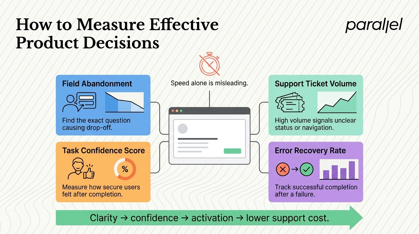
If a user takes longer to read a loan agreement, that is a sign of engagement and careful consideration. It is not a sign of bad design. Optimizing strictly for speed will often lead you to build non-compliant or confusing features.
Effective fintech UX requires tracking different behavioral signals. You must focus on the metrics that indicate confidence and clarity.
We recommend tracking the following data points:
- Abandonment rate by field. Find exactly which question in your onboarding flow causes users to close the app.
- Support ticket volume. Track the number of tickets related to basic navigation or transaction statuses. High volume means your interface is failing to explain itself.
- Task confidence scores. Ask users how confident they felt after completing a sensitive action.
- Error recovery rate. Measure how many users successfully complete a task after triggering an initial error state.
When you conduct usability testing, do not just ask if the user completed the task. Ask them to narrate their internal emotional state while doing it.
The ROI of UX in finance is directly tied to reducing customer support costs and increasing initial activation rates. A clear, trustworthy interface is the most profitable feature your engineering team can build.
How do you design for different user states?
Users do not use financial apps in a single frame of mind. Sometimes they are casually checking a balance. Other times, they panic because they lost their credit card.
You must design for both the planning state and the panic state. When a user is in a panic state, their cognitive load is maxed out. They cannot read dense paragraphs or navigate complex menus.
If a user needs to freeze a stolen card, that button must be accessible within two seconds of opening the app. It should not be buried under "Settings" and then "Account Management" and then "Security". It needs to be front and center.
Understanding UX laws and design principles helps teams map these emotional states to actual interface layouts. We map out the highest-stress scenarios and ensure the paths to resolution are completely frictionless.
What are the key takeaways for fintech UX?
The barrier to entry for financial products has never been lower. Bain & Company projects embedded finance revenue in the United States alone to reach roughly $51 billion by 2026. This means your users have endless alternatives just a tap away.
If your product makes them feel stupid, anxious, or ignored, they will leave. You do not need to reinvent the wheel to win their loyalty. You just need to show them that their money is safe in your hands. Ground your fintech UX in reality, respect the user's anxiety, and make clarity your absolute highest priority.
What are the frequently asked questions about fintech UX?
1) What is fintech UX?
It is the highly specialized process of designing interfaces and interactions for financial technology products. It focuses on simplifying complex financial data, ensuring regulatory compliance, and building deep user trust through clear, secure digital experiences.
2) How do you design for financial anxiety?
You design for anxiety by actively reducing uncertainty. This means providing extremely clear error messages, avoiding any hidden fees, making transaction statuses highly visible, and ensuring the interface behaves predictably at every single step.
3) Why is onboarding so critical in financial products?
Onboarding is the first moment a user decides to trust your company with their highly sensitive data. If the process is confusing or asks for too much information without proper context, users will abandon the app entirely before they even see your core features.
4) What is the difference between simplicity and clarity in financial design?
Simplicity is the act of removing visual elements to make a screen look cleaner. Clarity is ensuring the user understands exactly what is happening. In finance, removing important context to achieve visual simplicity often destroys clarity and breaks user trust.
5) How does a UX audit improve a financial product?
An audit identifies the specific points of friction where users drop off or experience anxiety. We evaluate the product against strict usability heuristics and provide actionable steps to fix trust-breaking design flaws before they impact revenue.
6) Is playful design appropriate for money apps?
It can be, but it must be used very carefully. Playfulness works well for saving milestones or gamified rewards. It backfires terribly during error states, declined transactions, or complex loan applications where a serious, professional tone is required.
7) How can artificial friction build trust?
In high-stakes actions like credit approvals or large fund transfers, users expect the system to do heavy lifting. Adding a slight delay with a transparent, step-by-step loading screen reassures them that their important request is being handled securely and thoroughly.
8) How does ParallelHQ help teams with fintech UX?
We work closely with founders and product teams to simplify their most complex financial features. Our fintech design services focus on grounded product thinking, helping companies build digital experiences that drive activation, reduce churn, and earn lasting user trust.

check out these related blogs