Building a product from scratch is an exercise in managing ambiguity. Most founders assume the hardest part is engineering. In my experience, the real trap is failing to validate the core user experience before writing a single line of code. Getting 0 to 1 product design right means stripping away features until only the essential value remains. I have seen too many early-stage teams burn their runway on complex interfaces that solve the wrong problems. This playbook breaks down how we approach the earliest stages of building at ParallelHQ.
What is effective 0 to 1 product design?
Effective 0 to 1 product design is about radical focus. It requires validating core assumptions, solving a single high-impact problem, and ignoring secondary features until the primary value proposition proves successful with real, unbiased users.
Why is the first product design decision critical?
When founders think about 0 to 1 product design, they often picture creating polished screens or trendy interfaces. This is a dangerous misconception. At this stage, design is entirely about risk mitigation and finding product-market fit. It is the process of translating a business hypothesis into a tangible artifact that users can react to.
The data paints a brutal picture for early-stage teams. According to 2025 global startup failure statistics, 42 percent of startups fail simply because there is no market need for what they built. They spend months, sometimes years, coding solutions to problems nobody actually cares about. This is a failure of discovery, not a failure of delivery.
Design is the cheapest and fastest way to test whether your business model holds water. Foundational research from the Nielsen Norman Group reinforces that catching usability and conceptual errors early can reduce development time by up to 50 percent. Every dollar invested in early user experience validation returns significantly more by preventing wasted engineering cycles.
In my work with founders, I always emphasize that your runway is not just measured in cash. It is measured in the number of iterations you can afford before the money runs out. If your first iteration takes six months of engineering, you only have one shot. If your first iteration takes two weeks of design and prototyping, you have a dozen shots at hitting the target.
This requires a fundamental shift in how technical founders view the design process. It is not the coat of paint you apply at the end. It is the architectural blueprint that proves the building will not collapse.
Why should you avoid the scale-first trap in product design?
The biggest mistake in 0 to 1 product design is building for scale too early. Founders often look at mature companies like Stripe, Notion, or Airbnb and try to replicate their current feature sets. They forget that those companies started with a single, highly constrained use case.
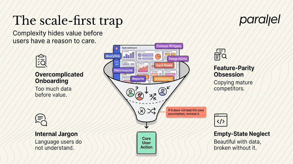
I see this pattern repeatedly in SaaS and fintech products. A team will build a massive dashboard with predictive analytics, customizable widgets, multi-tiered user permissions, and dark mode toggles. Meanwhile, their core onboarding flow is completely broken. New users cannot figure out how to complete the primary action that delivers value.
This bloat creates a noisy product experience. It confuses the user and obscures the very value you are trying to provide. When you throw ten features at a new user, they will likely ignore all ten.
Here are the most common failure patterns we observe across early-stage teams:
- Overcomplicating the onboarding: Asking users for too much data upfront before delivering any value. Teams want to capture demographic data for their own metrics, forcing users through friction-heavy sign-up walls.
- Feature parity obsession: Trying to match entrenched competitors feature-for-feature instead of doing one thing exceptionally well. You cannot beat a legacy product by copying its bloated feature set.
- Internal jargon as UI text: Using terminology that makes sense to the engineering or legal team but confuses the target customer.
- Ignoring the blank slate: Designing screens that look beautiful when filled with dummy data, but look broken and intimidating when a real user logs in for the first time.
Constraint is your greatest asset right now. If a feature does not directly prove or disprove your core business assumption, it does not belong in the initial build. You have to ruthlessly prioritize.
How do you approach validation in 0 to 1 product design?
A mature approach to 0 to 1 product design requires shifting your mindset from output generation to learning velocity. You are not building a final, static product. You are building a mechanism to learn what the final product should actually be.
We often look to IDEO and their human-centered design framework. They evaluate early concepts across three critical pillars: desirability, feasibility, and viability.
Most technical and business teams index heavily on feasibility (can our engineers build it) and viability (will this business model make money). They completely ignore desirability (do people actually want to use this). You can build a highly scalable, economically viable product that zero people want to log into.
To test desirability, you need high-fidelity prototypes, not necessarily high-fidelity code. A clickable prototype in design software can simulate a real product experience well enough to gather genuine user reactions. We frequently use our discovery framework to map out these critical user journeys before committing to a single line of frontend development.
This is where clarity in product thinking becomes a superpower. You have to ask hard questions and accept answers that might invalidate your original idea. It is painful to sit in a user research session and watch someone completely misunderstand your favorite feature. It is much more painful to learn this after spending six months and a massive chunk of funding building it.
What is the psychology of early adopters in product design?
To design effectively for the initial phase, you must understand the psychology of the early adopter. These are not your mainstream users. Mainstream users want reliability, comprehensive features, and social proof. Early adopters want a specific, painful problem solved immediately.
They are willing to forgive a lack of visual polish. They are willing to forgive minor bugs. They will not forgive a product that wastes their time or fails to deliver on its core promise.
Therefore, your design decisions must cater to speed to value. The "aha moment" (the exact point where the user realizes how your product improves their life) must happen as quickly as possible.
Consider a B2B SaaS tool designed to automate invoicing. If the user has to spend three hours configuring templates and setting up API keys before they can send their first invoice, they will churn. The design must facilitate sending that first invoice within minutes, even if it means hiding advanced customization settings behind secondary menus.
We map this out relentlessly. What is the minimum sequence of clicks required for the user to experience the core value? Every step added to that sequence reduces your activation rate.
What is the ParallelHQ framework for 0 to 1 product design?
Here is the exact framework we use for 0 to 1 product design at ParallelHQ. This process helps early-stage teams move from vague ideas to validated product directions rapidly and systematically.

We break this down into five distinct phases, engineered for speed and clarity.
Phase 1: Opportunity mapping and risk identification
Start by mapping out all your assumptions. Which assumption, if proven false, kills the entire business? This is usually related to user behavior. Will small business owners actually connect their live bank accounts to an unproven app?
We run intensive product strategy consulting sessions to isolate these existential risks immediately. You must separate what is risky from what is simply time-consuming to build.
Phase 2: Designing the minimum viable test
Once you know the primary risk, design the smallest possible experience to test it. This is not a Minimum Viable Product. This is a Minimum Viable Test. If you are building a complex AI workflow tool, maybe your first test is a single text input and a hard-coded output visualized in a static format.
We rely heavily on wireframing and prototyping to create these thin slices. The goal is to create just enough illusion of functionality to observe authentic user behavior.
Phase 3: The design sprint compression
When a startup team is spinning in circles debating features, a time-boxed exercise forces decisions. We compress months of back-and-forth into a few intensive days.
Our approach to design sprints defines the challenge, sketches solutions, builds a realistic prototype, and tests it with users all within one week. This shifts the conversation from subjective opinions among founders to objective observations of real users.
Phase 4: Structured usability testing
Put the prototype in front of real, unbiased users. Do not test with your friends, family, or investors. They will likely lie to you to protect your feelings or their investment.
According to foundational research by the Nielsen Norman Group, testing with just five targeted users uncovers roughly 85 percent of a product's core usability problems. We run rigorous usability testing to watch what users do, not just what they say. We look for points of hesitation, confusion, and delight.
Phase 5: Synthesis and strategic pivot
Look at the data objectively. Did users complete the core action? Did they understand the value proposition immediately?
If they struggled, you need to iterate the design. If they succeeded, you have the green light to move into MVP development. This phase requires immense intellectual honesty from the founding team.
What are the economics of clarity and design debt?
Let us talk about the financial reality of product decisions. Building software is expensive. Redesigning software after it has been built is exponentially more expensive.
When you skip the design and validation phase, you are effectively taking out a high-interest loan on your product architecture. You accumulate design debt and technical debt simultaneously. You build backend systems to support frontend features that users do not even want.
I have watched teams providing SaaS design services spend weeks unraveling complicated navigation structures that a startup hastily shipped just to hit an arbitrary launch deadline. The founders thought they were moving fast. In reality, they were building a product that required extensive customer support and manual intervention just to function.
True speed comes from alignment. When the design is clear, the engineering team knows exactly what to build without guessing. The marketing team knows exactly what to sell. The user knows exactly what to do.
The Financial Impact of Design Clarity
This table illustrates why we treat design as a strategic business function. It is not about making things look pretty. It is about making the business model economically viable.
How do case studies demonstrate the power of design constraints?
To make this concrete, let us look at how constraint plays out in different startup sectors.
The fintech example A common challenge in fintech is building trust quickly. We often see early fintech teams try to design comprehensive financial hubs from day one. They include budgeting tools, investment trackers, and crypto wallets.
The successful approach is radically different. A strong early-stage fintech product focuses on one transaction. Moving money from point A to point B faster, cheaper, or with more transparency. The design challenge is entirely focused on the security and clarity of that single transaction flow. Only after that behavior is proven do you layer on additional services.
The healthtech example In healthtech, the user base is often stressed, distracted, or dealing with cognitive overload. Complex interfaces are dangerous here. We worked with teams where the instinct was to present physicians with massive dashboards of patient data.
Through targeted user research, it became clear that physicians needed binary decision support, not more raw data. The design was stripped back to highlight anomalous data points, requiring only a glance. Simplifying the interface directly improved patient care outcomes and product adoption.
Designing the unseen engine
How do you design the unseen engine of a product?
Founders often obsess over the visual layer. They worry about the colors, the typography, and the logo. While branding matters eventually, it cannot save a fundamentally flawed user flow. If a user cannot figure out how to reset their password or invite a team member, the aesthetic polish is irrelevant.
This is why we advocate for low-fidelity wireframing early on. It forces everyone to look at the structure and the logic. If the product makes sense as a series of gray boxes and simple text, it will shine when the visual layer is applied. If the gray boxes are confusing, no amount of UI trends will fix the underlying problem.
How do you transition from 0 to 1 to 10?
Eventually, you will find traction. The small group of early adopters will validate your core thesis. At this point, the rules of design begin to shift.
You are no longer just fighting for survival. You are fighting for scale. This is when you begin building comprehensive design systems. You start addressing edge cases, accessibility standards, and broader feature requests.
But you can only earn the right to tackle these scaling challenges if you survive the initial phase. The discipline you build in the early days will become the cultural foundation of your product team as it grows. The habit of validating assumptions, talking to users, and keeping interfaces clean pays dividends forever.
How can you master 0 to 1 product design?
Building a new product is an incredible challenge. The odds are inherently stacked against you. But you can drastically improve those odds by choosing to be disciplined in your early decisions.
The goal of the first version of your product is not a massive public launch to millions of people. The goal is rapid, undeniable learning from a specific set of users. Keep the interface simple. Keep the feature set constrained. Listen to what the user behavior is telling you, not just what they say in interviews.
Good design at this stage is invisible. It simply gets out of the way and lets the user experience the core value of your idea. Let the thinking speak for itself, and the product will follow.
Frequently Asked Questions about 0 to 1 product design
1) What is 0 to 1 product design?
It is the process of taking an abstract idea and turning it into a validated, tangible product for the very first time. It focuses heavily on discovering product-market fit, testing core assumptions, and defining the absolute minimum feature set required to deliver value to early adopters.
2) How is 0 to 1 product design different from scaling?
Scaling focuses on optimization, performance, edge cases, and building comprehensive design systems for thousands of users. The initial zero to one phase is entirely about survival and validation. You are simply trying to prove that the problem exists and that your specific solution is desirable.
3) What is the role of a founder during this phase?
Founders must act as the primary researchers and product decision-makers. You should be present in user interviews, observing reactions firsthand. Your primary job is to enforce strict constraints, prevent feature creep from the engineering team, and ensure the product remains relentlessly focused on solving the core problem.
4) Should we focus on UI or UX first?
User Experience (UX) must always come first. A beautiful User Interface (UI) cannot save a product that solves the wrong problem or has confusing navigation. Focus on the architecture, workflows, and value proposition before worrying about colors, typography, or visual polish.
5) How long should this phase take?
While it varies heavily by industry and complexity, a focused team can usually validate core assumptions and design a testable prototype within four to eight weeks. If you are spending six months in the design and planning phase without putting anything in front of real users, you are moving too slowly and overthinking the solution.
6) How do I know when we have reached the '1'?
You have reached the '1' when you have a small but highly engaged group of users who are consistently using the product to solve their problem without your manual intervention. Qualitative feedback will shift from confusion about how it works to requests for more capability. This indicates you have found a foundation worth building upon.
7) Is this right for me if I already have an MVP built?
If you have an MVP but are struggling with low activation, high churn, or confused users, you likely need to revisit this foundational thinking. Many teams build an MVP based on assumptions rather than validation. Stepping back to assess the core experience and run structured testing can course-correct a failing product.
8) Why choose ParallelHQ for 0 to 1 product design?
We have spent years working closely with early-stage teams to navigate the chaos of building from scratch. We do not just deliver beautiful screens. We partner with founders to bring deep clarity to complex product decisions, ensuring the initial product is simple, usable, and tightly grounded in real user needs.

check out these related blogs