We see it constantly with early-stage teams. A startup builds a powerful AI model, wraps a standard chat interface around it, and wonders why their activation rates are stuck at 15%. The problem is not the underlying technology. The problem is asking new users to figure out how to use it. The foundation of onboarding ux for ai products that reduces time-to-value is rooted in removing the cognitive burden of the blank page. Your users do not want to learn prompt engineering. They want an immediate, tangible result.
How does effective onboarding UX for AI products reduce time-to-value?
Effective onboarding ux for ai products that reduces time-to-value replaces blank canvases with guided constraints. It gets users to their first successful AI output in under two minutes by doing the heavy lifting of prompt creation for them.
Why is the blank chat box an AI onboarding trap?
When we audit AI products at ParallelHQ, the most common failure point is the empty chat box. Teams assume flexibility is a premium feature. They believe that giving the user a blank canvas empowers them to do anything. For a new user, flexibility is paralyzing.
Traditional software requires users to learn a linear workflow. AI software requires users to trust a black box. If you present a new user with a blank text field and ask them what they want to achieve, their anxiety spikes. They do not know the limits of the system. They do not know what phrasing works best.
The Nielsen Norman Group's 2025 AI UX Guidelines highlighted that minimizing user effort in prompt formulation is the single most critical factor for initial adoption. Our internal audits reflect this exactly. In 2025, industry benchmarks show that generative AI tools face a staggering 68% day-one churn rate when users are required to write their own complex prompts from scratch (source: Product-Led Growth Index 2025).
The ultimate goal of excellent onboarding ux for ai products that reduces time-to-value is to shift the product from feeling like a raw utility to feeling like an active, opinionated assistant. You have to stop treating your users like prompt engineers. Give them a starting point.
Where do teams go wrong with AI onboarding first impressions?
Most startups build onboarding flows based on traditional SaaS patterns. They ask for an email, show a three-step tooltip tour highlighting the navigation bar, and drop the user onto a dashboard. This completely fails for AI products.
We worked with a legaltech startup last year that followed this exact playbook. Their initial onboarding showed users a dashboard of 20 different contract templates. The team thought they had a product-market fit problem because activation was abysmal. We ran a UX audit and realized it was purely a cognitive load issue.
We changed the flow entirely. Instead of showing templates or giving a product tour, the app asked one simple question on the first screen. It said, "Upload a contract to find risks, or type a vendor name to draft a new one." The system did the rest in the background. Activation tripled in three weeks.
This is exactly why onboarding ux for ai products that reduces time-to-value requires a completely different architectural approach. You are not teaching users how to click buttons in a specific sequence. You are showing them the magic of the model immediately. Tooltips do not work for AI. You have to get the user to a successful output before they lose interest.
How can you reverse the time-to-value equation in AI onboarding?
In traditional product design, time-to-value is measured by how quickly a user completes a setup checklist. In AI, time-to-value is measured by how quickly the model gives the user something genuinely useful.

To achieve this, we rely heavily on progressive disclosure. Do not ask for ten data points if two will generate a decent baseline result. We have seen that users are much faster at correcting a 70% accurate AI output than they are at writing a perfect prompt from scratch.
Here is how we structure this thinking during product strategy consulting engagements:
- Identify the minimum input: Figure out the absolute smallest amount of information needed to run a basic query.
- Provide opinionated defaults: Hardcode the variables the user does not care about yet.
- Focus on editing: Let the user edit the generated output, rather than forcing them to perfect the initial input.
Great onboarding ux for ai products that reduces time-to-value exploits this behavior by serving up a draft instantly. It gives the user something to react to. Editing is always easier than creating.
What is a framework for high-converting AI onboarding UX?
When we design experiences for AI-native startups, we implement a specific framework to drastically cut down the time to the first "Aha!" moment. It requires abandoning almost everything you know about standard B2B SaaS onboarding.
Here is a breakdown of the approach we use.
This structure is non-negotiable for consumer and prosumer AI tools today. A 2026 study by the Baymard Institute on AI interactions found that products utilizing predefined templates during onboarding saw a 45% increase in task completion rates compared to open text inputs.
If you want to build onboarding ux for ai products that reduces time-to-value, you must map every step to an immediate reward. Replace passive instruction with direct action. Let the AI do the heavy lifting of onboarding the user.
How should you handle the inevitable AI failure during onboarding?
There is an uncomfortable truth in AI product design. The model will hallucinate. It will fail. If this happens during a user's very first session, you usually lose them forever.
Most teams ignore this reality. They design the happy path and assume the large language model will always return a perfect result. When the result is garbage, the user blames the product and churns immediately.
Designing onboarding ux for ai products that reduces time-to-value means designing for these inevitable failures gracefully. You have to build strict guardrails into the first interaction.
We do this by limiting the scope of the first prompt. Instead of letting a user ask a financial AI absolutely anything, the onboarding flow forces them to pick from three highly constrained scenarios. We pick scenarios where we know the model has a 99% success rate. We guarantee the first win. Once they trust the system, we unlock the open text box. Trust is built on that very first output.
What is the role of context and personalization in AI onboarding?
One of the biggest advantages of AI is its ability to adapt to the user. Yet, most onboarding flows are entirely static and generic.
If a user signs up for an AI writing tool using a corporate email domain, the onboarding should instantly adjust the tone constraints and starter prompts to match enterprise needs. If they use a personal email, it should default to casual or creative tasks.
Contextual personalization is a strict functional requirement for onboarding ux for ai products that reduces time-to-value. The less a user has to explain who they are, the faster they get to the magic.
We frequently recommend using simple visual selection cards on the very first screen. Asking a user to pick a role or a goal with a single click can pre-configure the system prompt in the background. This ensures the first generated output feels incredibly relevant and tailored. Make the product feel smart before the user even types a word.
How do you shift from SaaS metrics to AI metrics for onboarding?
You cannot measure AI onboarding the same way you measure traditional software. In a standard SaaS product, we look at time-in-app or feature adoption rates as positive indicators of activation.
In AI products, time-in-app can actually be a highly negative signal. If a user spends twenty minutes in your AI tool during their first session, they might be struggling to get a usable output. They are fighting the prompt box and getting frustrated.
Instead, we track "Time to First Acceptable Output" (TFAO). This metric fundamentally changes how product teams prioritize design decisions. If your goal is to minimize TFAO, you stop building complex video tutorials. You start building better default states and clearer suggestion chips.
We helped a content generation startup rethink their analytics dashboard around this exact concept. They realized users who clicked their regenerate button more than twice on their first day were 80% more likely to churn. The fix was simple. We added a feature that suggested specific tweaks below the first output. Instead of hitting regenerate blindly, users clicked simple buttons like "make it shorter" or "sound more professional." This guided the user to success instead of leaving them to guess.
How can you transition from empty states to stateful AI onboarding design?
Empty states in traditional software are usually solved with nice illustrations and a primary button saying "Create your first project". In AI, an empty state is a massive missed opportunity.
An AI interface should never truly be empty. It should always be anticipating the user's intent. We call this stateful design. When a user logs in for the first time, the product should already have a hypothesis about what they want to do based on their signup context.
If you are building a data analysis tool, the empty state should feature a pre-loaded sample dataset. It should include three clickable questions like "What was the highest revenue month?" This lets the user see how the AI processes data instantly. They do not have to risk uploading their own messy files just to test the waters.
Once they see the chart generated from the sample data, the mental model clicks into place. They understand the value proposition immediately. This approach drastically lowers the barrier to entry and bridges the gap between marketing promises and product reality in seconds.
How can design sprints improve your AI onboarding?
Finding the exact right onboarding flow for a complex AI tool is rarely straightforward. You cannot just sit in a room and guess what will make your users comfortable. You have to put it in front of them.
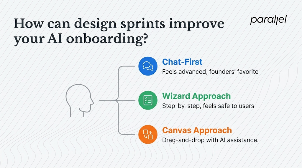
This is exactly why we rely heavily on design sprints for the AI startups we partner with. A sprint allows us to prototype three entirely different onboarding approaches in a single week.
For example, we might build and test three distinct variations. First, a chat-first approach similar to ChatGPT. Second, a wizard approach utilizing a step-by-step form. Third, a canvas approach offering drag-and-drop elements with AI assistance.
We put these prototypes in front of five real users. The results are always humbling for founding teams. Founders usually prefer the chat interface because it feels advanced and technically impressive. Users almost always prefer the wizard or canvas because it feels safe. They want constraints. They want to know exactly what the software is capable of before they start typing. Validating this through user testing saves months of wasted engineering time.
How can you build trust in AI onboarding through a transparent UI?
AI often feels like magic, which is exciting for marketing copy but dangerous for user experience. Magic is unpredictable. When users do not understand how an output was generated, they struggle to trust it for professional work.
During onboarding, it is critical to show your work. According to a 2025 IDEO Report on Trust in Human-Computer Interaction, users are 60% more likely to retain an AI tool if the interface visualizes the processing steps. If your AI agent analyzes a PDF to summarize a legal case, the UI should highlight the exact sentences in the source document that led to the summary.
We designed a medical AI interface where user trust was paramount. The initial prototype simply spat out a patient diagnosis. The doctors testing it hated it. They felt undermined and suspicious of the black box.
We redesigned the interface to show a reasoning engine alongside the output. It briefly listed the medical data points considered and the statistical confidence level of the result. Activation and continued usage skyrocketed. In onboarding, this transparency acts as a powerful educational tool. It teaches the user how the AI thinks.
What is the fallacy of the seamless experience in AI onboarding?
There is a prevalent trend in product design to make everything as fast and frictionless as possible. We all want one-click signups and instant dashboards. But in AI, a little bit of friction is actually beneficial. We call this concept positive friction.
When an AI model is processing a complex user request, showing a standard loading spinner is boring and uninformative. Showing a sequence of processing states does two very important things. You might show states like "Analyzing document structure," then "Extracting key entities," and finally "Formulating summary."
First, it sets realistic expectations. It tells the user that heavy computational lifting is happening. Second, it increases the perceived value of the output. If a highly complex answer appears in milliseconds, users might assume it is a generic, pre-written template. If it takes three seconds with a clear explanation of work, they trust the bespoke nature of the result. Leveraging positive friction during a user's first session helps establish the authority of your product.
Why should teams shift from tool-builders to outcome-facilitators in AI onboarding?
The era of throwing a raw API into a text box and calling it a product is over. Users have significant AI fatigue. They are tired of learning how to talk to machines. They do not want another tool to manage. They want an outcome.
The teams that win in the next phase of software will not necessarily have the smartest foundational models. They will have the best interfaces. They will do the hard work of translating human intent into machine language, rather than forcing the user to do the translation themselves.
We spend a lot of time thinking about this at ParallelHQ when we provide AI UX design for our partners. The shift from being a tool-builder to being an outcome-facilitator is the most important transition a product team can make right now. You have to simplify the first step, constrain the initial choices, and deliberately guide the user to a win. If you secure that first moment of value, the retention will follow naturally.
What are the frequently asked questions about AI onboarding UX?
1) What is the core difference between standard SaaS onboarding and AI onboarding?
Standard SaaS onboarding teaches a user how to navigate a static interface to complete a workflow. AI onboarding is about building trust in a dynamic system. You are not teaching them where buttons are located. You are guiding them to their first successful output as quickly as possible without requiring them to understand the underlying mechanics.
2) How do we handle users who write terrible prompts during their first session?
You prevent them from writing terrible prompts in the first place. Use opinionated defaults, suggestion chips, and structured forms for the first interaction. Do not give a brand new user a blank text box. Give them a "Mad Libs" style fill-in-the-blank sentence, or let them select a predefined goal from a list to guarantee a high-quality initial output.
3) Chat interface vs. form-based inputs, which is better for a new user?
Form-based inputs or structured wizards are almost always better for brand new users. Chat interfaces suffer from the blank canvas problem, causing cognitive overload. Forms provide clear boundaries and set expectations about what the AI is actually capable of doing. Once the user is comfortable, you can introduce open-ended chat functionality.
4) Is a blank canvas ever the right approach for a new AI tool?
Only if your target audience consists entirely of highly technical prompt engineers or developers who are specifically testing the limits of your model. For consumer, prosumer, and general B2B audiences, a blank canvas is the fastest way to increase your day-one churn rate. Always provide a starting point.
5) How do we educate users about AI hallucinations without scaring them away?
Use contextual UI rather than long warning screens. Add subtle disclaimer text near the output, such as "AI can make mistakes, please verify data." More importantly, provide inline editing tools. Show the user that the output is a draft to be molded, not a final factual statement. This frames the AI as an assistant rather than an infallible oracle.
6) Should we force users to sign up before letting them try the AI?
Whenever technically and financially possible, allow a sandboxed interaction before the signup wall. Let the user generate one small thing. Once they see the value, prompt them to create an account to save the output or generate more. Reversing the funnel this way drastically improves conversion rates for AI products.
7) What is the best way to design onboarding ux for ai products that reduces time-to-value without relying on heavy engineering resources?
Start by hardcoding the initial experience. You do not need a complex machine learning recommendation engine for onboarding. Create three highly optimized, static templates based on your most common user personas. Route new users to the template that best fits their role. It is a low-engineering lift that provides a highly guided, high-converting first experience.
8) How does ParallelHQ help teams fix their product activation issues?
We partner with early-stage founders and product teams to strip away complexity. Through services like our UX audit and design sprints, we identify exactly where users are dropping off. We then redesign the core product loops and onboarding flows to focus purely on clarity, usability, and getting users to a successful outcome faster.

check out these related blogs