Founders constantly ask me what a vision prototype is and why investors demand it before writing a check. In the early days of a startup, you have a grand idea but limited resources. You need capital to build the product, but venture capitalists want to see the product before they commit capital. This creates a challenging paradox for early stage teams. In my years working with product leaders, I have seen how a tangible artifact breaks this deadlock. It replaces abstract pitch deck promises with a concrete experience. Here is exactly how we approach this critical design phase.
What is a vision prototype fundamentally?
You might wonder exactly what a vision prototype is when planning your roadmap. It is a high fidelity interactive simulation of your future product. It looks and feels real but contains no backend code. It exists purely to validate ideas and secure investor buy in.
Why do founders need a vision prototype before raising capital?
The venture capital landscape in 2026 is brutal. According to recent pitch deck data from Unbiased Ventures, investors spend an average of just under four minutes reviewing a deck. They scan for traction, unit economics, and clarity. When you lack historical data, your product narrative must carry the entire weight of your pitch.
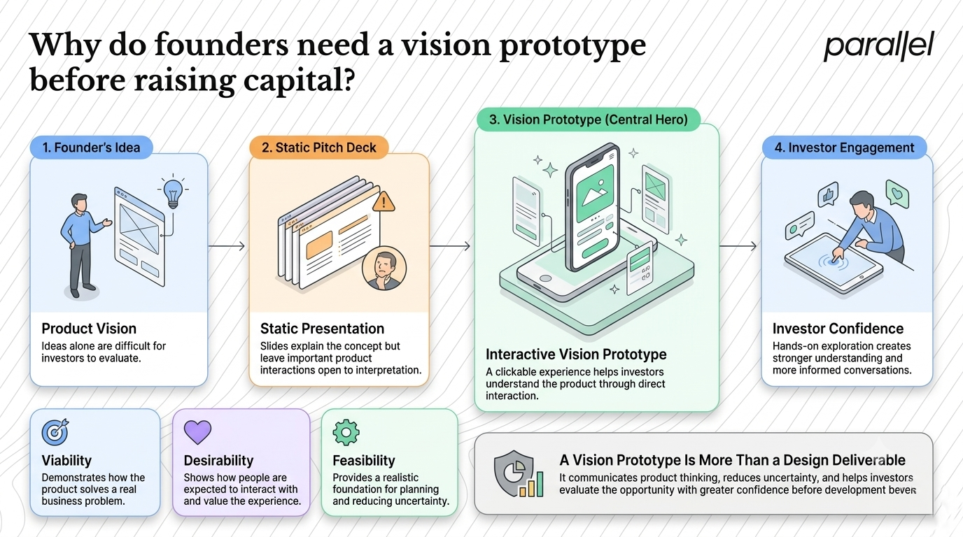
This is where a static slide deck fails. You can write bullet points about an intuitive interface all day. An investor will not believe it until they click through it themselves. A functional simulation bridges the gap between your abstract concept and their concrete understanding. It proves that you have thought through the user journey in detail.
Let us dive into the psychology of a VC pitch. When an investor sits through their fifth pitch of the day, their default state is skepticism. They are actively looking for reasons to say no. A static pitch deck allows their mind to wander to risks and hypothetical problems.
When you hand them a phone with a clickable application, their posture changes. They lean forward and start tapping the screen. They stop acting as a critic and start acting as a user. This psychological shift is monumental for a founder trying to secure funding.
The Nielsen Norman Group has documented how early prototyping and testing reduces development rework significantly. When you validate the core loop before writing code, your development estimates become up to fifty percent more accurate. This level of derisking is exactly what investors look for. They want to know you are not going to burn their capital figuring out basic user experience flaws.
We apply this thinking across all our product strategy consulting engagements. The goal is never just to make something look pretty. The goal is to build a strategic asset that communicates viability, desirability, and feasibility in a single package.
Where do teams fail when exploring a vision prototype?
The biggest mistake founders make is confusing a prototype with a minimum viable product. They try to build too much. They hire engineers, set up databases, and spend six months writing code for features that users might not even want.
This approach drains your runway rapidly. If you learn that your core assumption is wrong after building an MVP, pivoting is incredibly expensive. You have to scrap code, rethink your architecture, and demoralize your engineering team. This is a classic symptom of overcomplicating product decisions.
Another common trap is staying in low fidelity for too long. Wireframes are excellent for internal team alignment. They are terrible for external fundraising. An investor needs to see the final polish to gauge the market standard. If you show them a gray box wireframe, they will struggle to imagine the premium experience you are promising.
We frequently conduct a UX audit for startups that failed to raise their seed round. The pattern is remarkably consistent. They either built a clunky MVP that failed to impress, or they presented a vague deck with no tangible product vision.
To illustrate this, consider the following breakdown of common missteps we observe:
Founders also fall in love with features instead of solutions. They believe that adding a chat function or a social feed will make their product more investable. In reality, feature bloat confuses investors and signals a lack of product focus. A strong simulation focuses entirely on the core value proposition.
Another critical error is neglecting the empty state. Founders often design simulations filled with perfect data and active users. But when a real user signs up, the dashboard is empty. Investors look for this transition. They want to see how you guide a new user from a blank slate to a moment of value.
We spend a lot of time in our SaaS onboarding teardowns fixing this exact issue. If your simulation does not include a flawless onboarding flow, it is incomplete. The first five minutes of the user journey are the most heavily scrutinized by venture capitalists.
How should you think about a vision prototype strategically?
You must treat this artifact as a storytelling device. It is not a functional piece of software. It is a prop for your pitch. Its primary job is to make the future feel inevitable to anyone who uses it.
When global design firms talk about prototyping, they emphasize the concept of building to think. A prototype forces you to answer hard questions. When you design a checkout flow, you have to decide exactly what information you need from the user. You cannot hide behind vague statements like "we will optimize the checkout." You have to actually draw it out.
This forced clarity is invaluable for internal alignment. I have sat in rooms where a CEO and a CTO argued for hours about a feature. When we mapped it out in a design sprint, the argument evaporated instantly. Seeing the flow on a screen makes abstract disagreements concrete and solvable.
You need to view this phase as risk mitigation. Startup failure is rarely due to a lack of technical capability. Teams fail because they build something nobody wants to buy. A simulation is the cheapest and fastest way to test market demand before committing to heavy engineering resources.
Think of it as a movie set. When you watch a film, you see a bustling city street. In reality, it is just a facade propped up by wooden beams. The audience does not care about the wooden beams. They care about the story. Your prototype is a facade designed to sell a specific story.
This mindset frees you from technical constraints. You do not have to worry about API rate limits or database latency during this phase. You can design the absolute ideal user experience. Once you sell that ideal vision, you can figure out the technical compromises later with your engineering team.
In our work with complex platforms, particularly through our AI UX design engagements, we use this phase to deeply simplify technical workflows. If an AI tool requires a user to understand machine learning parameters, it will fail. We use the design phase to abstract that complexity into a simple interface. The investor sees the simple interface and immediately understands the mass market potential.
What are the practical steps to building a vision prototype?
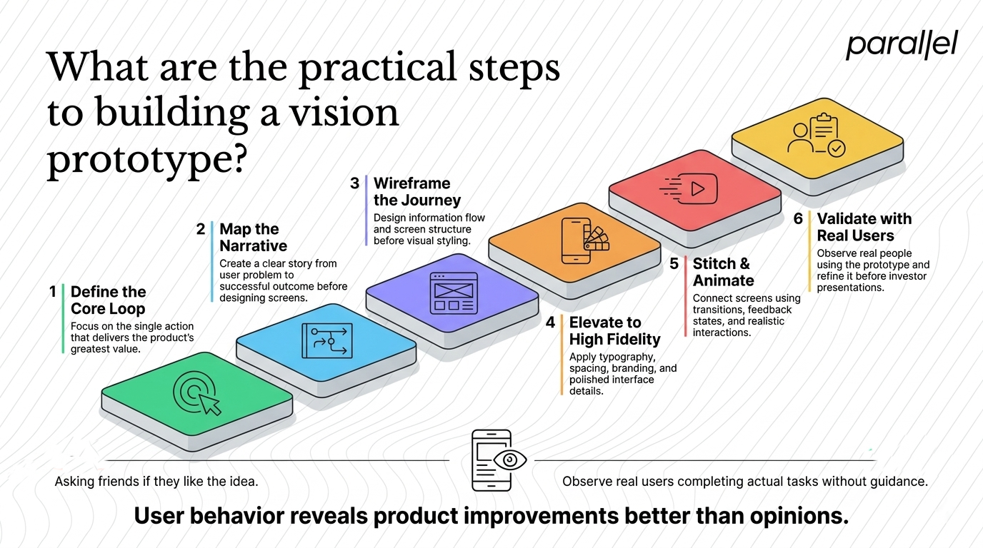
Building this correctly requires a systematic approach. You cannot just open a design tool and start drawing screens randomly. You need a structured process that moves from raw concept to a polished asset. Here is the exact sequence we use at ParallelHQ.
Step 1: Define the core loop
Do not try to design every edge case or secondary feature. Identify the single most important action a user takes in your product. For a fintech app, it might be transferring money. Define this core loop clearly. Ignore the settings menu, the forgot password flow, and the terms of service entirely. Focus entirely on the magic moment where the user receives value.
Step 2: Map the narrative
Before touching a pixel, write down the story you want to tell the investor. The user has a problem. The user discovers your product. The user experiences frictionless onboarding. The user achieves their goal. This narrative becomes the script for your pitch. Every screen you design must serve this exact story. We often use our discovery framework to extract this precise narrative from founders.
Step 3: Wireframe the journey
Now you can start drawing. Use low fidelity wireframes to block out the structure and information architecture. Where does the primary call to action sit? How does the user navigate between steps? This phase is about logic, not aesthetics. Test these wireframes internally. If a team member cannot explain the flow, it is too complex and needs simplifying.
Step 4: Elevate to high fidelity
This is where the magic happens. You take the logical wireframes and apply premium typography, spacing, and brand colors. The goal is to make it indistinguishable from a live app downloaded from the App Store. Investors are pattern matchers who associate clean design with competent execution. If you need support executing this level of polish, our Figma design services specialize in this exact transformation.
Step 5: Stitch and animate
A folder of static images is not a simulation. You must connect the screens logically. Add transitions, hover states, and loading animations. If the user clicks a button, show a brief success state. These micro interactions sell the illusion of functional software. Modern design tools make this incredibly accessible today.
Step 6: Validate with real users
Never show an investor a prototype that has not been tested by real users. Run five moderated testing sessions with your target audience. Watch where users click and listen to their confusion. Fix the glaring errors. When you finally pitch the VC, you can confidently say the design has already been validated. This is a core component of our usability testing methodology.
Validation is not asking your friends if they like your idea. Your friends will lie to you to protect your feelings. Validation is watching a stranger struggle to use your product. When you conduct a usability test, you must remain completely silent and simply observe their behavior. That raw frustration is the exact data you need to fix the design.
What is the true return on investment for early design prototyping?
Founders often worry about the cost of professional design services at the seed stage. They view it as an expense rather than a strategic investment. This is a fundamental misunderstanding of venture economics and early stage product development in 2026.
When you secure a seed round, you are essentially selling a portion of your company based on a perceived valuation. A strong, validated product vision increases that perceived value significantly. If a high fidelity simulation helps you raise capital at a twenty percent higher valuation, the design work pays for itself tenfold.
Furthermore, consider the actual cost of engineering. The average developer salary is a massive line item for an early stage startup. If you build an MVP without validating the design first, you are paying engineering rates for discovery work. Prototyping allows you to do discovery work at design rates, which are significantly more efficient.
Consider the handoff to engineering. Without a clear visual guide, developers have to guess how a feature should work. They build it, the founder reviews it, and says it is wrong. They rebuild it. This cycle burns thousands of dollars in hourly engineering rates and delays your launch.
When you provide developers with a comprehensive, clickable simulation, the guesswork is eliminated. They can inspect the CSS values directly in the design file. They can see the exact animation timing. Development speed increases dramatically. We have seen this efficiency firsthand in our AI software design services.
We have seen this play out repeatedly in our MVP development partnerships. Teams that invest heavily in the pre code design phase launch faster and require fewer iterations post launch. They have a clear blueprint. The engineers know exactly what to build, how it should behave, and why it matters.
For specialized industries, this visual proof is even more critical. In our fintech design services, trust is the primary currency. Users will not connect their bank accounts to an app that looks amateurish. Investors know this reality perfectly. They will heavily scrutinize the design quality of a financial product before investing a single dollar.
A polished artifact is also a powerful recruiting tool. When you are trying to hire a world class technical lead, equity is not always enough. They want to know the company has a strong foundation. Showing them a brilliant product vision convinces top talent that your startup is worth their time and career risk.
Conclusion
The startup ecosystem will only become more competitive. Capital is available, but the bar for securing it has never been higher. You cannot rely on a charismatic pitch and a spreadsheet full of projections anymore. Investors demand visual proof of execution.
By building a highly realistic interactive simulation, you control the narrative. You show rather than tell. You derisk the engineering phase and prove that you deeply understand your user. It is the single most effective tool for transforming an abstract idea into a fundable reality. Focus on clarity, validate your assumptions, and let the product experience do the heavy lifting in your next pitch meeting.
Frequently asked questions
1) What is a vision prototype compared to a minimum viable product?
A prototype is a clickable simulation with no backend code, designed to test the user experience and secure funding. An MVP is a coded, functional product with minimal features, designed to be released to the public to generate real usage data and revenue.
2) How long does it take to create a high fidelity simulation?
In our experience, a focused team can take a concept from raw idea to a polished, testable simulation in three to four weeks. This involves rapid iterations, clear decision making, and a strict adherence to designing only the core user loop.
3) Do investors expect fully functional code at the seed stage?
Not always. While having traction is ideal, many seed stage investors are willing to fund strong teams with a deeply validated concept. A high quality simulation often serves as sufficient proof that the team can execute on the product vision effectively.
4) What tools are best for building these artifacts in 2026?
Figma remains the industry standard for high fidelity interface design and basic prototyping. For more complex animations and advanced interactions, tools like Framer or Protopie are excellent choices to make the experience feel completely real to the user.
5) How do we test a simulation with early users properly?
Recruit five people who match your ideal customer profile perfectly. Ask them to complete a specific task using the simulation while thinking out loud. Record the session without guiding them. Their struggles will highlight exactly where the design needs improvement.
6) Is this approach right for a deeply technical backend startup?
Yes. Even if your core technology is an API or a complex backend algorithm, the end user still needs an interface to interact with it. A simulation of the dashboard helps investors visualize how the technical value is ultimately delivered.
7) How much should a seed stage startup budget for this phase?
Budgets vary widely based on complexity and agency expertise. Treating this as a critical strategic asset rather than just visual design is key. It is an investment in securing your funding round and preventing costly engineering mistakes later.
8) How does ParallelHQ help teams navigate this process?
We act as a strategic design partner for early stage startups. We help founders refine their product thinking, simplify complex user journeys, and build the interactive assets necessary to impress investors. You can learn more through our ui ux design services offerings.

check out these related blogs








































































.webp)