You are reading a UX for AI products: definitive guide with examples because simply wrapping a chat interface around a large language model is no longer enough. If you are building an intelligent tool today, you need to solve real problems without overwhelming your users. I have spent years working with founders and product leaders at early-stage startups, and I see the same patterns repeatedly. Teams overcomplicate the experience, lose user trust, and struggle with activation. This guide breaks down exactly how to design intelligent systems that people actually want to use.
Quick Answer
This UX for AI products: definitive guide with examples shows that successful intelligent software requires building user trust through transparency. You must replace lazy chat interfaces with contextual nudges, implement adjustable autonomy, and design for probability rather than deterministic perfection.
What Makes This UX for AI Products Necessary Right Now?
The landscape of intelligent software has shifted dramatically over the last year. We have moved past the initial hype cycle where users were easily impressed by simple text generation. Today, expectations are significantly higher, and patience for clumsy implementations is remarkably low.
According to 2026 forecasts from Gartner, worldwide end-user spending on AI platforms is projected to hit $64 billion this year. This represents a massive 63.4% increase from 2025. However, enterprise budgets are facing stricter scrutiny than ever before. Leaders want measurable outcomes, usage efficiency, and durable margins. They do not want another novelty feature that users abandon after ten minutes.
This economic reality changes how we must approach product design. You cannot rely on the novelty of the technology to drive retention. The interface must do the heavy lifting to prove its value immediately. At ParallelHQ, we work closely with startup teams to bridge this exact gap. We focus on clarity in thinking to ensure that smart features genuinely serve the user's workflow.
The core challenge is that artificial intelligence is fundamentally probabilistic. Traditional software is deterministic. When a user clicks a traditional save button, they know exactly what will happen. When a user clicks a generate button, the outcome is highly unpredictable. This unpredictability creates anxiety. Your design must mitigate that anxiety to drive successful adoption.
Where Do Product Teams Go Wrong When Designing Intelligent Interfaces?
When I drafted this UX for AI products: definitive guide with examples, I reviewed dozens of recent startups to identify recurring failure points. The same design mistakes appear constantly across different industries. Teams often fall into traps that seem logical internally but fail completely in the hands of real users.
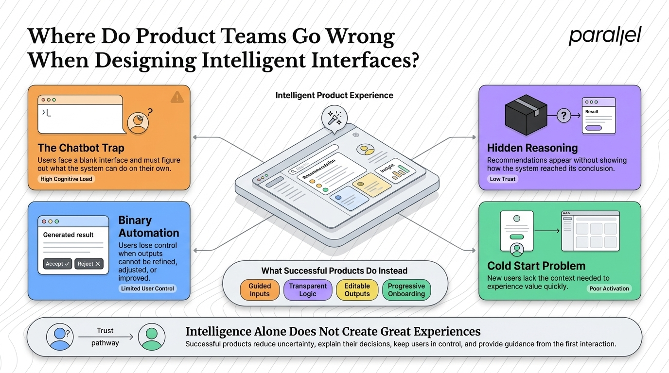
1) Falling for the Chatbot Trap
The most common mistake is defaulting to a conversational interface. Product teams assume that because the underlying model is a chatbot, the user interface should be one too. But a blank text box is incredibly intimidating. It forces the user to figure out what the system can do, how to ask for it, and how to format the prompt. This violates basic usability principles. We have documented this extensively in our thoughts on UX for AI chatbots.
2) Hiding the System's Reasoning
Many teams treat their intelligent features like a magic black box. The system takes an input, processes it invisibly, and spits out a final answer. When users cannot see how an answer was derived, they will not trust it for high-stakes decisions. Trust requires transparency. If your product touches finances, health, or core business operations, hiding the reasoning guarantees low activation rates.
3) Implementing Binary Automation
Binary automation means the system either does everything or nothing. If the system generates an output that is 90% correct, binary design forces the user to either accept the flawed result or discard it entirely and start over. Users want the final say. When you remove their ability to edit, tweak, or guide the output, you replace helpful assistance with frustrating roadblocks.
4) Ignoring the Cold Start Problem
Intelligent systems need context to provide good answers. But new users have not provided any context yet. Teams often drop new users into an empty state and expect them to start feeding the system complex data. Without proper product strategy consulting to map out progressive onboarding, users simply bounce before they ever experience the core value proposition.
How Should You Approach Adjustable Autonomy in Intelligent Systems?
Adjustable autonomy is a critical concept you must understand to build successful intelligent products. It is the practice of giving users layered control over how much the system does automatically versus how much requires manual approval.
In a traditional workflow, the user does all the work. In full automation, the system does everything. Adjustable autonomy sits in the middle. It allows the user to dial the system's involvement up or down based on their current comfort level and the stakes of the task.
When referencing a UX for AI products: definitive guide with examples, teams often look for quick UI patterns to copy. But adjustable autonomy is a strategic product decision, not just a UI component. It requires mapping out the user's emotional journey. For example, when a user first tries a financial categorization tool, they want to review every single transaction manually. After a week of seeing accurate results, they will happily switch to full automation.
You must design the interface to accommodate this transition naturally. Start by offering suggestions that require explicit user approval. Include a simple way to undo actions. Over time, as the system learns and the user builds trust, you can introduce bulk approvals or background processing. This phased approach is exactly what we test during our AI design sprints.
The Nielsen Norman Group highlighted in their 2025 research that the modern UX reckoning requires practitioners to find a middle ground between user goals and business goals. Adjustable autonomy is that middle ground. It protects the user's need for control while delivering the efficiency metrics the business requires.
What Are the Practical Steps to Build Better AI User Experiences?
Understanding the theory is only half the battle. You need concrete methods to apply these concepts to your daily product decisions. Here is the practical approach we use to help teams simplify complex product decisions and ground their features in real user behavior.
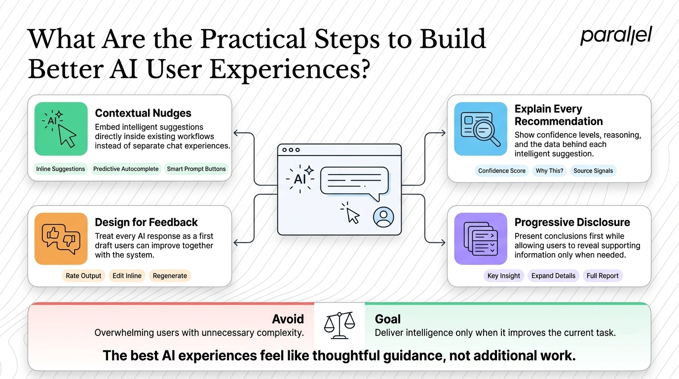
Step 1: Replace Blank Canvas with Contextual Nudges
Stop making users guess what your product can do. Instead of a floating chat widget, embed intelligent capabilities directly into the user's existing workflow.
- Use inline suggestions that appear when the user highlights text.
- Provide predictive autocomplete options as they type.
- Offer predefined prompt buttons tailored to the specific page they are viewing.
If you are redesigning an existing application, we often recommend starting with a UX audit to identify where these contextual nudges will have the highest impact.
Step 2: Build Explainability into the Interface
You have to show your work. When your product makes a recommendation, the interface must briefly explain why.
- Include a small confidence score next to predictions.
- Add a "Why did we suggest this?" tooltip.
- Highlight the specific data points in the user's history that influenced the current output.
This is especially critical in complex domains. We apply this rigorously when delivering AI UX design services for enterprise software.
Step 3: Design for Feedback and Iteration
Every intelligent output should be treated as a first draft. Your interface must invite the user to collaborate with the system.
- Include simple thumbs-up and thumbs-down icons on all generated content.
- Allow users to edit generated text directly inline without opening a new modal.
- Provide a "regenerate with instructions" field so users can course-correct the model easily.
Step 4: Use Progressive Disclosure for Complex Outputs
Generative models can output massive amounts of data in seconds. Just because the system can generate a five-page report instantly does not mean the user wants to read it instantly.
- Show the primary conclusion first.
- Use accordion menus to hide the supporting data.
- Allow the user to drill down into specific sections only if they need more context.
This prevents cognitive overload and keeps the interface feeling lightweight and fast.
How Do You Measure the Success of an AI Product Redesign?
Standard product metrics like daily active users or time on page do not tell the full story when evaluating intelligent features. In fact, if an intelligent feature works perfectly, time on page might actually decrease because the user finished their task faster. You need a different measurement framework.
First, track the suggestion acceptance rate. This is the percentage of times a user clicks "apply" or "accept" on a system-generated recommendation. This is your purest indicator of model accuracy and contextual relevance. If this number is low, your system is generating noise, not value.
Second, monitor the correction rate. When a user accepts a suggestion, how heavily do they edit it afterward? Minor edits are a natural part of collaboration. Total rewrites indicate a failure in the initial generation. Tracking this helps you determine if the friction lies in the UX or the underlying model.
Finally, measure trust through progressive adoption. Track how many users move from manual review modes to automated bulk processing over a 30-day period. We often help teams set up these specific tracking frameworks during our product strategy consulting engagements. If you are unsure where your product currently stands, running an AI readiness design scorecard is the best first step.
Conclusion
Wrapping up this UX for AI products: definitive guide with examples, remember that the technology serves the user, not the other way around. The most successful intelligent applications in the coming years will not be the ones with the largest underlying models. They will be the ones that understand human psychology, mitigate anxiety, and seamlessly blend into existing workflows. Focus on clarity, prioritize trust, and never force your users to adapt to lazy design decisions.
Frequently Asked Questions
1) What is the main focus of a UX for AI products?
A true UX for AI products: definitive guide with examples focuses on bridging the gap between raw computational power and human usability. It moves beyond visual trends to address core behavioral challenges like building trust, managing unpredictability, and designing intuitive feedback loops.
2) How do you design onboarding for intelligent applications?
Onboarding must be treated as a gradual journey. Start with simple, low-stakes concepts and predefined actions. Do not drop users into a blank text box. Reveal advanced capabilities progressively only after the user has experienced the initial core value.
3) What is the difference between traditional software design and artificial intelligence design?
Traditional software design is deterministic; the same input always produces the exact same output. Artificial intelligence design is probabilistic; outputs vary based on context and learning. This requires interfaces that accommodate uncertainty, offer revisions, and explain reasoning.
4) How can I test probabilistic interfaces with real users?
You must observe users interacting with the system in highly realistic scenarios. Instead of testing basic click paths, evaluate how users handle incorrect or unexpected outputs. We detail this specific methodology in our insights on AI UX research.
5) Should every smart tool use a conversational interface?
Absolutely not. Conversational interfaces place a heavy cognitive burden on the user by forcing them to write complex prompts. Only use chat if open-ended dialogue is the primary value proposition. Otherwise, rely on contextual nudges and integrated UI controls.
6) Is this approach right for my early-stage startup?
Yes. Early-stage startups cannot afford to lose users to confusing interfaces. Building a foundation of trust and simplicity is actually more critical for startups than established enterprises because you do not have existing brand loyalty to fall back on.
7) How does ParallelHQ help teams refine their artificial intelligence strategies?
We act as a product design and strategy partner. We do not just make things look good visually; we simplify complex product decisions. Through focused sprints and UI/UX design services, we help teams build features grounded in real user behavior.
8) What metrics matter most when evaluating smart features?
Look past traditional engagement metrics. Focus heavily on suggestion acceptance rates, user correction rates after acceptance, and the speed at which users transition from manual oversight to automated workflows. These metrics accurately reflect user trust and utility.

check out these related blogs


































.avif)
















.webp)