I have spent years watching founders build incredible technology that nobody wants to use. When it comes to product design for seed-stage AI startups, the biggest mistake is treating the mathematical model itself as the product. It is not. You are building a human interface to solve a specific human problem. The large language model is just the engine under the hood. If the user experience is overly complex or unpredictable, your underlying technology simply does not matter. We built ParallelHQ to help early teams simplify these exact decisions and ground them in real behavior.
What are the essentials of seed-stage AI product design?
Product design for seed-stage AI startups must prioritize user trust, explicit control, and real problem solving over technical novelty. Strip away the hype, validate core user flows early, and build interfaces that make complex interactions feel entirely predictable and safe.
What is the harsh reality of today’s AI startup market?
Let me share a harsh reality about the current startup ecosystem. MIT research in 2025 estimated a staggering 95% failure rate for generative AI pilots. Teams are raising seed rounds on weekends and vibe-coding demos that look like finished software. But demos do not survive contact with real users.
Founders often fall into the trap of AI-washing. They slap a conversational interface onto a weak value proposition and expect the user to figure it out. This approach almost always fails. Users pay for clear value and saved time. They absolutely do not pay for an AI label.
I have seen this pattern repeatedly in our product strategy consulting engagements. A team builds a brilliant technical proof of concept. They launch it to the public with massive hype. Then they watch their retention flatline because the product lacks basic usability. If your product requires users to write perfect, multi-paragraph prompts just to get baseline value, your design strategy is fundamentally broken.
The numbers from late last year back this up. S&P Global reported that 42% of AI initiatives were scrapped entirely before hitting production. Furthermore, early 2026 data from Gartner shows that user churn in early-stage AI tools is directly correlated to unpredictable interface behavior. The problem is rarely the underlying model. The problem is the massive gap between the raw technology and the human attempting to use it.
How does poor product design impact AI startup economics?
Most founders view design as a surface layer. They think of it as making things look pretty. This is a fatal misunderstanding of how business works in the artificial intelligence space. Bad design is an existential economic threat to your startup.
Consider the token costs associated with large language models. Every time a user interacts with your system, you pay for the computer. If your user interface is confusing, the user will have to regenerate answers multiple times. They will try a prompt, fail, tweak it slightly, and try again.
You are paying API costs for all of those failed attempts. A poor user experience literally burns through your runway.
Furthermore, bad design destroys your Customer Acquisition Cost ratio. Acquiring users for a new AI tool is expensive right now. If a user signs up, gets confused by a complex generative interface, and churns within five minutes, you have lost that acquisition money permanently. When we map out interaction design, our primary goal is to reduce this friction so that users experience value within the first sixty seconds of use.
Good design makes your product economically viable. It reduces unnecessary API calls by guiding the user to the right outcome on the first try. It improves retention by making the system feel reliable and trustworthy.
What are the five common design traps for early-stage AI teams?
It has never been easier to build software. You can spin up an application using natural language in a matter of days. But this sheer speed creates a dangerous illusion of expertise. In fact, getting the interface right is harder now than it was during the Web 2.0 era.
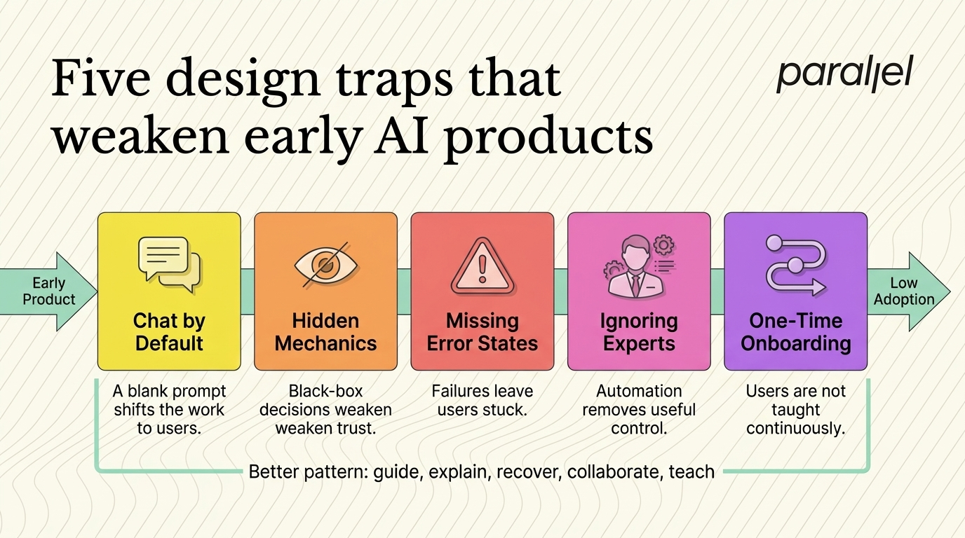
We constantly see founders and product managers fall into five specific design traps when building their initial products.
Trap 1: The chat interface default
Every new tool seems to look exactly like ChatGPT. But forcing a user into an open-ended chat is often a lazy design. It shifts the entire cognitive load onto the end user. They have to guess what the system can do, what parameters they need to set, and how to format their request. Instead of guiding them toward a solution, you are handing them a blank, intimidating page. If you are building a B2B UX design solution, an open chat box is rarely the correct answer.
Trap 2: Hiding the mechanics
Humans are inherently suspicious of black-box technology. If an AI system makes a massive change to a user's workflow or data without explaining why, the user will panic. Transparency is an absolute requirement for adoption. You must show your work. If the system summarizes a document, it must provide citations linking back to the source text.
Trap 3: Ignoring error states
Generative models hallucinate. They make mistakes. They drop context. Most seed-stage teams design the "happy path" where the AI performs perfectly every single time. They completely ignore the edge cases. When the model inevitably fails, the user is left at a dead end with a vague error message and no way to recover their progress.
Trap 4: Forgetting the domain expert
We worked on a complex project with Sarvam AI. We learned quickly that specialized models should augment domain experts, not try to replace them entirely. If your interface patronizes a skilled professional by removing their control or obscuring the details they care about, they will abandon your product immediately. Domain experts need tools that make them faster, not tools that treat them like beginners.
Trap 5: Lack of continuous onboarding
You cannot drop a user into a generative platform with a three-screen tooltip tour and consider them trained. The Nielsen Norman Group highlighted in late 2025 that onboarding for unpredictable systems must be a continuous journey. You have to teach users how the system learns, what inputs yield the best results, and what limitations they should realistically expect.
What are the core principles of product design for seed-stage AI startups?
To fix these structural problems, you have to fundamentally shift your thinking as a founder. You must stop designing for pure automation. You must start designing for collaboration.
The most critical principle is designing for absolute user trust. The research team at the Nielsen Norman Group advocates heavily for a concept called "adjustable autonomy." Users always want the final say over the outcome. If an AI tool suggests a complex action, the interface must explain the reasoning behind the suggestion in plain English.
Most importantly, it must allow the user to edit, refine, or completely reject the output without breaking the overall workflow. Think of the artificial intelligence as a highly capable junior partner, not an infallible autopilot. When we conduct an UX audit for a startup, we constantly look for ways to put the human back in the driver's seat.
Here are the strict rules we follow to build that trust.
- Provide contextual nudges: Do not wait for the user to type a prompt. Offer smart, one-click suggestions based on the context of their current task or their previous behavior in the app.
- Show confidence scores: If the model is unsure about a generated output, tell the user explicitly. Highlighting low-confidence answers actually builds massive credibility because it proves the system is honest.
- Enable micro-edits: If an AI generates a full paragraph of text or a complex snippet of code, let the user tweak a single sentence directly. Do not force them to regenerate and rewrite the entire block from scratch.
- Always include an undo button: The fear of making an irreversible mistake prevents users from exploring advanced features. A clear, omnipresent undo function eliminates this anxiety and encourages playful discovery.
- Expose the learning loop: When a user corrects the system, show them a visual confirmation that the system has registered the correction and will improve in the future.
Design firms like IDEO have long championed human-centered design for emerging technology. This philosophy is exponentially more critical today when the underlying system behaves unpredictably.
How do you build a practical framework for seed-stage AI product design?
How do you actually build this from scratch without wasting months of engineering time? You have to stop obsessing over the mathematical model. You need to start focusing entirely on human behavior and interface predictability.
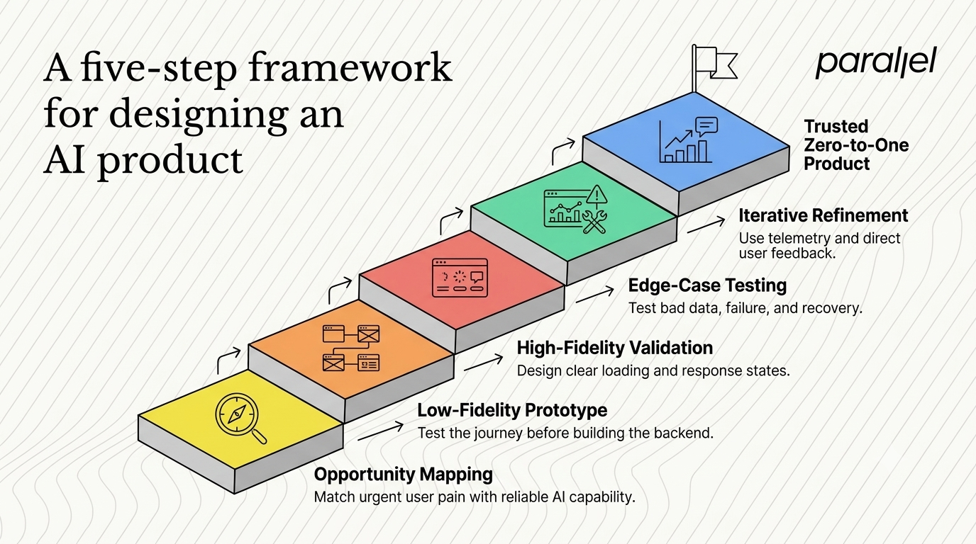
You should approach product design for seed-stage AI startups as a deep partnership between your engineering team and your earliest users. Building sophisticated features in a vacuum is a guaranteed path to commercial failure. Here is the exact playbook we use when partnering with early-stage founders to build zero-to-one products.
Step 1: Deep opportunity mapping
Do not write a single line of backend code until you know exactly what user pain you are solving. Use formal opportunity mapping to find the intersection between what the AI can do reliably today and what the user actually needs urgently. Sometimes founders realize during this phase that a traditional database search solves the problem better than an LLM. If that is the case, do not use the LLM.
Step 2: Low-fidelity prototyping
Run focused design sprints to validate the core user journey before committing to heavy technical architecture. We rely heavily on "Wizard of Oz" testing for generative products. We build a simple, clickable frontend in Figma. During user testing, a human manually types out the simulated AI responses behind the scenes. This allows you to test the user's reaction to the value proposition before you spend weeks training a model or setting up complex API pipelines.
Step 3: High-fidelity validation
Once the core flow is validated, move to high-fidelity UI/UX design. Pay highly specific attention to your loading states. Generative processes take time. If a user clicks a button and the screen freezes for four seconds, they will assume the product is broken and refresh the page. You must use skeleton loaders, streaming text generation, and educational micro-copy to keep them engaged while the model processes the request.
Step 4: Usability testing the edge cases
This is the critical step that most technical startups skip entirely. You must conduct rigorous usability testing specifically focused on edge cases and failure modes. Intentionally feed the system bad data during the test. Watch how the user reacts when the AI provides a poor, nonsensical, or unhelpful answer. Design graceful fallback states and clear error recovery paths so the user never feels stupid or stuck.
Step 5: Iterative refinement and telemetry
Your launch day is just the beginning of the design process. You need a tight feedback loop to capture how users are actually interacting with the model in the wild. Include simple, low-friction thumbs-up and thumbs-down mechanisms on every generated output. Use this qualitative data in combination with analytics to continuously refine both the visual interface and the hidden system prompts.
Which metrics actually matter for AI product design success?
Most early teams track entirely the wrong metrics. They obsess over system latency, token cost optimization, or average output length. While those are definitely important engineering considerations, they tell you absolutely nothing about the user experience.
You need to establish a strong UX metrics framework that reflects trust, utility, and deep adoption. The metrics for a generative product look very different from a traditional SaaS dashboard.
If your users are constantly fighting the system, rewriting prompts multiple times, or abandoning tasks halfway through, you have a critical design problem. We help teams run targeted, objective evaluations of these flows to uncover hidden friction points. The goal is always to make the complex machinery feel invisible and effortless to the end user.
How do you build future-proof products for AI startups?
Building a company in this space right now is incredibly chaotic. The underlying technology changes every single week. New models drop constantly. But the fundamental rules of human psychology and behavior have not changed at all.
People still want to feel capable at their jobs. They still want to feel in control of their digital tools. They still absolutely hate feeling confused, overwhelmed, or replaced.
When you nail product design for seed-stage AI startups, you create an experience that feels like genuine magic. You do not achieve that magic by adding more features to the roadmap or exposing more of the underlying mathematical model to the user. You achieve it by ruthlessly simplifying the experience until only the pure, undeniable value remains.
Stop building impressive technical demos for investors. Start building highly intuitive tools that deeply respect your users' time, workflow, and intelligence.
Frequently Asked Auestions
1) What is product design for seed-stage AI startups?
It is the highly specialized, strategic process of shaping how early users interact with new generative models. It focuses heavily on translating complex, unpredictable technical capabilities into intuitive, trustworthy, and valuable interfaces. Unlike traditional software design, it requires planning for variable outputs, designing robust error recovery paths, and managing user expectations around what the system can and cannot do reliably.
2) How do I know if my AI product has a failing user experience?
You need to look closely at your activation and retention rates. If users sign up, run exactly one generative prompt out of curiosity, and never return to the product, your user experience is failing. High friction during the initial onboarding phase is common. However, the biggest red flag is a high rate of rejected suggestions or a high "edit rate" where users constantly have to rewrite the text your system generated.
3) Should every new tool use a conversational chat interface?
Absolutely not. Chat interfaces are incredibly popular right now, but they force the user to do the hard work of prompting. They require the user to know exactly what they want. In many practical business cases, embedded intelligence with contextual buttons or smart defaults offers a much better, faster experience. A conversational interface should only be used when open-ended exploration or complex brainstorming is the primary goal of the user.
4) How do we test a complex technical concept before writing expensive code?
We strongly recommend using a formal design sprint methodology to validate ideas rapidly. You can use a technique called "Wizard of Oz" testing. You build a simple, static prototype interface. During the test, a human manually simulates the AI's responses behind the scenes based on what the user types. This helps you validate the core concept and the interaction model without committing to weeks of heavy backend engineering.
5) Generative interfaces versus static interfaces: Which is better for early products?
Generative UI is highly powerful but deeply unpredictable to build and test. For an early-stage product trying to find initial market fit, a static UI with predictable, bounded AI enhancements usually builds user trust much faster. You can introduce more dynamic, generative interface elements slowly as your user base matures, understands the value proposition, and begins to trust the underlying system.
6) Is a human-centered design approach right for highly technical founders?
Yes, it is absolutely essential. Technical founders often underestimate the critical importance of usability. They incorrectly assume that the best algorithm automatically wins the market. This is false. Partnering with AI UX design experts helps you bridge the massive gap between a powerful backend algorithm and a commercially successful, widely adopted business tool.
7) Why do so many artificial intelligence startups fail in their first year?
They fail because they build sophisticated technical solutions in search of actual human problems. They falsely assume the technology itself is the entire value proposition. Without a deep, rigorous understanding of user research and customer pain points, they build incredibly powerful products that nobody actually wants to use in their daily workflow.
8) How does ParallelHQ handle product design for seed-stage AI startups?
We do not just paint screens or add trendy visual effects to your existing application. We act as a strategic, deeply experienced partner to help founders simplify complex product decisions. We help you validate your core user flows early through rapid prototyping, and we build highly intuitive interfaces that your target users will actually trust, adopt, and pay for.

check out these related blogs