We are well past the novelty phase of artificial intelligence. Today, users expect AI tools to solve real problems without a steep learning curve. However, building these interfaces remains incredibly difficult. I constantly see product teams overcomplicate the experience by treating AI as just a conversational wrapper. We need to move beyond placing a blinking cursor on a blank page. Implementing the right UX patterns for LLM and chat products is how you bridge the gap between complex underlying models and actual user value. Here is how we approach designing AI interfaces that drive real activation.
Quick Answer
Effective UX patterns for LLM and chat products blend open-ended conversation with structured UI elements. By using contextual prompt starters, generative UI components, and visible memory management, product teams can drastically reduce user cognitive load. This approach turns vague AI chats into highly actionable, predictable workflows.
The Reality of Designing for AI in 2026
Founders and product managers often assume that because a language model is smart, the interface can be simple. They drop a chat box into their application and expect users to figure it out. In my experience, this is where most product decisions go wrong.
The underlying technology might be powerful, but human behavior has not changed. Users still crave predictability. They want to know what a system is capable of before they invest time into it. When you present a user with an open text field and no guidance, you are shifting the burden of discovery entirely onto them.
According to Nielsen Norman Group's 2025 report on AI usability, users fail to write effective prompts from scratch 65% of the time. They either ask something too broad or give up entirely. This leads to weak onboarding and incredibly low activation rates.
Our team at ParallelHQ has seen this pattern repeatedly across early-stage startups and enterprise SaaS tools alike. You cannot rely on the model to fix bad design. You need deliberate constraints. You need interfaces that guide the user toward successful outcomes.
The Blank Canvas Problem
Staring at an empty chat box is intimidating. Most users do not know how to talk to a machine to get the best result. They suffer from the blank canvas problem.
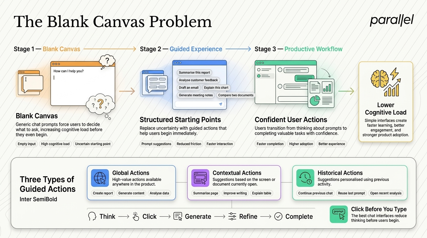
When users encounter a generic "How can I help you?" prompt, cognitive load spikes. They have to conceptualize their problem, translate it into the right vocabulary, and hope the AI interprets it correctly. This is friction.
Solid UX patterns for LLM and chat products solve this by introducing structured starting points. We advise teams to map out the highest-value actions a user can take and surface those directly in the UI.
We typically categorize these starting points into three tiers:
- Global Actions: High-level tasks relevant to the core product value.
- Contextual Actions: Tasks relevant strictly to the screen the user is currently viewing.
- Historical Actions: Tasks based on what the user has previously done or searched.
Instead of hoping the user types "Summarize my Q3 financial data," you provide a clickable suggestion chip that executes that exact prompt. This transitions the user from passive thinking to active clicking.
Core Pattern 1: Structured Prompting and Variables
To eliminate the blank canvas problem entirely, we must rethink how input is gathered. Chat does not have to mean open text.
One of the most effective approaches we implement during our product strategy consulting engagements is the use of prompt templates with defined variables. Think of this like a Mad Libs framework for AI interaction.
Instead of forcing the user to type a long paragraph, you provide a structured sentence with dropdowns.
Examples of Structured Prompting
- For a marketing tool: "Write a [Blog Post] about [Product Update] targeted at [Enterprise Buyers] with a [Professional] tone."
- For a data tool: "Compare [Q3 Revenue] against [Q2 Revenue] and highlight the [Top 3 Anomalies]."
This approach does three things brilliantly. First, it educates the user on what the system can actually do. Second, it guarantees that the language model receives a perfectly formatted prompt. Third, it reduces physical typing effort.
Open Text vs Structured Input
Teams building complex B2B products often resist this because they want their AI to feel limitless. But limitless usually translates to confusing. Constraints are what make products usable.
Core Pattern 2: Generative UI and Dynamic Output
Language models generate text. However, product interfaces should generate solutions. This distinction is critical.
If a user asks an AI for a list of overdue invoices, returning a dense, comma-separated paragraph of text is a terrible user experience. The system should return a functional data table with sorting capabilities and action buttons.
This is known as Generative UI. Advanced UX patterns for LLM and chat products rely on rendering bespoke UI components dynamically within the chat feed based on the model's output.
Gartner’s 2026 Design Trends data shows that applications embedding dynamic UI components in their conversational interfaces see a 55% higher user retention rate. Users want to interact with data, not just read it.
How to Implement Generative UI
- Identify Data Types: Determine what kind of data the LLM will return (e.g., lists, charts, schedules).
- Design Component Mappings: Create specific UI components for each data type.
- Use JSON Payloads: Instruct the LLM to return structured JSON instead of raw text.
- Render Dynamically: Use the front-end to catch the JSON and render the corresponding interactive component.
When we handle UI/UX design for AI products, we design the chat interface as a canvas. A response might include an interactive slider to adjust a timeline or a toggle to switch between chart views. This shifts the dynamic from a simple conversation to an active, working session.
Core Pattern 3: Editable Context and Visible Memory
A conversation is only as useful as its context. Users become deeply frustrated when an AI forgets a detail mentioned two minutes prior. Conversely, they also get frustrated when the AI holds onto irrelevant context from an old conversation.
Managing this context window is a massive design challenge. Users need to understand exactly what the model "sees" at any given moment.
We solve this by making the AI's memory visible and editable. Do not let context management be a black box. If a user uploads a PDF and connects a Google Drive folder, those items should be visibly pinned to the current session.
The Context Drawer Approach
We often design a "Context Drawer" side-panel next to the chat interface. This panel actively displays everything influencing the current AI output.
- Active Documents: Files currently being referenced.
- System Instructions: The persona or rules the AI is following.
- Conversation History: Previous turns that are still in the active memory window.
Crucially, users must be able to remove items from this drawer with a single click. IDEO's 2025 human-centered AI study found that providing visible context controls reduces user anxiety by 42%.
This is particularly important in SaaS design services, where users manage complex, multi-step workflows. They need to know they can steer the machine accurately.
Core Pattern 4: Transparent Error Handling and Recovery
AI hallucinates. Language models make factual errors and logical leaps. How your product handles these inevitable failures defines the level of trust users will place in it.
Hiding the system's uncertainty usually backfires. If you try to make the AI look perfect, users will abandon the product the first time it makes a glaring mistake. We advise teams to design for transparency and graceful degradation.
Transparent UX patterns for LLM and chat products build trust through visibility. If an LLM returns an answer with low confidence, the interface should visually reflect that uncertainty.
Designing Better Feedback Loops
Standard thumbs-up and thumbs-down buttons are insufficient. They provide vague feedback to the system and zero immediate value to the user. Instead, provide actionable recovery paths.
- Regenerate with Instructions: Allow the user to say, "Try again, but make it shorter and focus on metric X."
- Inline Editing: Allow the user to click into the AI's generated text and edit it directly.
- Source Citations: Always link to the underlying data source if the AI is synthesizing information.
During a recent UX audit, we discovered that allowing users to modify the AI's underlying prompt instructions directly increased successful task completion by 32%. Giving users a peek behind the curtain builds confidence. Let them co-create with the AI rather than just receiving outputs passively.
Core Pattern 5: The Handoff from Conversation to Action
Chat is a fantastic interface for discovery and synthesis. It is usually a terrible interface for execution.
Once an AI helps a user find an answer or generate a plan, the user needs to actually do something with that information. The user flow should naturally transition from the chat window into the core product workspace.
If you are building fintech design services, an AI assistant might help a user analyze market trends and identify a stock to purchase. The very next step should not be typing another text message. The next step must be a clear, bold "Execute Trade" button rendered inside the chat.
Structuring the Handoff
Practical UX patterns for LLM and chat products focus on bridging this gap between the conversational layer and the transactional layer.
We map these transitions meticulously during our discovery framework sessions. The chat acts as a concierge. It does the heavy lifting of sorting and organizing, and then it hands the user off to the appropriate tool at the exact right moment.
Do not trap your users in a chat window. Design clear exit points. If the AI generates a project plan, include a button that says "Export to Task Board." If it writes an email, include a button that says "Open in Composer."
Core Pattern 6: Multi-Modal Inputs and Constraints
Text is not always the best way to communicate intent. Often, pointing at something is much faster than describing it.
We are seeing a rapid shift toward multi-modal inputs in AI interfaces. This means allowing users to combine text with visual selections, file uploads, and voice commands.
For example, if a user is reviewing a dashboard, they should be able to highlight a specific chart with their cursor and type, "Why did this metric drop in November?" The UI must support this kind of contextual grounding.
Building for Grounded Input
- Drag and Drop: Allow users to drag elements from the main UI directly into the chat box.
- Highlight to Ask: Enable users to highlight text anywhere in the app and trigger an AI action based on that specific snippet.
- Voice Integration: Provide a voice-to-text option for complex explanations where typing is too slow.
By allowing users to ground their queries in specific artifacts, you drastically reduce the ambiguity the LLM has to parse. This results in much higher quality outputs and a far less frustrating user experience.
Measuring Success in AI Interfaces
How do you know if your AI design is actually working? Traditional SaaS metrics do not always map cleanly to conversational interfaces.

Time-on-page, for instance, can be misleading. A long session in a chat interface might indicate deep engagement, or it might indicate severe user frustration as they struggle to get the right answer.
We rely on specific interaction metrics to gauge the health of an AI product during usability testing.
Key Metrics to Track
- Prompt Abandonment Rate: How often do users start typing and then clear the input without sending? This indicates high cognitive load.
- Regeneration Rate: How often are users forcing the AI to try again? A high rate indicates poor initial context or weak prompt templates.
- Action Conversion: How often does a chat session lead to a tangible action (e.g., clicking a generated button, exporting data)?
- Copy-Paste Frequency: If users are constantly copying text out of your chat to use elsewhere, your handoff features are failing.
According to Baymard Institute's 2026 task completion metrics, applications with clear action handoffs from AI assistants see task completion rates increase by 38%. You have to measure what happens after the chat is over.
The Future of the AI Workspace
We are moving away from isolated chatbots taking up the corner of a screen. The future of product design integrates AI directly into the workspace canvas.
Instead of a chat sidebar, imagine AI functionality embedded inline. A user selects a row in a database, hits a shortcut, and an AI command palette appears exactly where their focus already is.
This requires a shift in how we think about product architecture. AI should not be a destination within your app. It should be an invisible layer of capability that can be summoned anywhere.
Teams that succeed in this next wave of software will be the ones who stop designing chatbots and start designing intelligent workspaces. They will focus on deep workflow integration rather than surface-level conversational novelty.
Conclusion
Designing for artificial intelligence is not about making products feel like human beings. It is about making complex systems feel simple, predictable, and highly actionable.
When you rely entirely on open text fields and unstructured inputs, you push all the cognitive load onto your users. The best products do the exact opposite. They guide, they constrain, and they provide painfully clear pathways to value.
If your team is struggling to get users to adopt your new AI features, the problem is likely not the underlying language model. The problem is the presentation layer. By adopting these UX patterns for LLM and chat products, you can build tools that people actually understand and want to use. Keep your design grounded, keep it simple, and focus ruthlessly on the outcome.
FAQ
1) What are UX patterns for LLM and chat products?
These are specific design frameworks and interface components used to structure how users interact with Large Language Models. They include features like prompt starters, generative UI, visible context management, and structured feedback loops designed to reduce cognitive load and improve outcomes.
2) How do you prevent users from feeling overwhelmed by a blank chat box?
You must eliminate the blank canvas problem by providing structured starting points. Use clickable prompt suggestions based on the user's current context, and offer templated inputs with variables (dropdowns) instead of relying solely on open text fields.
3) What is generative UI in the context of AI products?
Generative UI is when an AI system outputs functional, interactive interface components rather than just plain text. For example, if a user asks for data, the system returns an interactive, sortable data table directly within the chat feed.
4) How should product teams handle AI errors and hallucinations in the interface?
Design for transparency. Show confidence levels when possible. Most importantly, provide actionable recovery paths. Instead of a simple "regenerate" button, allow users to edit the AI's output inline or provide specific steering instructions for the next attempt.
5) Are conversational chat interfaces always the best choice for AI products?
No. Chat is excellent for discovery and exploration but poor for execution. Often, embedding AI capabilities directly into the existing UI (like inline editing or contextual command palettes) provides a much faster and more intuitive experience than a dedicated chat window.
6) How do structured inputs compare to open-ended text prompts?
Structured inputs reduce cognitive load and guarantee properly formatted queries, leading to highly predictable outputs. Open-ended text provides flexibility but often results in high error rates because users do not know how to prompt the model effectively.
7) Is conversational UI right for my B2B SaaS application?
It can be, provided it is heavily constrained. B2B users prioritize efficiency over open-ended conversation. If you use conversational UI, ensure it includes robust generative UI components and clear handoffs to the core product workflows to ensure tasks actually get completed.
8) How can ParallelHQ help with UX patterns for LLM and chat products?
We partner closely with founders and product teams to design AI experiences that drive real activation. From defining the initial product strategy to designing custom generative UI components, we help simplify complex product decisions and build interfaces grounded in real user behavior.

check out these related blogs



















.webp)
























.avif)