I have spent years watching brilliant product teams build software that their users actively hate. Building complex tools often feels like a race to add features until the interface collapses under its own weight. Teams frequently confuse capability with visual complexity. But your enterprise saas ux does not have to be a painful experience. You can build highly powerful tools that respect the user. It just requires a massive shift in how you make design decisions and prioritize workflows.
What is the best way to simplify Enterprise SaaS UX?
The best enterprise software hides its complexity until the user actually needs it. You reduce friction by prioritizing core workflows over edge cases, standardizing navigation systems, and designing for specific user roles rather than generic buyer personas.
Why does enterprise product bloat happen?
I constantly see startups fall into the same trap when they start selling to larger organizations. The sales team requests a new feature to close a massive deal. The product manager writes a quick spec. The engineering team builds the logic. The design team simply finds an empty corner on the screen to place the new button.
When you repeat this cycle for three years, you end up with a monster.
You create a product that requires a certification course just to understand the basic navigation. This is where most product decisions go wrong. Teams optimize for the checklist of the buyer instead of the daily reality of the user. They build for the pitch rather than the actual work.
Recent data highlights how severe this problem has become. A 2025 Gartner report on software adoption shows that 68% of corporate buyers regret their enterprise software purchases due to low user adoption. Employees simply refuse to use tools that make their jobs harder.
This happens because teams misunderstand what makes enterprise software valuable. Value does not come from having the most features on a single screen. Value comes from helping a specific employee complete a specific task faster than they could yesterday. When we think about enterprise saas ux, we have to start measuring success by time saved rather than features shipped.
What is the true cost of poor product decisions?
Many founders view usability as a luxury. They believe that as long as the software technically works, the users will eventually figure it out. This mindset is incredibly dangerous for early stage startups trying to scale.
Poor usability directly impacts your bottom line. It creates a hidden tax on your entire organization.
When your product is confusing, your support tickets skyrocket. Your customer success team spends all their time conducting basic training instead of driving expansion revenue. Your engineering team wastes cycles fixing workflow errors that users made because they misunderstood the interface.
Consider the financial impact on your clients. According to Forrester's 2026 workplace software index, companies now spend an average of $1200 per employee annually just on basic software training. If your tool requires weeks of onboarding, you become a massive cost center for your clients.
We see this frequently when teams ask us for a UX audit. They come to us because their churn rate is spiking. They usually blame their pricing model or a competitor. But when we watch real users interact with the product, the truth becomes obvious. The product is just too exhausting to use.
Good enterprise saas ux acts as a massive competitive moat. When your software is clear and grounded in real user behavior, you reduce the time to value. This turns end users into internal champions who fight to keep your software when budget cuts happen.
How do you balance buyer personas and end user realities?
To fix complex software, you first have to understand the inherent conflict in B2B product development. The person writing the check is rarely the person clicking the buttons.
Enterprise buyers care about governance, compliance, reporting, and high level visibility. End users care about completing their daily tasks without wanting to throw their laptops out the window. If you only design for the buyer, your product will fail the user.
How this disconnect manifests
- The dashboard dilemma: Buyers love dashboards. They want to see every metric at a glance. Designers respond by cramming 15 complex charts onto the home screen. But the end user usually just needs a simple list of tasks to complete today.
- The permission nightmare: Enterprise organizations require strict access controls. Product teams often expose these complex permission matrices directly in the primary interface. This clutters the screen for users who only have basic access.
- The terminology trap: Software built for executives often uses high level business jargon. The people actually doing the data entry use entirely different terminology. This creates massive cognitive friction.
We help teams solve this through rigorous user research. You have to separate the marketing messaging from the product interface. The pitch deck is for the buyer. The interface is for the user.
You need to define strict user roles. A system administrator needs a completely different interface than a daily data entry clerk. Trying to serve both roles on the same screen is a guaranteed path to failure.
Why do early stage teams struggle when moving upmarket?
The transition from serving small businesses to serving large enterprises breaks most products. Small business software is usually flat. One user does everything. The architecture is simple because the organization is simple.
Enterprise organizations are hierarchical, siloed, and deeply complex. When startups move upmarket, they try to stretch their flat architecture to fit hierarchical needs. This is where we see teams overcomplicate onboarding and daily usage.
The configuration trap
To serve different enterprise clients, startups start building massive configuration engines. They make everything customizable. Every module gets a toggle. Every workflow gets a conditional logic builder.
The intent is good. You want to be flexible. But total flexibility creates total chaos.
When you make everything customizable, you force your users to become system architects. Most users do not want to design a workflow. They want you to tell them the best way to do their job.
Feature parity obsession
Another massive mistake is chasing feature parity with legacy competitors. A potential client will say they need a specific obscure feature before they sign a contract. The startup panics and builds it.
This is a failure of product strategy consulting and basic prioritization. Legacy competitors have terrible interfaces precisely because they spent twenty years saying yes to every niche feature request. If you copy their feature list, you will eventually copy their usability problems.
You have to learn to say no. Or at least, you have to learn to hide the niche features away from the primary workflows.
What are the core principles for simplifying complex systems?
Untangling years of technical debt and interface bloat requires a structured framework. You cannot just redesign the buttons and hope the product gets easier to use. You have to fix the foundational thinking.
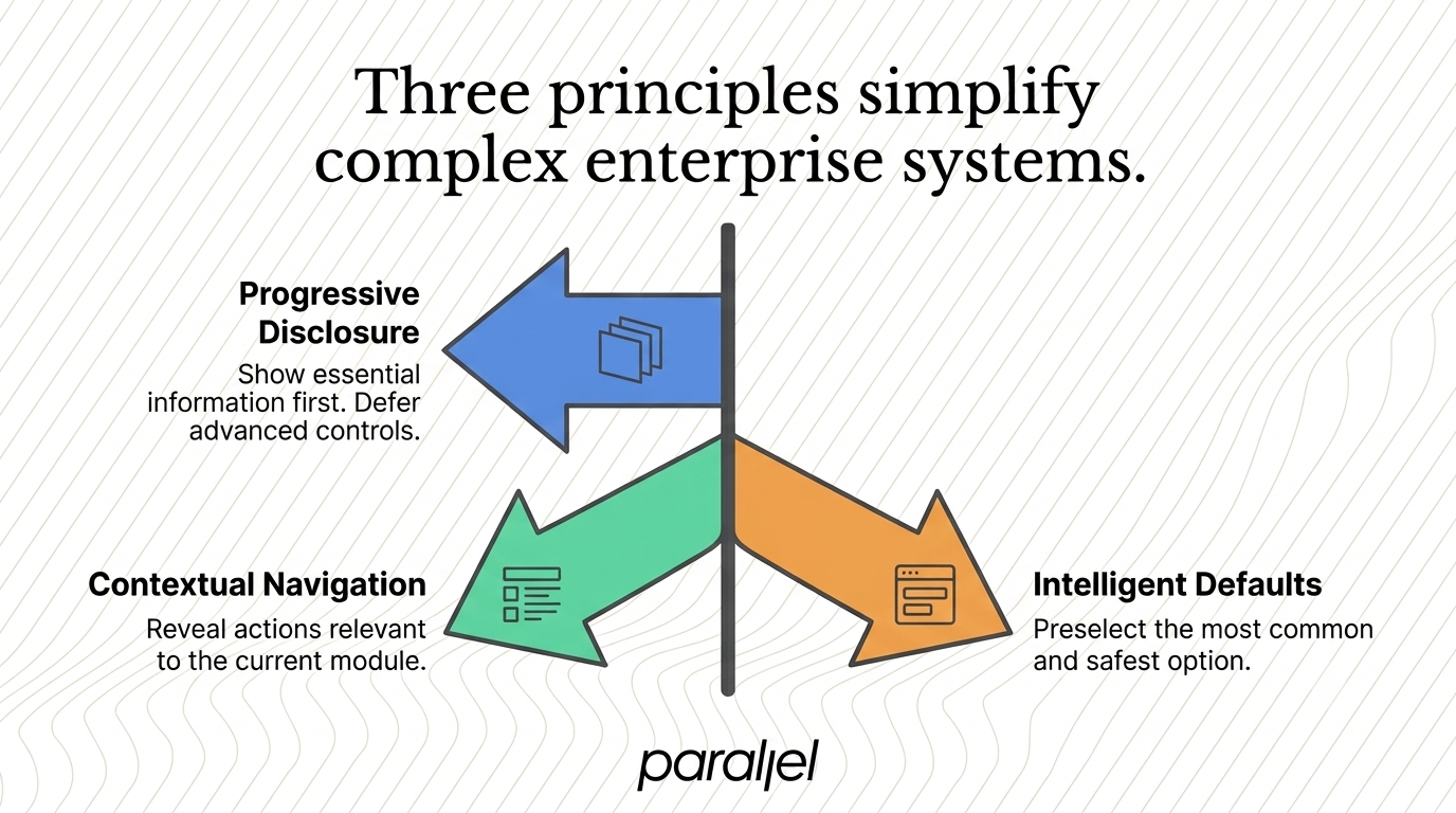
When approaching enterprise saas ux, we rely on a few specific principles to guide decision making. These rules help product teams create focus.
1) Progressive disclosure
The Nielsen Norman Group has advocated for progressive disclosure for decades. It is the single most important concept in enterprise design.
Progressive disclosure means you only show the user the information they need at this exact moment. You defer advanced or rarely used features to secondary screens.
If a form has 50 fields, do not put them on one page. Ask for the 5 essential fields first. Put the other 45 behind an advanced settings panel. Assume the user wants the simplest path possible until they explicitly ask for more control.
2) Contextual navigation
Static navigation menus are the enemy of scale. If you try to fit every module of an enterprise platform into a persistent left sidebar, you will eventually run out of space.
Instead, rely on contextual navigation. When a user clicks into a specific project or module, the navigation should adapt to show only the actions relevant to that context. This reduces cognitive load and keeps the interface clean.
3) Intelligent defaults
Do not make the user think if you can avoid it. Every dropdown, every form, and every setting should have a smart default value based on the most common use case.
If 80% of your users select standard shipping, make it the default. If most users generate reports for the last 30 days, prefill the date picker. Intelligent defaults speed up workflows and reduce the likelihood of user error.
What is a practical framework for reducing cognitive load?
Knowing the principles is different from actually doing the work. Redesigning a massive platform while it is currently in use is like changing the tires on a moving car. You need a structured approach to reduce risk.
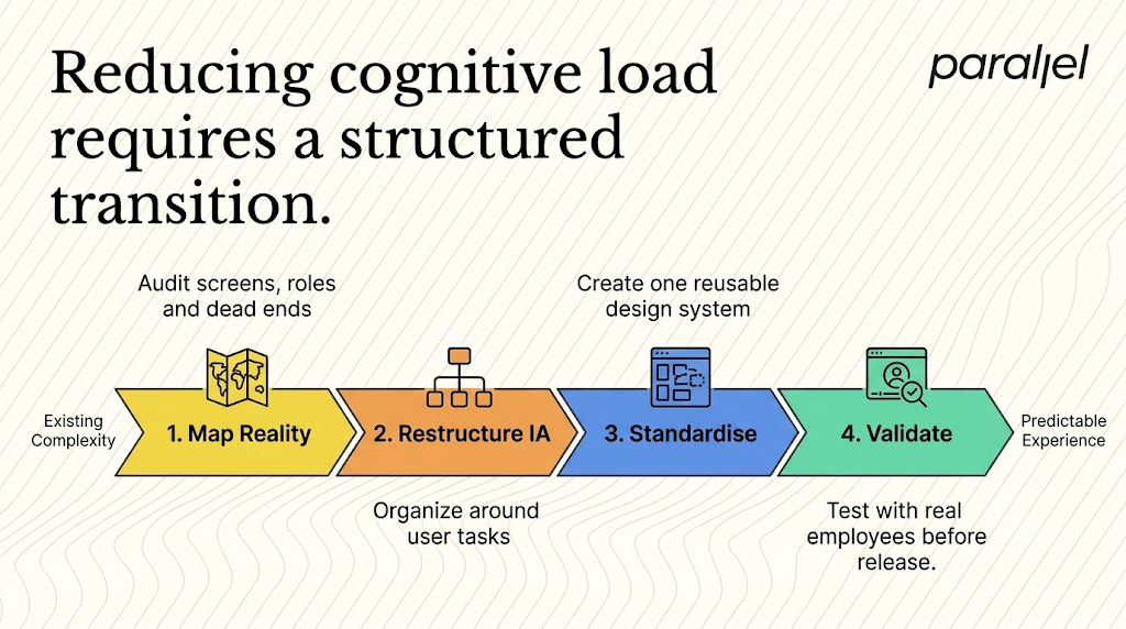
Here is how we think about executing this transition.
Step 1: Map the existing reality
You cannot simplify what you do not understand. Before you touch Figma, you need to map out the real workflows. We often use discovery frameworks to map the current state of the product.
You need to identify every single screen, every user role, and every dead end in the application. We look at product analytics to see which features are actually being used. We often find that 80% of users only interact with 20% of the product. This data gives you the confidence to start hiding or deprecating the unused 80%.
Step 2: Restructure the information architecture
Information architecture is the skeleton of your product. If the bones are in the wrong place, the skin will always look deformed.
You need to organize your system based on user tasks, not your internal database structure. Teams often design screens that perfectly mirror their backend tables. This forces users to think like computers. You must translate the database logic into human logic.
Group related tasks together. Use clear, verb based labels for actions. Ensure the hierarchy of information matches the priority of the user.
Step 3: Componentize and standardise
Inconsistencies destroy user confidence. If a primary button is blue on the dashboard but green on the settings page, the user has to relearn the interface on every screen.
Establishing a robust design system is critical. You need a single source of truth for every component, pattern, and interaction in the product. Standardizing your components dramatically speeds up development time and ensures a predictable experience for the user.
Step 4: Validate with extreme prejudice
Never roll out a massive redesign to your entire user base at once. Enterprise users hate change, even if the change is objectively better.
You must test your assumptions. We run extensive usability testing with real employees. We give them specific tasks and watch them fail. We iterate based on those failures before a single line of production code is written.
What are proven design patterns for complex software?
Theoretical frameworks are nice, but practical application is where the actual value lies. Over the years, we have seen specific patterns emerge that consistently solve complex product problems.
1) The command palette
Search is no longer just for finding documents. Borrowing from developer tools, many enterprise platforms are adopting global command palettes.
By pressing a keyboard shortcut, the user opens a search bar that acts as a central nervous system. They can type navigate to settings or create new users to jump directly to those workflows. This completely bypasses complex navigation menus. It is an incredible pattern for power users.
2) Inline editing over separate views
Legacy software often forces users to click an edit button, load a completely new page, make a change, and click save. This breaks the user flow.
Modern systems embrace inline editing. If a user needs to change a status in a data table, let them click the status badge directly and select a new one from a small popover. Keep the user in the context of their current work.
3) Empty states that educate
An empty dashboard is a missed opportunity. When a new user logs into a complex system, a blank screen is terrifying.
Good teams design empty states that act as integrated SaaS onboarding. Instead of showing zero records found, the screen should explain what the module does and provide a primary action button to get started. You guide the user step by step rather than abandoning them.
How do you measure success in complex software environments?
If you cannot measure usability, you cannot improve it. However, standard consumer metrics like daily active users do not always work in the enterprise space.
Enterprise users are forced to use your software by their employers. High daily active usage might just mean their job is tedious, not that your product is good. You need different metrics to evaluate enterprise saas ux effectively.
Key metrics to track
You have to look at these metrics across different user cohorts. A workflow might be incredibly fast for a veteran employee but completely impossible for a new hire. Both experiences matter.
We encourage teams to focus heavily on the error recovery rate. When a user makes a mistake, how easily can they fix it? Do they get a clear, plain text error message, or do they get a raw database code? Designing for failure is a core part of designing for humans.
How do you design for the enterprise power user?
While we spend a lot of time talking about simplifying interfaces for beginners, you cannot alienate your power users. These are the people who live in your software for eight hours a day.
If you make a workflow too simple, you might actually slow down a power user who prefers dense information and rapid data entry.
This is the ultimate balancing act. You have to design an interface that provides a soft landing for the novice but scales to support the veteran.
Strategies for supporting experts
- Keyboard shortcuts: Every primary action should be accessible without a mouse.
- Bulk actions: Power users need to update 50 records at once. Single item editing will frustrate them.
- Customizable views: While global configuration is dangerous, allowing individual users to save their own filtered table views is highly effective.
- Data density toggles: Let users choose between a spacious, comfortable view and a compact, high density view that shows more rows on the screen.
You do not build these expert features on day one. You build the simple path first. You layer the expert features on top only after the foundation is stable.
Why is the human element critical to enterprise design?
It is easy to forget that there are actual human beings on the other side of these complex systems. They are stressed. They have tight deadlines. They are tired.
When you build overly complicated software, you add to their cognitive burden. When you build clear, grounded software, you give them time back. You reduce their stress.
Our work in enterprise software design services is rooted in this empathy. We do not simplify things just to make them look minimal. We simplify things to make them functional. We want the software to get out of the way so the user can do their actual job.
This requires discipline. It requires pushing back on sales teams who want to bloat the roadmap. It requires telling founders that their vision is too complicated. It requires defending the end user in every single product meeting.
How can you build respectful enterprise software?
Building enterprise software is fundamentally an exercise in managing chaos. The natural entropy of product development always pushes toward more features, more buttons, and more confusion.
Ultimately, getting enterprise saas ux right is not about making things look pretty. It is about making hard decisions about what truly matters to the user. It is about having the courage to remove things. When you prioritize clarity over capability, you stop building software that users tolerate and start building tools they actually respect. Let the simplicity speak for itself.
What are the common FAQs about Enterprise SaaS UX design?
1) What exactly does enterprise software design mean in this context?
It refers to the strategic process of structuring, organizing, and designing digital products intended for large scale organizational use. Unlike consumer apps, these systems must handle complex permissions, massive data sets, and diverse user roles while remaining usable.
2) How do we reduce cognitive load without removing necessary features?
You use progressive disclosure. Keep all the advanced features in the system, but hide them behind contextual menus or advanced setting tabs. The primary screen should only show the tools needed to complete the most common daily tasks for that specific user role.
3) How should we handle navigation when we have dozens of modules?
Move away from persistent, static sidebars. Implement a hierarchical navigation system where the menu changes based on the context of the user. Combine this with a global search or command palette to allow power users to bypass menus entirely.
4) What is the fastest way to identify usability issues in our current platform?
Conduct task based observation. Sit with real users and ask them to complete their five most common daily tasks. Do not help them or answer questions. Watch where they click, where they hesitate, and where they fail. The bottlenecks will become obvious immediately.
5) How does designing for B2B differ from designing for B2C?
B2C design focuses heavily on emotional engagement, retention loops, and quick conversion. B2B design focuses on task efficiency, error reduction, and managing complex state changes. The B2B user is required to be there, so your job is to make their required work as painless as possible.
6) Should we prioritize the buyer persona or the end user?
You must market to the buyer but design the interface for the end user. If you clutter the daily workspace with high level executive dashboards, the end users will abandon the tool. Build separate reporting environments for the buyers, and keep the primary interface focused on the workers.
7) Is a complete redesign right for my startup right now?
If your support team is overwhelmed with basic how to questions, or if user adoption is directly causing churn, you need to fix the foundation. However, you should rarely execute a massive overnight redesign. It is much safer to update specific workflows iteratively to avoid shocking your existing user base.
8) How does ParallelHQ help teams solve these specific scaling problems?
We partner directly with founders and product teams to clarify their thinking. We do not just reskin interfaces. We audit the core workflows, restructure the information architecture, and build scalable systems that help teams make confident product decisions grounded in real user behavior. You can explore how we approach this through our product design services.

check out these related blogs


















































































.avif)