The AI hype has settled. Founders and product managers are no longer just adding chat windows to their apps. They are trying to solve real, complex business problems. But I still see teams making the same fundamental design mistakes. They build incredibly powerful AI models but wrap them in confusing, overcomplicated user interfaces.
If you want users to actually adopt your intelligent features, you need a different approach. That is why I want to share these AI UX best practices: 15 patterns with examples. These are the exact frameworks we use at ParallelHQ to help early-stage startups build clear, grounded, and usable AI products.
Quick answer (TL;DR)
Looking for AI UX best practices: 15 patterns with examples? The short answer is that great AI design requires adjustable autonomy, transparent audit interfaces, contextual nudges, and intentional friction. Stop hiding how the AI works and start designing for trust.
Why do most teams fail at AI product design?
I have spent years working closely with founders and product leaders. When they come to us, their AI products almost always suffer from the exact same core issue. They treat AI like magic. They hide the underlying complexity and expect the user to blindly trust the final output.
This approach is fundamentally broken. In 2025, the Nielsen Norman Group highlighted that while AI capabilities are accelerating, usability is severely struggling to keep pace. Users do not want a black box. They want a collaborative co-pilot. They want to understand why the machine made a specific decision and how to correct it if it is wrong.
This brings us to the core of our AI UX best practices: 15 patterns with examples. You simply cannot rely on standard SaaS design rules anymore. Intelligent agents and generative tools require a completely new set of interaction models to drive true user activation.
How should users control the AI?
Giving up control to a machine is inherently uncomfortable. If your interface does not manage this psychological transition properly, users will abandon the feature.
1) Adjustable autonomy
It is a huge mistake to force users into an all-or-nothing relationship with automation. When AI takes complete control without explicit permission, it ruins trust. Users want to feel empowered, not replaced.
We frequently see teams build a single button that executes an entire workflow. The assumption is that users want maximum efficiency immediately. In reality, users reject systems they do not fully understand yet. They need a transition period to build confidence.
You should think of AI as an intelligent assistant on probation. A great product lets the user dial the automation up or down based on their immediate comfort level.
- The pattern: Provide clear toggle settings or sliders that dictate the AI's level of intervention.
- Real-world example: GitHub Copilot allows developers to accept full code blocks, review line-by-line suggestions, or just use the tool as an advisory chat assistant.
- The takeaway: Never force full automation on day one. Let users earn trust at their own pace.
2) The audit interface
As AI agents begin handling complex, multi-step tasks, users urgently need a way to verify the work. Recent data from METR in late 2025 shows AI can now autonomously perform tasks requiring up to five hours of human expert time. By the end of 2026, models are targeting full work-week autonomy.
But how do you trust an AI that worked quietly for five hours? We see product managers fail by presenting just the final output. When users cannot see the math behind the answer, they reject it completely.
You must deliberately design for verification. The human user is transitioning from a creator to an editor and reviewer. Your interface needs to support that new supervisory role seamlessly.
- The pattern: Create a summary view that shows the exact logical steps, data sources, and paths the AI took to reach its conclusion.
- Real-world example: When synthesizing market data, enterprise AI tools now provide a "chain of thought" dropdown, allowing managers to review the specific datasets queried before approving the final report.
- The takeaway: Design for verification. Make it effortless for a human manager to glance at the AI's logic and approve it.
3) Intentional friction
We are traditionally trained to remove every possible point of friction in digital design. The goal has always been to make users click less. But with AI, moving too fast can be incredibly dangerous.
Founders often automate highly destructive actions to show off their technology's speed. If an AI agent autonomously deletes files, alters financial records, or sends mass emails without oversight, catastrophic errors will happen.
You must strategically slow the user down. Introduce deliberate friction right before high-stakes decisions to force cognitive engagement. This ensures the human is actually paying attention.
- The pattern: Insert summary screens, explicit confirmation checkboxes, or slight loading delays before executing irreversible AI actions.
- Real-world example: An AI financial advisor will draft a complex portfolio rebalancing strategy, but it requires the user to explicitly type "Confirm Trade" before moving any actual money.
- The takeaway: Add friction to build psychological safety. A split-second pause prevents permanent mistakes.
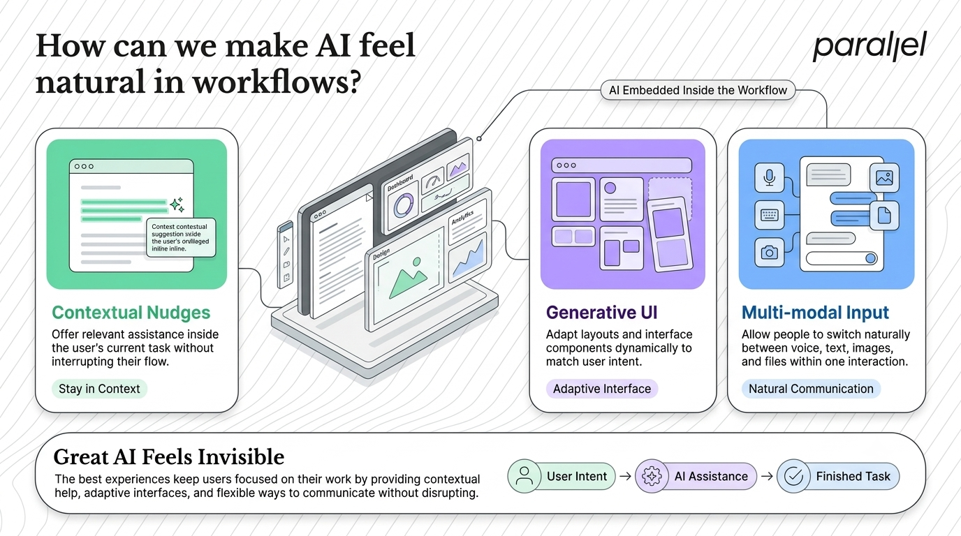
How can we make AI feel natural in workflows?
Chatbots are incredibly useful, but they are not the future of all software. The most effective AI interactions happen natively in context.
4) Contextual nudges
Instead of forcing users to navigate away to a separate chat window, bring the intelligence to them. It is a foundational concept in any list covering AI UX best practices: 15 patterns with examples.
Users lose their train of thought when they have to constantly switch tabs to ask an AI a question. Context switching kills productivity and severely limits feature adoption.
Embed the intelligence directly into the space where the user is already doing the work. The AI should read the context of the screen and offer timely, highly relevant suggestions.
- The pattern: Surface AI suggestions directly inside the user's current workflow using subtle UI elements like floating action buttons or highlight menus.
- Real-world example: Notion AI highlights your selected text and offers a small sparkle icon inline. You do not have to leave the document editor to rewrite a messy paragraph.
- The takeaway: Keep users deep in their flow state. AI should feel like a subtle superpower, not a heavy interruption.
5) Generative UI (GenUI)
Static interfaces are rapidly becoming obsolete. Showing every single user the exact same menu options and rigid layout no longer makes sense for highly personalized products.
Teams often try to cram dynamic AI capabilities into legacy dashboards. This results in cluttered, broken screens that overwhelm the user with irrelevant options.
The solution is real-time adaptive design. As Jakob Nielsen noted in his 2026 industry predictions, we are seeing a massive shift toward Generative UI, where software interfaces are drawn in real time based on user intent.
- The pattern: Adapt the layout, navigation, and data visualization natively based on the user's immediate query and context.
- Real-world example: An analytics dashboard that instantly changes from a dense, complex data table to a simple, highly focused pie chart when the user asks a specific question about quarterly expenses.
- The takeaway: Stop designing rigid screens. Design a system of flexible, modular components that the AI can assemble on the fly.
6) Multi-modal inputs
People do not think exclusively in typed text. They point, they speak, and they upload visual references. Your AI product needs to support this human reality.
Forcing users to translate a complex visual problem into a perfectly typed prompt is deeply frustrating. It creates an unnecessary barrier to entry for non-technical users.
You need to reduce the cognitive load required to get a good answer. Let users communicate with the machine naturally, using whatever medium is easiest for them in that exact moment.
- The pattern: Allow users to smoothly switch between voice, typed text, and visual photo inputs within the exact same interaction thread.
- Real-world example: ChatGPT allows you to take a photo of your open refrigerator, speak a quick voice memo about your dietary restrictions, and instantly receive a typed recipe.
- The takeaway: Let users communicate naturally. Multi-modal input is no longer a luxury feature.
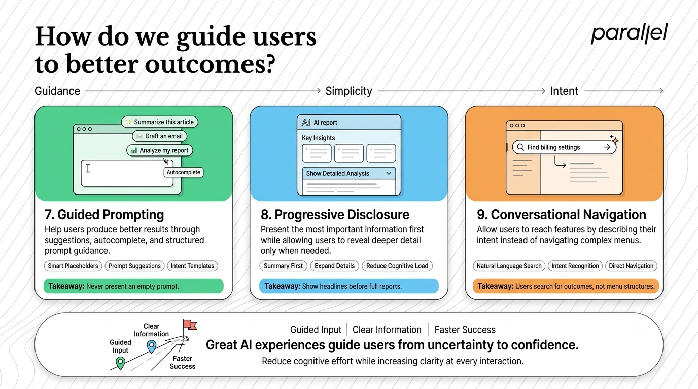
How do we guide users to better outcomes?
The blank input box is terrifying. If you simply give new users an empty prompt line, they will freeze up and abandon the product.
7) Guided prompting
You cannot expect your customers to act as professional prompt engineers. It is your responsibility as a designer to help them get good results. It is one of the most critical AI UX best practices: 15 patterns with examples that we teach.
When users write poor prompts, they get terrible outputs. They will inevitably blame your product for the bad result, completely unaware that their input was the actual problem.
You need to bridge the gap between a user's raw idea and the highly specific language the AI model requires. Hold their hand through the prompting process.
- The pattern: Provide suggestive placeholders, auto-complete phrasing, or a visual menu of common intents to structure the prompt.
- Real-world example: Midjourney introduced visual style buttons and parameter toggles to help users shape their creative prompts without typing complex backend code.
- The takeaway: Never leave the user staring at a blank box. Suggest what is possible immediately.
8) Progressive disclosure of complexity
Large language models can generate massive amounts of unstructured data in a matter of seconds. If you dump all of that raw text onto the screen at once, you will completely overwhelm the reader.
Many product teams fall into the trap of showing off everything the AI knows. They fill the interface with dense paragraphs, assuming more information equals more value. In reality, it just creates a massive cognitive burden.
You need to respect the user's time and attention span. Great design filters out the noise and only presents what matters most upfront.
- The pattern: Show a high-level, scannable summary first. Provide interactive elements like accordions or "Read More" buttons to reveal the detailed analysis.
- Real-world example: When an AI tool summarizes an hour-long meeting, it should initially display just three key action items. A secondary button can then reveal the full timestamped transcript.
- The takeaway: Give users the headline first. Let them opt-in to the heavy details at their own pace.
9) Conversational navigation
Complex, multi-level mega-menus are dying. Users want to find nested features by simply asking for them in plain English.
In robust enterprise software, users spend entirely too much time clicking through settings panels just to find a simple toggle. This traditional navigation model is slow and highly inefficient.
You should leverage AI to flatten your product's architecture. Let users navigate by stating their intent rather than forcing them to memorize your interface layout.
- The pattern: Replace or augment traditional site navigation with an intelligent, persistent search bar that understands natural language intent.
- Real-world example: Arc Browser's "Ask to Search" feature bypasses the traditional search engine results page entirely, summarizing the exact answer directly in a native overlay.
- The takeaway: Let users navigate by intent. Searching for outcomes is faster than clicking through menus.
What happens when the AI is wrong?
AI models hallucinate, drop connections, and return errors. How your interface handles these inevitable failures determines your long-term retention. We always include handling failure states in our AI UX best practices: 15 patterns with examples.
10) Graceful degradation
Startups routinely fail here by presenting a generic error message when an API call times out. This leaves the user completely stranded in a broken workflow with zero path forward.
You must plan for failure from day one. Graceful degradation means that when the intelligent system breaks down, the product smoothly falls back to a traditional, manual toolset.
Do not let a machine error stop the user from finishing their work. Ensure they can pick up the pieces and complete the task themselves.
- The pattern: Provide a clear error message and immediately offer the user a manual tool to bypass the broken AI step.
- Real-world example: If an AI image generation tool fails to parse a prompt, it immediately provides access to a stock photo library and a manual cropping tool so the user can keep working.
- The takeaway: Never leave the user blocked. Always have a human-led backup plan ready to deploy.
11) Co-creation and feedback loops
AI is rarely perfect on the first try. It requires a highly collaborative relationship with the human user to get the best possible results.
We see SaaS platforms generate complete marketing campaigns without giving the user any tools to tweak the output natively. The user is forced to copy the text into a different app just to edit it, which breaks the experience.
You need to treat the AI as a junior creative partner. Build mechanisms that allow the user to effortlessly correct the AI and shape the output natively.
- The pattern: Include prominent upvotes, downvotes, and rich inline editing tools attached to every single AI output block.
- Real-world example: Grammarly provides a specific UI card explaining its suggestion, allowing you to dismiss it entirely or tell the AI to stop flagging that specific phrase in the future.
- The takeaway: Make iterative editing effortless. The human user must always remain the final, empowered editor.
12) Confidence indicators
If an AI model is only 50 percent sure about a highly critical data point, the user absolutely deserves to know. Hiding uncertainty breaks trust instantly.
Product teams often try to make their AI look smarter than it is by presenting all outputs as absolute facts. When the user inevitably spots a hallucination, their trust in the entire platform evaporates.
You must be honest about system limitations. Visualizing uncertainty actually increases long-term trust because the user knows exactly when they need to pay closer attention.
- The pattern: Use clear visual cues like color coding, warning icons, or percentage bars to show the AI's internal confidence level.
- Real-world example: AI-powered medical diagnostic software often highlights a potential anomaly but attaches a low confidence score, deliberately prompting a human doctor to review it closely.
- The takeaway: Transparency is always better than fake certainty. Prove to the user that you are being honest.
How do we build lasting trust and safety?
You cannot just bolt safety onto the end of a project before launch. It has to be baked deeply into the interface. I consider transparent provenance the bedrock of our AI UX best practices: 15 patterns with examples.
13) Transparent provenance
Users need to know exactly where the AI got its information. This is especially critical for enterprise software, legal tech, and B2B products where accuracy is paramount.
If an AI generates a financial summary without citing any sources, a professional user cannot safely use that data in a board meeting. They have to manually verify it anyway, defeating the purpose of the AI.
You need to ground your AI in verifiable reality. Make it incredibly easy for the user to double-check the raw data that informed the AI's final output.
- The pattern: Include hyperlinked footnotes, source links, or hover states that reveal the direct origin of the data.
- Real-world example: Perplexity AI lists small numeric citations inline with its text. Clicking them opens the exact web page the model used to generate that specific sentence.
- The takeaway: Ground your AI in reality. Always show your work.
14) Personalized sandboxes
Before a user deploys a powerful AI agent to handle their inbox or manage their calendar, they want to see it practice first. High stakes create high anxiety.
Where teams go wrong is forcing users to test the AI in a live, public environment. If an AI agent accidentally sends a poorly phrased email to a client during testing, the user will permanently revoke its permissions.
You need to drastically lower the stakes. Users require a safe, completely isolated environment where they can test AI actions securely before they ever go live.
- The pattern: Create a staging area or a mock environment within the product to simulate AI behavior safely.
- Real-world example: When setting up an AI customer support bot in tools like Intercom, you are given a private testing window. You can chat aggressively with the bot to see how it responds before publishing it to your live website.
- The takeaway: Let users play with the AI in a risk-free zone to build operational confidence.
15) Ethical guardrails
AI can inadvertently generate biased, inaccurate, or harmful content. Your user experience must actively prevent this and warn users of potential blind spots before they occur.
Ignoring edge cases and safety guidelines is a massive liability. If your interface does not actively manage bad prompts, you risk severe brand damage and user churn.
Design for deep responsibility. Protect your users from unintended consequences by building strong, visible guardrails directly into the product experience.
- The pattern: Display contextual warnings when a prompt might lead to biased results, or politely refuse the prompt with a clear explanation.
- Real-world example: Claude explicitly states if a user request violates safety guidelines, explaining exactly why it cannot comply rather than just returning a confusing error code.
- The takeaway: Protect your users and your brand. Safety must be highly visible.
How to apply these design patterns today
Learning about these patterns is the easy part. Implementing them seamlessly into your specific product is hard. At ParallelHQ, we run specialized design sprints to help teams map out these exact interactions without breaking their existing workflows.
Do not try to implement all fifteen patterns at once. Start by picking one core workflow. Look closely at your onboarding sequence or your primary feature set. Ask yourself exactly where the user feels confused or abandoned by the AI. Then, apply the right pattern from this list to fix it.
If you are entirely unsure where to begin, a proper UX audit can easily highlight your biggest friction points. Building great AI products is not about flashy technology. It is about grounded, clear product thinking.
The reality is that AI models will only get more powerful in the coming years. But without strong, empathetic design, that raw power is completely useless to the average user. Mastering these AI UX best practices: 15 patterns with examples is how you build products people actually want to use.
Conclusion
The next generation of billion-dollar startups will not win just by having the fastest machine learning models. They will win by having the best user experience.
We are officially moving past the era of the raw, unrefined chat interface. Users demand seamless integration, deep transparency, and absolute control. They want intelligent software that respects their time and their intelligence.
By focusing on these robust patterns, you move completely away from the hype cycle. You start building durable products that solve real problems in clear, highly intuitive ways. Let the underlying technology handle the heavy lifting, but always let the human user remain the pilot.
Frequently asked questions
1) What are the core benefits of using AI UX best practices?
These patterns actively reduce user anxiety and drastically increase feature adoption. They transform confusing AI black boxes into intuitive, human-centered tools. By following them, you build deep, long-term trust with your user base.
2) How do I know if my AI product needs a UX redesign?
Look closely at your drop-off rates and customer support tickets. If users are constantly abandoning the AI workflow or manually double-checking every piece of AI output, your current design is failing. High friction in adoption is a clear signal you need a strategic refresh.
3) What is the difference between traditional UX and AI UX?
Traditional UX deals strictly with deterministic systems where clicking a button yields the exact same result every time. AI UX deals with probabilistic systems. Your interface must handle dynamic, unpredictable outputs gracefully without ever confusing the user.
4) How do we handle AI hallucinations in the user interface?
You handle them through graceful degradation and highly visible confidence indicators. Never present an AI output as an absolute, undeniable fact. Always provide robust editing tools and manual fallback options so the user can easily correct any machine mistakes.
5) Is it possible to implement these patterns in a legacy software product?
Yes. You do not need to rebuild your entire software suite from scratch to improve the experience. We highly recommend starting with a targeted product strategy consulting session to identify specific areas where contextual nudges can be introduced smoothly.
7) How does ParallelHQ help startups with AI product design?
At ParallelHQ, we act as a strategic AI UX design partner for ambitious teams. We help simplify complex AI capabilities into clear, highly usable interfaces. We focus purely on practical product thinking that drives real user activation and retention.
8) Are standard chat interfaces going away completely?
No, chat is still highly useful for open-ended exploration and creative brainstorming. However, it will no longer be the default interface for everything you build. Generative UI and inline contextual nudges will rapidly replace chat for specific, task-oriented workflows.
9) How do we measure the success of an AI user experience?
Standard metrics like task completion time and error rates still absolutely matter. But you also need to rigorously measure user trust. Track how often users natively accept AI suggestions versus how often they override or edit them. High acceptance rates indicate a successful, trustworthy system.

check out these related blogs