Finding the right Philadelphia web design company can feel like navigating a maze. I have spoken with countless founders who spent months on a website overhaul, only to see their activation rates flatline immediately after launch. The problem usually stems from treating a website like a static brochure instead of a dynamic, interactive product.
Users do not want to read your organizational chart. They want to solve a problem quickly and understand your value proposition instantly. In this guide, I will break down the top agencies in the region. We will look at who they serve, why their specific approaches work, and how you should think about your next major design investment.
TL;DR
Here is a quick comparison of the top ten options if you need a Philadelphia web design company. I ranked them by their core strengths and specialized capabilities to help you choose the right partner for your specific growth stage.
What makes a Philadelphia web design company effective?
We see teams overcomplicate onboarding all the time. It usually backfires spectacularly. A visually stunning website is completely useless if the core user journey is broken. Effective agencies understand that aesthetics must serve a very specific business function.
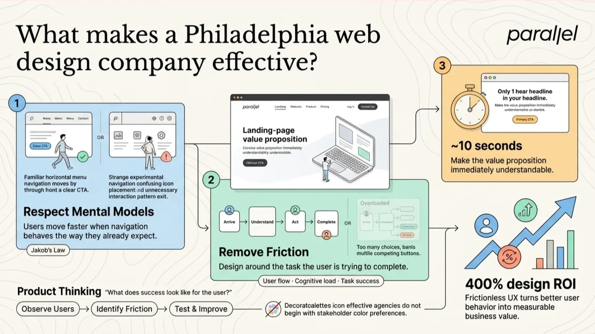
They ground their design decisions in real user behavior and rigorous testing. According to Nielsen Norman Group, users rely heavily on mental models built from their past digital experiences. This concept is known as Jakob's Law. If your website forces users to learn a completely new way to navigate, they will simply abandon your site for a competitor.
Recent industry data backs this up. A 2026 usability benchmark report from Forrester highlights that companies investing heavily in clear, frictionless user experience see a 400 percent return on their design investments. Users have less patience than ever before. You have about ten seconds to communicate your value proposition clearly before they click away.
The best agencies borrow heavily from product management principles. They look at user flow, cognitive load, and obvious friction points. They do not just ask stakeholders what colors they prefer. They ask how your users define success and what tasks they are trying to complete. This human-centered approach, championed by organizations like IDEO, ensures that the final deliverable actually solves a tangible business problem rather than just acting as a digital billboard.
Top 10 Philadelphia web design companies compared
Let us look at the top players in the market. Each of these teams brings a specific strength to the table. Hiring the wrong type of agency for your specific problem is the most common reason redesigns fail.
1) ParallelHQ
As a product design partner, we operate differently than a traditional agency. We focus heavily on early-stage startups, complex SaaS platforms, and AI-driven products. Our primary goal is to bring absolute clarity to your product thinking and execution.
We have seen too many founders guess what their users want. This leads to bloated websites, feature creep, and confusing navigation paths. We rely on a structured discovery framework to remove this guesswork. We map the exact market opportunity and user pain points before we ever draw a single wireframe.
Our approach is built around speed and rigorous market validation. We frequently use design sprints to test concepts with real users in a matter of days. This prevents teams from building features that nobody actually wants to pay for. We also run comprehensive UX audits for teams struggling with low activation rates.
Observed pattern: Startups often try to speak to every possible audience on their homepage simultaneously. This dilutes the core message and confuses high-intent buyers.
Takeaway: Focus your core website redesign on your most valuable user segment. Extreme simplicity and targeted messaging always win.
2) Brolik
Brolik takes a highly holistic view of the web. They do not separate the website from the broader business strategy. Their team focuses heavily on how a site integrates with active marketing campaigns and daily sales operations.
We often see mid-market companies struggle because their marketing teams and design teams work in complete silos. Brolik solves this by building sites that are engineered from the ground up to support active growth campaigns. They focus heavily on data tracking, user analytics, and strict conversion metrics.
They are an excellent choice for established companies that need their website to function as a highly predictable lead generation engine rather than just an information portal.
Observed pattern: Companies build beautiful sites but forget to establish clear, trackable conversion funnels.
Takeaway: A redesign must always start with a detailed map of the customer acquisition journey.
3) eCity Interactive
Information architecture is incredibly difficult to get right at scale. eCity Interactive excels at organizing massive amounts of institutional content. They are highly regarded in the higher education, government, and nonprofit sectors.
Universities often have thousands of interconnected web pages. Managing the cognitive load for prospective students requires strict design discipline. eCity Interactive uses robust user research and card sorting exercises to categorize information logically. They ensure that complex portals remain accessible and meet strict WCAG 2.2 accessibility standards.
If your organization has deep archives, multiple distinct user portals, and strict compliance requirements, they are a very strong contender.
Observed pattern: Large organizations frequently let internal politics dictate their primary website navigation.
Takeaway: Your site structure must always reflect the user's mental model, not your internal organizational chart.
4) The 215 Guys
The 215 Guys stands out as a reliable Philadelphia web design company for local businesses. They focus on delivering clean, highly functional websites without unnecessary agency overhead or inflated timelines.
Small businesses rarely need months of strategic consulting. They need a fast, secure, and mobile-friendly site that clearly states what they do and how to contact them. The 215 Guys deliver exactly that. They rely heavily on proven platforms like WordPress and Shopify to keep costs reasonable and timelines short.
They are known for their transparency and incredibly straightforward communication. This makes them a great fit for founders who want a hands-on technical partner without the enterprise price tag.
Observed pattern: Local businesses routinely overspend on custom development when a solid CMS would comfortably suffice.
Takeaway: Do not reinvent the wheel for a basic service website. Rely on established conventions and proven templates.
5) Think Company
Think Company is a Philadelphia web design company focused heavily on enterprise software and deep UX research. They tackle highly complex, heavily regulated industries like enterprise finance, banking, and healthcare.
When you design for the enterprise level, the stakes are incredibly high. A bad user interface can cost large corporations millions in lost productivity and training hours. Think Company employs rigorous usability testing to ensure their interfaces are deeply intuitive. They rely on core UX principles like Fitts's Law to minimize user error in complex data dashboards.
Their team is built specifically for large-scale digital transformation projects. They are the right choice if your project requires deep technical integration and extensive rounds of user testing.
Observed pattern: Enterprise tools inevitably suffer from feature bloat, leading to steep and frustrating learning curves.
Takeaway: Continuous user research is absolutely mandatory when designing software for professional workflows.
6) Push10
Push10 is a premium branding and web design agency that focuses heavily on the B2B sector. They understand that B2B purchases are driven by long-term trust and complex, multi-stakeholder sales cycles.
In the competitive B2B space, your website is often your most important sales asset. It needs to establish absolute authority instantly. Push10 excels at creating cohesive, modern brand identities that translate perfectly to digital environments. They build sites that articulate complex value propositions clearly and beautifully.
They are a fantastic option if your current brand feels outdated and is actively hurting your credibility with sophisticated enterprise buyers.
Observed pattern: B2B companies often rely on dense, industry-specific jargon that alienates potential buyers researching solutions.
Takeaway: Clear, concise copywriting is just as important as the visual aesthetic.
7) Inverse Paradox
Inverse Paradox specializes deeply in eCommerce infrastructure. They build highly customized digital storefronts that are optimized for high-volume transactions and complex inventory management.
eCommerce user experience is a very specific, unforgiving discipline. According to 2026 data from the Baymard Institute, the average online cart abandonment rate remains stubbornly near 70 percent. This is usually due to complex, multi-step checkout flows. Inverse Paradox understands these friction points intimately. They build highly optimized, conversion-focused sites on enterprise platforms like Magento and WooCommerce.
If your primary business revenue comes from online product sales, you need a dedicated specialist. Inverse Paradox brings the necessary technical expertise required to handle complex payment gateways and inventory syncing.
Observed pattern: Retailers lose massive amounts of revenue by forcing users to create accounts before allowing them to check out.
Takeaway: Always offer a frictionless guest checkout option to maximize immediate conversions.
8) BNP Engage
BNP Engage sits squarely at the intersection of technical web design and inbound marketing. They are a certified HubSpot partner that focuses entirely on driving sustainable B2B growth.
A beautiful website is only effective if the right target accounts can actually find it. BNP Engage builds sites specifically engineered to capture organic traffic and nurture qualified leads. They focus heavily on deep CRM integration, lead scoring, and automated marketing workflows.
They are the right partner if your organization is struggling to align your sales and marketing teams around a unified digital strategy.
Observed pattern: Marketing teams frequently struggle to measure the exact return on investment of their top-of-funnel website traffic.
Takeaway: Deep, flawless integration between your CMS and CRM is non-negotiable for modern B2B teams.
9) Eastern Standard
Eastern Standard handles projects with significant, underlying technical complexity. They are a powerful combination of a heavy-duty web development firm and a strategic brand consultancy.
Some web projects require custom backend logic, complex database architectures, and strict data security protocols. Eastern Standard has the raw engineering depth to handle these demanding requirements. They are also adept at building scalable design systems that allow large internal teams to maintain strict visual consistency across massive digital platforms.
If you are dealing with years of legacy technical debt and need a secure, highly scalable web architecture, they are a proven and reliable partner.
Observed pattern: Rapidly growing companies tend to create heavily fragmented digital experiences across different subdomains over time.
Takeaway: A unified design system prevents future design debt and drastically speeds up engineering output.
10) O3
O3 focuses broadly on customer experience and digital innovation. They look beyond the confines of the website to analyze the entire omnichannel customer journey.
Consumer expectations are higher today than ever before in history. O3 helps companies map exactly how users interact with their brand across web, mobile, and physical touchpoints. They focus heavily on corporate digital transformation, helping legacy, brick-and-mortar businesses adapt to modern consumer behaviors.
They are ideal for large, established organizations looking to completely rethink how they deliver their core services digitally.
Observed pattern: Companies often focus all their budget on acquiring users but completely ignore the post-purchase experience.
Takeaway: Retention is fundamentally a design problem. Your website must serve existing customers just as well as it serves new prospects.
Common traps founders fall into during a redesign
It is easy to get distracted during a major website or product overhaul. I have seen startups burn through months of runway building the wrong thing. Here are the three most common traps you need to avoid.
First, many teams design for their internal stakeholders instead of their actual users. The CEO wants a flashy video header. The marketing team wants six different calls to action. Before long, the homepage becomes a chaotic compromise. You must ruthlessly prioritize the primary user task over internal opinions.
Second, teams skip usability testing to save time. This is a fatal error. Launching an untested interface is like flying blind. We mandate testing during our ui/ux design engagements because assumptions are almost always wrong. Five quick user interviews can save you three months of wasted engineering effort.
Third, founders often over-index on visual trends. Trends fade rapidly. A product that relies on gimmicky animations will feel outdated in a year. Instead, focus on clear typography, obvious navigation, and blazing fast load times. Utility will always outlast aesthetic trends.
How should you evaluate a Philadelphia web design company before hiring?
Choosing a design partner is a high-stakes business decision. Do not rely solely on a beautiful Dribbble portfolio. You need to understand exactly how the agency thinks and solves problems.
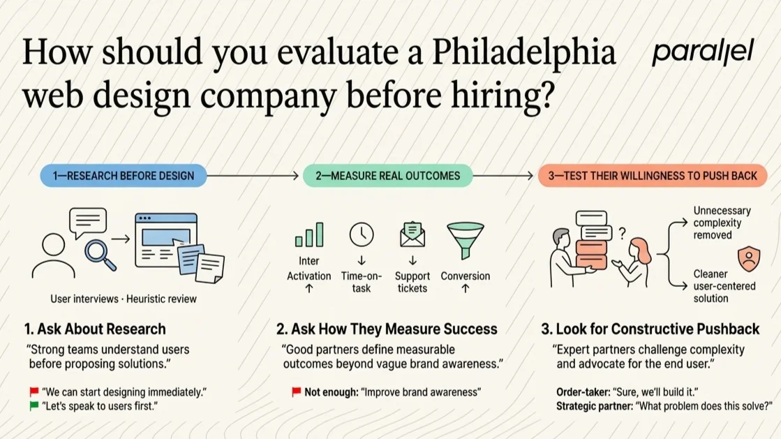
First, ask them directly about their research process. If an agency agrees to build a complex site without speaking to a single one of your actual users, that is a massive red flag. They should insist on doing baseline user interviews or a heuristic evaluation. You simply cannot solve a business problem you do not intimately understand.
Second, evaluate their specific stance on metrics. Ask them how they measure the success of a launch post-deployment. Vague answers about improving brand awareness are simply not enough in 2026. They should talk confidently about activation rates, time-on-task, reduced support tickets, and conversion funnel improvements.
Finally, look for a team that actively challenges your assumptions. A good partner will tell you bluntly when your idea is too complex or unfeasible. They will advocate aggressively for the end user, even if it means pushing back against strong internal stakeholder opinions. You are hiring them for their specialized expertise, not their blind obedience.
Conclusion
Building a great website or digital product is not about keeping up with fleeting visual trends. It is fundamentally about removing friction from the user's daily life. The best design teams understand this concept deeply and build their entire processes around it.
Whether you need a simple local storefront or a deeply complex B2B SaaS platform, the core fundamentals remain exactly the same. Start with clear, intentional product thinking. Validate your early assumptions with real people. Focus ruthlessly on the user's primary core task. When you align your design decisions with actual human behavior, the positive business results will follow naturally.
Frequently Asked Questions
1) What does a Philadelphia web design company actually do?
They plan, research, and build complete digital experiences for businesses. The best firms go far beyond surface-level aesthetics. They map complex user journeys, conduct rigorous usability testing, and ensure the final site architecture drives specific, measurable business outcomes like lead generation, product activation, or direct sales.
2) Is hiring a Philadelphia web design company right for my startup?
It depends entirely on your current growth stage. If you are still searching for basic product-market fit, a simple landing page template might suffice. However, if you are actively scaling and losing valuable users due to poor onboarding or confusing navigation, investing in professional product strategy consulting is absolutely critical for sustained growth.
3) How do we start an engagement with ParallelHQ?
We always start with a deep conversation about your underlying business goals and growth metrics. We do not jump straight into drawing wireframes. We usually recommend beginning with an opportunity mapping session to define the exact, highest-priority problems we need to solve before committing to a large, expensive build.
4) What is the difference between product design and web design?
Web design historically focuses on marketing sites, lead generation, and static brochure pages. Product design focuses on complex, highly interactive applications where users log in to accomplish specific, repeatable tasks. Product design requires a much deeper focus on state management, user retention loops, and continuous, data-driven iteration.
5) How do we measure the success of a website redesign?
You must strictly define success metrics before you write a single line of code. Look closely at quantitative metrics like bounce rate, overall conversion rate, and task completion speed. You should also gather continuous qualitative data through recorded user interviews to ensure the new design actually reduces friction for your daily customers.
6) Should we choose Webflow or custom development?
For most modern marketing websites, scalable platforms like Webflow or WordPress are more than sufficient. They allow for rapid iteration and empower marketing teams with easy content management. Custom development should strictly be reserved for complex SaaS platforms or sites requiring deep, proprietary database integrations and unique security protocols.
7) How do we fix low activation rates on our site?
Low product activation usually points directly to a severe cognitive overload problem. Users are likely confused about what exact step to take next. You should conduct a comprehensive usability audit to identify exactly where users drop off in the funnel. After identifying the friction, you must simplify the onboarding flow ruthlessly, removing any non-essential steps.
8) How much does a top-tier agency engagement typically cost?
Costs vary wildly based on scope and technical complexity. A basic marketing site from a local agency might cost between $10,000 and $20,000. However, comprehensive digital transformation projects or deep product design engagements involving extensive user research, prototyping, and complex frontend engineering can range from $50,000 to well over $150,000.

check out these related blogs